mirror of
https://github.com/microsoft/terminal.git
synced 2026-02-04 05:35:20 +00:00
Unfinished UI in the title bar (new tab icon and drop down) #11845
Closed
opened 2026-01-31 02:59:09 +00:00 by claunia
·
2 comments
No Branch/Tag Specified
main
automated/loc-update
feature/llm
dev/cazamor/sui/search
dev/pabhoj/actions_editor_search
dev/lhecker/11509-kitty-keyboard-protocol
dev/lhecker/11509-kitty-keyboard-protocol-wip
dev/pabhoj/actions_editor_visual
dev/cazamor/selfhost/2026-01-29
dev/duhowett/no-blank-issues-you-lost-privileges-for-that-fam
dev/lhecker/benchcat-fix
dev/lhecker/dcs-perf
dev/duhowett/eoy-25/allow-set-foreground
release-1.24
release-1.23
dev/cazamor/bot/deprecate-area-atlasengine
dev/pabhoj/actions_editor_followups
dev/cazamor/selfhost/2026-01-20
dev/cazamor/selfhost/2026-01-12
dev/cazamor/spec/auto-save
dev/duhowett/eoy-25/underline-colors-in-atlas-bug-redux
dev/duhowett/fhl-2024/asciicast-recorder
dev/duhowett/eoy-25/underline-colors-in-atlas-bug
dev/duhowett/hax/serial-port-support
dev/duhowett/connection-utf8
dev/lhecker/fused-event
dev/lhecker/18928-wip
dev/duhowett/fhl-2024/clang
dev/cazamor/uia-leak
dev/duhowett/win7-wpf-termcontrol-squash
release-1.22
dev/cazamor/selfhost/11-18-v3
dev/cazamor/selfhost/11-18
dev/duhowett/fhl-2025/bitmap-fonts
dev/duhowett/server-2025-vms
dev/duhowett/cant-believe-gotta-do-this-shit
dev/lhecker/1410-large-scrollback
dev/lhecker/dark-mode
dev/cazamor/sui/invert-cursor-color
dev/duhowett/fhl-2025/wt-command-palette-cmdpal-integration
dev/duhowett/fhl-2025/wt-json-relative-icons
dev/lhecker/fucking-service-locator
dev/duhowett/unicode-17
dev/duhowett/multi-blern
dev/lhecker/wellp2-alt
dev/duhowett/wellp2
dev/lhecker/1860-horizontal-scrollbar
dev/lhecker/fix-window-count
dev/cazamor/sui/tab-color-old
dev/duhowett/hax/conhost-icon
dev/duhowett/hax/sui-color-chip-border
dev/duhowett/hax/terminalsettings-as-a-lib-/with-types-merged-into-tsm
dev/pabhoj/page_control_input_cleanup
dev/duhowett/padding-in-atlas-rebase-20250729
dev/lhecker/attach-thread-input
dev/duhowett/portable-shader-members
msbuildcache-reenable
dev/cazamor/selfhost/1.24-2025-06-10
dev/cazamor/upgrade-settings-containers
dev/cazamor/sui/ext-page/powershell-stub
dev/cazamor/selfhost/1.24-2025-05-15
dev/pabhoj/sui_action_overhaul
dev/cazamor/selfhost/1.24-2025-05-06
dev/cazamor/selfhost/1.24-2025-04-29
dev/cazamor/sui/ext-page/lazy-load-objects
dev/cazamor/sui/ext-page/badge
dev/cazamor/selfhost/1.24
dev/lhecker/sdk-26100
dev/duhowett/testing
dev/jadelaga/VS-Pty.Net-1.22
dev/duhowett/fhl-2025/what-if-no-content-ids
dev/cazamor/a11y/vt-seq-prototype
dev/lhecker/18584-part2
dev/lhecker/get-lang-id
dev/duhowett/hax/clogs
release-1.21
dev/pabhoj/featurellm_fix_paste
dev/lhecker/grapheme-backup
dev/jadelaga/VS-Pty.netFixes
dev/lhecker/atlas-engine-compute-shader
dev/migrie/s/ai-providers
dev/lhecker/animated-cursor-wip
dev/pabhoj/featurellm_timeout
dev/lhecker/dark-mode-alt
dev/duhowett/osc-strided-table
dev/lhecker/bugbash
dev/pabhoj/featurellm_improve_parsing
dev/duhowett/coast-to-coast
dev/lhecker/curly-improvements
dev/duhowett/net8
dev/duhowett/onebranch-custom-pool
dev/lhecker/renderer-overhaul-2nd-attempt
dev/lhecker/cleanup
dev/cazamor/sui/confirmation-announcements
dev/lhecker/theme-quality
dev/duhowett/hax/cmake
dev/lhecker/winconpty-cleanup
dev/duhowett/learn/rewrite-highlights
dev/migrie/b/no-nesting-when-searching
release-1.20
dev/lhecker/14165-conhost-font-size
dev/duhowett/sel-2-spans
dev/lhecker/7118-cursor-color
dev/lhecker/remove-glyph-width
dev/lhecker/igfw-scroll-region
dev/lhecker/17656-win32im-double-encoding
dev/duhowett/fhl-2024/merge-idls
dev/duhowett/feed-forward-variables
dev/lhecker/remove-chrome-math
dev/duhowett/copylink
dev/duhowett/applicableactions
gh-readonly-queue/main/pr-17566-de50310295b7d92ed3d51f07974a2a945776bf9d
dev/lhecker/atlas-engine-stride-copy
dev/migrie/b/bump-nuget-in-c
dev/migrie/f/992-redux-redux
dev/migrie/f/filter-weight-input-too
dev/migrie/f/disable-nesting
dev/migrie/f/local-snippets-cleaner
dev/migrie/s/1553-mouse-bindings
selfhost-1.22-bugbash-2024-06-04
selfhost/1.22-bugbash-2024-06-04
dev/lhecker/15689-tab-drag-crash-fix
dev/migrie/f/sxnui-font-size-change
dev/migrie/f/local-snippets-on-action-refactor
dev/migrie/f/just-local-snippets
dev/migrie/save-input-patches
dev/migrie/f/md-pane-official
dev/migrie/base-pane
dev/migrie/fhl/tasks-pane
release-1.19
dev/migrie/b/17130-clear-marks-2
dev/migrie/b/17075-its-me-the-killer
dev/duhowett/i-figured-out-why-sometimes-the-publish-build-failed
dev/duhowett/nuget-publication-with-aad-app-id
selfhost-1.20
dev/duhowett/graph
dev/migrie/b/15803-activate-dont-copypasta
dev/duhowett/is-pgo-broken-because-of-sui-being-slower
dev/migrie/b/remove-terminaltab
dev/migrie/fhl/md-pane
dev/migrie/fhl/local-tasks-2024
dev/migrie/fhl/2024-inline-notebook
dev/duhowett/interface-projects
dev/duhowett/dead-loc
release-1.18
dev/migrie/fhl/2024-spring-merge-base
dev/duhowett/hax/l9
inbox
dev/migrie/14073-on-main
dev/duhowett/hax/conhost_dump_replay
user/lhecker/atlas-engine-srgb
dev/migrie/fhl/sxnui-tooltips-3
dev/migrie/7718-notifications-experiments
dev/migrie/fhl/7718-notifications
dev/migrie/fhl/7718-notifications-reboot
dev/lhecker/remove-gsl
dev/lhecker/16575-TerminateProcess
dev/lhecker/window-thread-climate-control
dev/lhecker/client-context-input-output-mode
dev/lhecker/ring-buffer-input-buffer
release-1.17
dev/lhecker/propsheet-fontdlg-refactor
dev/lhecker/renderer-overhaul
dev/pabhoj/test
dev/duhowett/chop
dev/lhecker/til-ulong-cleanup
dev/lhecker/til-env-cleanup
dev/migrie/f/16005-a11y-pane
dev/cazamor/a11y/fastpass
dev/migrie/b/15487-push-cwd
dev/migrie/b/15536-or-15219-idk
dev/duhowett/move-timers-down-into-core-interactivity-etc
dev/migrie/b/15812-broadcast-paste-two
dev/migrie/fhl-fall-2023/11162-quake-III-arena
dev/migrie/fhl-fall-2023/1620-automatic-tab-progress
dev/migrie/fhl-fall-2023/9992-quake-II
dev/migrie/fhl-fall-2023/9992-default-quake-settings
dev/migrie/fhl-fall-2023/9992-window-name-settings
dev/migrie/fhl-fall-2023/oceans
dev/lhecker/ColorScheme-improvements
dev/migrie/search-v2-v3
dev/migrie/pr-15717/its-dangerous-to-go-alone
dev/migrie/f/4768-taskbar-icons
dev/duhowett/padding-in-atlas
dev/migrie/f/3121-tooltips
dev/duhowett/sticky-control
dev/duhowett/fix-tracing-2
dev/migrie/b/add-support-for-vsc-marks
dev/migrie/f/1860-this-is-literally-what-less-is-for
dev/migrie/s/5916-draft
dev/lhecker/tracy
dev/migrie/s/north-star
dev/cazamor/tag-youre-it
dev/migrie/f/12336-let-it-mellow
dev/migrie/f/now-with-more-compat-settings
dev/migrie/f/compatibility-sui
dev/duhowett/hax/wpf-atlas
dev/duhowett/fgb
dev/migrie/b/15487-relative-paths-are-hard
dev/lhecker/colrv1
loc-update
dev/migrie/fhl/dyndep-csharp
dev/migrie/fhl/dyndep
dev/migrie/fhl-clickable-send-input
dev/migrie/f/cwd-hijinks-5506-15173
dev/lhecker/openconsole-async-start
1.17
dev/migrie/bump-scratch
dev/migrie/f/3726-restartConnection
dev/migrie/b/cxn-restarting-attempt-1-backport
dev/migrie/b/9053-part-3-the-actual-doing-of-the-thing
dev/migrie/b/13388-focus-logger
dev/migrie/b/9053-part-4-i-guess-defterm
dev/migrie/oop/3/of-the-silmarils
of-the-darkening-of-valinor
dev/migrie/fhl/notebook-proto-000
dev/migrie/f/narrator-buddy
dev/migrie/mux-2.8.2-march-2023
dev/migrie/f/roast-mutton
dev/migrie/f/12861-preview-input
dev/lhecker/clang-tidy
dev/migrie/f/3121-wE-dOnT-hAvE-dEv-DaYs
dev/duhowett/compiler-compliance
dev/duhowett/i-have-a-burning-hatred-for-ntstatus-of-later-so-why-not-fix-it
dev/duhowett/shorthand-namespaces
dev/duhowett/rename-all-dlls
dev/duhowett/errordialog
dev/lhecker/gsl-narrow
dev/migrie/b/11522-dumb-idea
release-1.16
dev/miniksa/env
dev/duhowett/hax/embed-everything
dev/migrie/b/13388-attempt-003
dev/migrie/b/14512-test-research
dev/migrie/b/13388-attempt-002
dev/migrie/b/14464-copyOnSelect-moving-text
dev/migrie/s/thema-schema-for-1.16
dev/migrie/s/theme-pair-schema
dev/migrie/b/13388-experiments-1
dev/cazamor/spec/a11y-vt-seq
dev/migrie/b/14557-empty-folder-dropdown
dev/cazamor/spec/a11y-vt-seq-v2
release-1.15
dev/migrie/f/process-model-v3-test-0
dev/lhecker/vsconfig
dev/migrie/s/5000-presentation
dev/lhecker/5907-startup-perf
dev/lhecker/winrt-file-api-benchmark
dev/duhowett/128-bit-compiler
dev/duhowett/hax/arm64-native-build
dev/migrie/fhl/more-shell-integration
dev/migrie/b/13388-experiments-0
dev/lhecker/til-to-ulong-improvements
dev/migrie/s/markdown-notebooks
dev/cazamor/a11y/nav-by-page
dev/cazamor/a11y/system-menu-support
dev/duhowett/no-private-registry-keys
dev/cazamor/wpf/uia-expose-enable-events
dev/cazamor/wpf/uia-events
extendAISpec
dev/migrie/fhl/clickSendInput
dev/migrie/fhl/save-command
dev/migrie/b/theme.profile
dev/migrie/b/13943-a-test-for-this
dev/migrie/oop/2/endgame
dev/duhowett/hax/merge_idl
dev/migrie/oop/2/infinity-war
dev/migrie/spellbot-cve
dev/cazamor/a11y-sev3/new-profile-announcement
dev/migrie/fhl/upside-down-mode
release-1.14
dev/migrie/f/9458-startupInfoToTerminal
dev/migrie/fhl/5916-triggers
dev/migrie/b/13523-context-menu
dev/migrie/b/6523-endpaint-outside-lock
dev/migrie/b/12413-OnUnhandledException
dev/lhecker/render-snapshot
dev/cazamor/1.15/scroll-to-point
dev/migrie/mux-2.8-aug-2022
dev/lhecker/lock-console-guard
dev/migrie/f/1504-final
dev/pabhoj/sui_follow_ups
dev/migrie/f/til-winrt.h
dev/cazamor/color-picker-redesign
dev/migrie/fhl/vscode-autocomplete-prototype
dev/migrie/f/1504-prototype
dev/migrie/oop/2/loki
dev/migrie/oop/2/wandavision
dev/migrie/b/8698-YOURE-OUT-OF-ORDER
fabricbot-configuration-migration
dev/migrie/b/12788-did-it-work
dev/migrie/b/localtests-ci-2022
dev/cazamor/1.14/replace-compareInBounds
dev/pabhoj/preview_string
dev/cazamor/ks/switchSelectionEndpoint
dev/migrie/oop/2/COM-ISwapChainProvider-attempt-1
dev/migrie/b/dxd-marker
release-1.13
dev/migrie/b/13066-for-defterm
dev/cazamor/revert-dwm
dev/migrie/b/13066-sw_flash_repeatedly
dev/migrie/b/no-cloaky-cloak
dev/migrie/f/apples-to-oranges
dev/migrie/f/no-custom-caption-btns
dev/migrie/f/10509-mica-and-transparent-titlebars
dev/migrie/b/12911-wpf-focus-fg
dev/migrie/titebar-colors
dev/lhecker/4015-cursor
dev/migrie/fhl/rgb-rainbow-window-frame
dev/migrie/fhl/scroll-marks-prototype
release-1.12
dev/miniksa/compliance
dev/migrie/f/default-icons
dev/migrie/fhl/10175-web-search-for-text
dev/migrie/fhl/menu-complete-prototype
dev/migrie/b/2988-merged-prototypes
dev/migrie/b/2988-niksa-msgs-prototype
dev/migrie/fhl/9583-colorSelection
dev/migrie/b/10609-sui-leak
dev/migrie/b/32-attempt-3
dev/migrie/release-1.12-rejuv-attempt-2
dev/migrie/demo-for-presentation
dev/migrie/b/32-but-im-here-for-12567
dev/duhowett/conpty_first_frame_blug
dev/migrie/b/11092-unfocused-acrylic-settings
dev/migrie/localtests-in-ci
dev/migrie/b/12356-attempt-2
dev/migrie/b/12353-with-null
dev/migrie/b/12387-trim-spaces
dev/migrie/b/5033-bad-start
dev/lhecker/12351-broken-locales
dev/migrie/b/8663-input-to-oem-crash
dev/migrie/b/11743-win10-opacity-is-hard
dev/migrie/f/ctrl-click-elevate
dev/migrie/b/12196-shim-localization
dev/lhecker/issue-4015-til-rect
dev/cazamor/eim/mvvm
dev/migrie/f/--elevate
dev/migrie/b/11668-i-think
dev/migrie/b/11994-wsl-mangline
dev/migrie/eim/3475-action-xmacros
dev/migrie/eim/incremental-build-000
dev/cazamor/a11y/fake-uia-data
dev/migrie/f/non-terminal-content-elevation-warning
dev/migrie/f/632-on-warning-dialog
dev/lhecker/rgba
dev/migrie/b/8480-keybindings-in-tabs
release-1.11
dev/migrie/b/11561-dead-ends
dev/migrie/oct-21-roadmap-update
dev/migrie/fhl/adaptive-card-extension
dev/cazamor/test/11440
dev/migrie/f/warning-dlg-automation
dev/migrie/b/1.12-crash-on-exit
dev/migrie/b/11146-next-tab-in-cmdpal
release-1.10
dev/migrie/5ff9a24-and-75e2b5f
dev/duhowtt/hax/cpal-jumplist-async
dev/lelian/actionid/1
dev/migrie/f/just-elevated-state
dev/lhecker/terminal-settings-cleanup
dev/migrie/gh-10824
dev/pabhoj/cursor_light
dev/migrie/oop/wandavision
dev/migrie/oop/endgame
dev/migrie/oop/infinity-war
dev/lhecker/app-state-actually-hidden
dev/migrie/b/6160-dynamic-default-warning
dev/mgirie/b/more-nchhittest-ideas
dev/migrie/b/9320-interfacial-separation
cinnamon/fhl/find-contextmenu
dev/lhecker/wsl-distro-generator-cleanup
dev/migrie/b/10875-but-more-clever
dev/migrie/b/broken-globalsummon-overloading
dev/duhowett/hax/rle-row
dev/migrie/fhl-2021/cmdpal-select-list
dev/migrie/fhl-2021/differential-pixel-shading
dev/duhowett/hax/no-writable-glyphat
dev/migrie/fhl-2021/more-shader-variables
dev/migrie/titlebar-shenannigans
dev/miniksa/win10_font_matching
dev/lhecker/conhost-oom
dev/migrie/b/10332-less-snappy-scrolling
dev/migrie/b/7422-1px-top-border
release-1.9
dev/cazamor/move-scratch
release-1.8
dev/miniksa/manifest_2
release-1.6
release-1.7
dev/migrie/oop/the-whole-thing
dev/migrie/oop/connection-factory
dev/migrie/f/quake-dropdown-2
dev/miniksa/rle2
dev/migrie/f/quake-toCurrent-experiments-2
dev/migrie/f/quake-toCurrent-experiments
dev/migrie/f/quake-dropdown
dev/cazamor/actions-page/template
dev/duhowett/hax/cursor_stamp_foreground_background
dev/migrie/f/1860-hey-might-was-well-hack-during-a-hackathon
dev/migrie/oop-terminal.control-split-control
dev/duhowett/hax/build-with-wholearchive
dev/cazamor/spec/tsm-actions-temp
dev/migrie/oop-tear-apart-control
dev/migrie/oop-scratch-3
dev/cazamor/sui/bugfix-reload-crash
dev/migrie/f/xmacro
dev/cazamor/sui/proto/profile-nav-view
dev/migrie/f/name-windows
dev/migrie/dol/messing-with-shaders-take-1
release-1.5
dev/cazamor/sui/inheritance-hyperlinks-test
dev/migrie/r/commandline-lib-002
dev/migrie/f/com.fabrikam.toaster
dev/cazamor/adaptive-cards-prototype
dev/migrie/f/commandline-lib
dev/miniksa/zipzoom2
dev/migrie/f/remote-commandlines
dev/migrie/f/632-elevated-profiles
dev/migrie/oop-broker-000
dev/migrie/fix-pr-7015
dev/duhowett/clang
dev/miniksa/input_tests_2
dev/miniksa/input2
dev/migrie/oop-rpc-000
release-1.4
dev/migrie/oop-mixed-elevation-1
dev/migrie/oop-window-content-1
cinnamon/open-json
dev/miniksa/input_tests
dev/duhowett/hax/tsm-graphviz
dev/miniksa/input
dev/duhowett/hax/caption_buttons
release-1.3
dev/cazamor/a11y/expand-line-under-viewport
dev/cazamor/acc/ch/word-nav-perf
dev/cazamor/spec/settings-ui-architecture-draft
dev/duhowett/hax/tap_upgrade
dev/migrie/f/pane-exit-animation
release-1.2
dev/migrie/move-lib-up-and-dll-down
release-1.1
dev/migrie/f/branch-2-backup
dev/migrie/f/settings-getters-only
dev/duhowett/hax/command_palette_search
dev/migrie/f/6856-let-terminalpage-expandcommands
dev/migrie/f/theming-2020
dev/migrie/oop-scratch-4
dev/duhowett/hax/punchout
dev/migrie/s/action-ids
dev/migrie/f/lets-just-generate-these
dev/migrie/oop-scratch-2
dev/miniksa/dcomp
dev/miniksa/gotta_go_fast_spsc
dev/miniksa/gotta_go_fast
dev/miniksa/perf_skip_checks
dev/miniksa/perf_buffer_dig
dev/migrie/s/1203-cursorTextColor
dev/migrie/f/fix-intellisense-i-guess-backup
release-1.0
dev/migrie/f/execute-commandlines
dev/migrie/f/2046-Command-Palette-v2
dev/migrie/b/6421-passthrough-alt
dev/migrie/b/moving-focus-is-hard
dev/miniksa/set
dev/migrie/f/1203-phase-1
dev/migrie/f/get-localtests-in-ci
dev/cazamor/drag-panes
dev/cazamor/tile-background
release-0.11
dev/duhowett/dev/duhowett/hax/appstate_remember
dev/duhowett/load_condrv
dev/duhowett/hax/wpf_win_8_hax
dev/migrie/b/3088-weird-exact-wrap-resize
release-0.10
dev/migrie/b/4591-custom-scaling-bug
dev/duhowett/hax/attr_smuggling
dev/migrie/b/5161-mingw-vim-fix
dev/miniksa/dx_bitmap
dev/migrie/b/1503-try-messing-with-cooked-read
dev/duhowett/eyebeam
dev/migrie/b/5113-experiments
dev/duhowett/hax-selection-exclusive
dev/migrie/f/more-vt-renderer-tracing
dev/miniksa/bitmap
dev/duhowett/wprp
dev/miniksa/bitmap-mad-with-power
dev/migrie/f/resize-quirk
dev/migrie/f/reflow-buffer-on-resize-002
wpf-renderer-revert
dev/miniksa/draw
release-0.9
dev/miniksa/tabs-color-fix
dev/miniksa/4309
dev/migrie/f/just-wrapping
dev/migrie/b/3490-try-another-resize-algo
release-0.8
dev/migrie/b/3490-a-simpler-resize
dev/migrie/b/3490-resize-down
dev/miniksa/4254
dev/migrie/f/conpty-wrapped-lines-2
dev/migrie/b/be-better-at-hiding
dev/migrie/f/3327-xaml-theming-proto
dev/miniksa/gardening2
release-0.7
dev/duhowett/conpty-flags
dev/migrie/f/603-vintage-opacity
dev/migrie/PR#3181-comments
dev/duhowett/font-64
release-0.5
dev/migrie/b/663-paste-lf-always
dev/migrie/b/2011-reordered-fallthrough-strings
dev/migrie/b/411-init-tab-stops
dev/migrie/b/json-patching-is-hard
dev/migrie/b/2455-try-getting-tests-working
dev/migrie/b/1223-change-256-table
dev/migrie/f/2171-openterm.cmd
dev/migrie/f/drag-panes
dev/migrie/f/2046-command-palette
release-0.3
dev/miniksa/manager
dev/migrie/f/non-terminal-panes
dev/migrie/f/passthrough-2019
dev/miniksa/shared_pch
dev/migrie/f/1897-less-duplicated-work
release-0.2
dev/cazamor/mcs/viewport-selection
dev/duhowett/version_hack
v1.24.10212.0
v1.23.20211.0
v1.24.3504.0
v1.23.13503.0
v1.24.2812.0
v1.23.12811.0
v1.24.2682.0
v1.23.12681.0
v1.24.2372.0
v1.23.12371.0
v1.23.12102.0
v1.22.12111.0
v1.23.11752.0
v1.22.11751.0
v1.22.11141.0
v1.23.11132.0
v1.23.10732.0
v1.22.10731.0
v1.21.10351.0
v1.22.10352.0
v1.23.10353.0
v1.22.3232.0
v1.21.3231.0
v1.22.2912.0
v1.21.2911.0
v1.22.2702.0
v1.21.2701.0
v1.22.2362.0
v1.21.2361.0
v1.21.1772.0
v1.20.11781.0
v1.21.1382.0
v1.20.11381.0
v1.21.1272.0
v1.20.11271.0
v1.20.11215.0
v1.19.11213.0
v1.20.10822.0
v1.19.10821.0
v1.20.10572.0
v1.19.10573.0
v1.20.10303.0
v1.19.10302.0
v1.18.10301.0
v1.20.10293.0
v1.19.10292.0
v1.18.10291.0
v1.18.3181.0
v1.19.3172.0
v1.19.2831.0
v1.18.2822.0
v1.19.2682.0
v1.18.2681.0
v1.18.1462.0
v1.17.11461.0
v1.18.1421.0
v1.17.11391.0
v1.17.11043.0
v1.16.10261.0
v1.17.1023
v1.16.10231.0
v1.15.3465.0
v1.16.3463.0
v1.15.2712.0
v1.15.2874.0
v1.16.2641.0
v1.16.2523.0
v1.15.2524.0
v1.15.2282.0
v1.14.2281.0
v1.14.1962.0
v1.15.2002.0
v1.15.2001.0
v1.15.1862.0
v1.14.1861.0
v1.14.1451.0
v1.14.1432.0
v1.13.11431.0
v1.13.10983.0
v1.12.10982.0
v1.13.10733.0
v1.12.10732.0
v1.13.10395.0
v1.12.10393.0
v1.13.10336.0
v1.12.10334.0
v1.12.3472.0
v1.11.3471.0
v1.12.2931.0
v1.12.2922.0
v1.11.2921.0
v1.11.2731.0
v1.10.2714.0
v1.11.2421.0
v1.10.2383.0
v1.10.1933.0
v1.9.1942.0
v1.9.1523.0
v1.8.1521.0
v1.9.1445.0
v1.8.1444.0
v1.8.1092.0
v1.7.1091.0
v1.8.1032.0
v1.7.1033.0
v1.7.572.0
v1.6.10571.0
v1.5.10411.0
v1.6.10412.0
v1.6.10272.0
v1.5.10271.0
v1.5.3242.0
v1.4.3243.0
v1.5.3142.0
v1.4.3141.0
v1.4.2652.0
v1.3.2651.0
v1.3.2382.0
v1.2.2381.0
v1.1.2233.0
v1.2.2234.0
v1.1.2021.0
v1.2.2022.0
v1.1.1812.0
v1.0.1811.0
v1.1.1671.0
v1.0.1401.0
v0.11.1333.0
v0.11.1251.0
v0.11.1191.0
v0.11.1111.0
v0.11.1121.0
v0.10.781.0
v0.10.761.0
v0.9.433.0
v0.8.10261.0
v0.8.10091.0
v0.7.3451.0
v0.7.3382.0
v0.7.3291.0
v0.7.3252.0
v0.6.3181.0
v0.6.2951.0
v0.6.2911.0
v0.5.2762.0
v0.5.2761.0
v0.5.2681.0
v0.5.2661.0
v0.3.2321.0
v0.4.2342.0
v0.4.2382.0
v0.3.2171.0
v0.3.2142.0
v0.2.1831.0
v0.2.1715.0
v0.2.1703.0
v0.1.1621.0
v0.1.1581.0
v0.1.1502.0
v0.1.1431.0
v0.1.1361.0
v0.1.1093.0
v0.1.1161.0
v0.1.1204.0
experiment-master
v0.1.1025.0
experiment-OutsideBuild
broken-tabstops
RS2-final
v0.1.1002.0
experiment-rel-windows-inbox
experiment-f-ServerApp
v0.1.1211.0
1904.29002
1810.02002
1708.14008
Labels
Clear labels
⛺ Reserved
A11yCO
A11yMAS
A11ySev1
A11ySev2
A11ySev3
A11yTTValidated
A11yUsable
A11yVoiceAccess
A11yWCAG
Area-Accessibility
Area-AtlasEngine
Area-AzureShell
Area-Build
Area-Build
Area-Chat
Area-CmdPal
Area-CodeHealth
Area-Commandline
Area-CookedRead
Area-DefApp
Area-Extensibility
Area-Fonts
Area-GroupPolicy
Area-i18n
Area-Input
Area-Interaction
Area-Interop
Area-Localization
Area-Output
Area-Performance
Area-Portable
Area-Quality
Area-Remoting
Area-Rendering
Area-Schema
Area-Server
Area-Settings
Area-SettingsUI
Area-ShellExtension
Area-ShellExtension
Area-ShellExtension
Area-Suggestions
Area-Suggestions
Area-TerminalConnection
Area-TerminalControl
Area-Theming
Area-UserInterface
Area-VT
Area-Windowing
Area-WPFControl
AutoMerge
Blocking-Ingestion
Culprit-Centennial
Culprit-WinUI
Disability-All
Disability-Blind
Disability-LowVision
Disability-Mobility
External-Blocked-WinUI3
Fixed
Gathering-Data
good first issue
HCL-E+D
HCL-WindowsTerminal
Help Wanted
Impact-Compatibility
Impact-Compliance
Impact-Correctness
Impact-Visual
In-PR
InclusionBacklog
InclusionBacklog-Windows TerminalWin32
InclusionCommitted-202206
Issue-Bug
Issue-Docs
Issue-Feature
Issue-Feature
Issue-Question
Issue-Samples
Issue-Scenario
Issue-Task
Needs-Attention
Needs-Author-Feedback
Needs-Bisect
Needs-Discussion
Needs-Repro
Needs-Tag-Fix
Needs-Tag-Fix
Needs-Triage
No-Recent-Activity
Priority-0
Priority-1
Priority-2
Priority-3
Product-Cmd.exe
Product-Colortool
Product-Colortool
Product-Colortool
Product-Conhost
Product-Conpty
Product-Meta
Product-Powershell
Product-Terminal
Product-WSL
pull-request
Resolution-Answered
Resolution-By-Design
Resolution-Duplicate
Resolution-External
Resolution-Fix-Available
Resolution-Fix-Committed
Resolution-No-Repro
Resolution-Won't-Fix
Severity-Blocking
Severity-Crash
Severity-DataLoss
spam
this-will-be-a-breaking-change
Tracking-External
WindowsTerminal_Win32
Work-Item
zAskModeBug
zInbox-Bug
Mirrored from GitHub Pull Request
Milestone
No items
No Milestone
Projects
Clear projects
No project
Notifications
Due Date
No due date set.
Dependencies
No dependencies set.
Reference: starred/terminal#11845
Reference in New Issue
Block a user
Blocking a user prevents them from interacting with repositories, such as opening or commenting on pull requests or issues. Learn more about blocking a user.
Delete Branch "%!s()"
Deleting a branch is permanent. Although the deleted branch may continue to exist for a short time before it actually gets removed, it CANNOT be undone in most cases. Continue?
Originally created by @iseeghosts on GitHub (Dec 20, 2020).
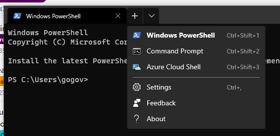
There seem to be unfinished UI elements in the tile bar, namely new tab (plus icon) and dropdown icon. As I understand it, the core team is going for chromium style title bar - if so, there should be a uniform padding and the icon itself should have a highlighted square with rounded corner in background when hovered,
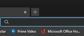
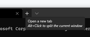
instead it appears there is no space netween the existing tabs and new tab icon when hovered or a clear background.
Also, there seem to be a weird bug (maybe?) when I click on the dropdown as both the new tab and dropdown are highlighted with an unusual background.
Environment
Windows build number: Windows 10 version 2004, build 21277.1000
Windows Terminal version (if applicable): Windows Terminal Preview / Version: 1.5.3242.0
Steps to reproduce
Simply click on plus icon, or dropdown
Expected behavior
Actual behavior
@DHowett commented on GitHub (Dec 20, 2020):
No, that UI is definitely finished. The split button control in the Windows UI toolkit highlights both halves when the dropdown is open, and it has tab styling so that it lines up with each tab (including spacing). Thanks for the report!
@iseeghosts commented on GitHub (Dec 24, 2020):
But the new tab overlaps or touches the existing tabs, shouldn't there be some padding. I mean there is a clear space separating new tab icon and dropdown. I mean it looks bad, should I expect changes to UI anytime soon?