MEGA THREAD: Design still subject to change, UI is pretty okay though #1827

Closed
opened 2026-01-30 22:37:37 +00:00 by claunia · 312 comments
Owner

Originally created by @DHowett-MSFT on GitHub (Jun 22, 2019).

I am creating this so I can pin it & to help keep track of several related issues/work-items.

Things we know:

  • The grab handles are bright white/accent color/dark black
  • The grab handles are too narrow / the borders are too thick / why can't I use the area outside the window frame to resize?
  • #994 Split panes need an indicator to show which is focused
  • #1000 Literally anything having to do with panes
  • Click/Right click icon should display Minimize/Maximize/Close menu
  • When you click Cascade Windows , Show windows stacked etc is completely ignored by Terminal
  • #376, #545 Commandline applications can't receive mouse input
  • #4980 system theme light = light borders, even if terminal theme dark
  • The title bar isn't acrylic, but now since architectural changes could be!
  • #1625 Has another giant bucket of work that's more specific to the non-client area (where the tabs are)
  • The area above the tabs isn't draggable
  • Can't pop/drag out tabs
  • Can't reorder tabs
  • #597 Without using tabs don't shrink/expand like browser tabs / I want to set a min width for my tabs / I want a fixed width for my tabs / I want tabs to expand to split the available space / any other possible tab sizing]
  • #3300 Tab bar doesn't grow when you resize the window, it only shrinks (Regressed in v0.6)

Things that people want, but we won't be able to fix:

  • #1753 Can only set "Opacity" of acrylic, not "Blur" / Can't have a non-acrylic transparency

Things fixed in v0.6:

  • #2513 Double click to non-client area should maximize the Window.
  • #771 The default 'active' tab contrast is very low (especially light mode)
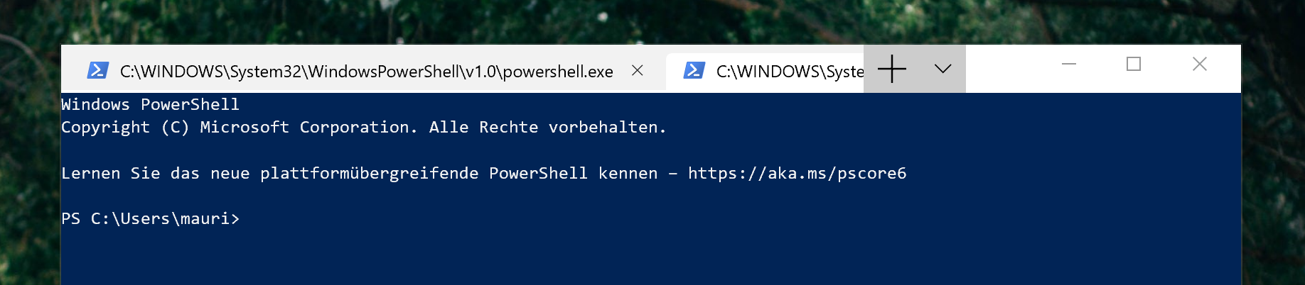
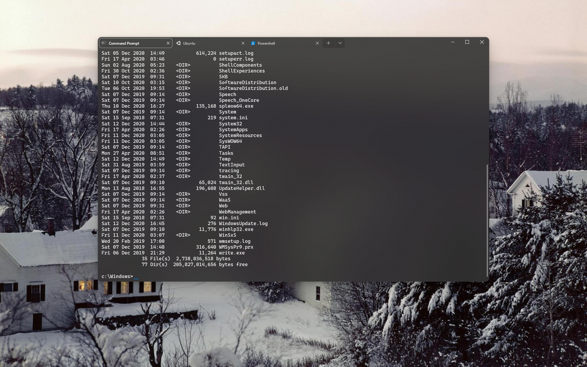
  • The tabs don't look as good as you'd like #702
    grafik
  • #857 When the window is smaller than the sum of the width of the tabs, the tabs are cut off, without indication to scroll

Things fixed in v0.5:

  • #1589 Alt+F4 doesn't close the Window (PR#2526)

Things fixed in v0.3:

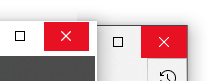
  • The non-client area looks wrong; PR #929, Issue #872
    grafik grafik

  • The plus button is too big, too small, too wide, too narrow (fixed in #1934)
    grafik

  • #564 draggable area in title bar (PR #1948)

  • When maximized on displays with a different DPI, the edges of the window are cut off. (Fixed by #1921)

  • #608 the text of my tabs is too long

  • I'm using the dark theme but am still seeing a white border and header are still white. (Might be fixed by #929)
    image

  • (caused by #929, tracked in #1625 #1963) The titlebar does not have my accent color in it
    image

  • Resizing the window causes the UI to disapper/reappear.
    ezgif-2-9dc95bf607e7

Originally created by @DHowett-MSFT on GitHub (Jun 22, 2019). I am creating this so I can pin it & to help keep track of several related issues/work-items. ## Things we know: * [x] The grab handles are bright white/accent color/dark black * [x] The grab handles are too narrow / the borders are too thick / why can't I use the area outside the window frame to resize? * [x] #994 Split panes need an indicator to show which is focused * [ ] #1000 Literally anything having to do with panes * [x] Click/Right click icon should display Minimize/Maximize/Close menu * [x] When you click `Cascade Windows` , `Show windows stacked` etc is completely ignored by Terminal * [x] #376, #545 Commandline applications can't receive mouse input * [x] #4980 system theme light = light borders, even if terminal theme dark * [x] The title bar isn't acrylic, but now since architectural changes _could_ be! ## Things related to tabs: * [x] #1625 Has another giant bucket of work that's more specific to the non-client area (where the tabs are) * [ ] The area above the tabs isn't draggable * [ ] Can't pop/drag out tabs * [x] Can't reorder tabs * [ ] #597 Without using tabs don't shrink/expand like browser tabs / I want to set a min width for my tabs / I want a fixed width for my tabs / I want tabs to expand to split the available space / any other possible tab sizing] * [x] #3300 Tab bar doesn't grow when you resize the window, it only shrinks (Regressed in v0.6) ## Things that people want, but we _won't_ be able to fix: * [ ] #1753 Can only set "Opacity" of acrylic, not "Blur" / Can't have a non-acrylic transparency ## Things fixed in v0.6: <details> * [x] #2513 Double click to non-client area should maximize the Window. * [x] #771 The default 'active' tab contrast is very low (especially light mode) * [x] The tabs don't look as good as you'd like #702 ![grafik](https://user-images.githubusercontent.com/2971735/59956008-ce108700-948d-11e9-8fbf-93d332ec8d3d.png) * [x] #857 When the window is smaller than the sum of the width of the tabs, the tabs are cut off, without indication to scroll </details> ## Things fixed in v0.5: <details> - [x] #1589 Alt+F4 doesn't close the Window (PR#2526) </details> ## Things fixed in v0.3: <details> * [x] The non-client area looks wrong; PR #929, Issue #872 ![grafik](https://user-images.githubusercontent.com/2971735/59955981-a28d9c80-948d-11e9-8e93-b8727acf4b23.png) ![grafik](https://user-images.githubusercontent.com/2971735/59956367-1d57b700-9490-11e9-820f-9ab49ec4b9f0.png) * [x] The plus button is too big, too small, too wide, too narrow (fixed in #1934) ![grafik](https://user-images.githubusercontent.com/2971735/59956019-e54f7480-948d-11e9-83f3-ffb73146ff91.png) * [x] #564 draggable area in title bar (PR #1948) * [x] When maximized on displays with a different DPI, the edges of the window are cut off. (Fixed by #1921) * [x] #608 *the text of my tabs is too long* * [x] I'm using the dark theme but am still seeing a white border and header are still white. (Might be fixed by #929) ![image](https://user-images.githubusercontent.com/20868530/60559084-43871d80-9d00-11e9-94f1-a4c42a7b4da3.png) * [x] (caused by #929, tracked in ~~#1625~~ #1963) The titlebar does not have my accent color in it ![image](https://user-images.githubusercontent.com/5177512/60739019-87a33980-9f1d-11e9-951a-400f6d3095ec.png) * [x] Resizing the window causes the UI to disapper/reappear. ![ezgif-2-9dc95bf607e7](https://user-images.githubusercontent.com/1243172/59960788-78f06780-94c5-11e9-863d-3adfa6f1c6d2.gif) </details>
claunia added the Issue-QuestionNeeds-Tag-FixProduct-TerminalArea-UserInterface labels 2026-01-30 22:37:37 +00:00
Author
Owner

@mdtauk commented on GitHub (Jun 22, 2019):

The plus glyph will probably shrink, I commented on the TabControl issue, and it seems they will push the change, to match the smaller glyph used by UWP Edge.

image

@mdtauk commented on GitHub (Jun 22, 2019): The plus glyph will probably shrink, I commented on the TabControl issue, and it seems they will push the change, to match the smaller glyph used by UWP Edge. ![image](https://user-images.githubusercontent.com/7389110/59958248-49c50080-949b-11e9-8e57-48607df09e4b.png)
Author
Owner

@Jaykul commented on GitHub (Jun 22, 2019):

Yeah, I think we can all agree "make the tabs like Edge Chrome" is nice, but "make the tabs like the promo video" is even better ... 😣

@Jaykul commented on GitHub (Jun 22, 2019): Yeah, I think we can all agree "make the tabs like Edge Chrome" is nice, but "make the tabs like the promo video" is even better ... 😣
Author
Owner

@mdtauk commented on GitHub (Jun 22, 2019):

I think the UWP Edge had nicer tabs than Edge Chrome. 🤔

@mdtauk commented on GitHub (Jun 22, 2019): I think the UWP Edge had nicer tabs than Edge Chrome. 🤔
Author
Owner

@19lmyers commented on GitHub (Jun 22, 2019):

Personally I wish they'd make Edge Chrome's tabs like UWP Edge, but nobody asked me...

@19lmyers commented on GitHub (Jun 22, 2019): Personally I wish they'd make Edge Chrome's tabs like UWP Edge, but nobody asked me...
Author
Owner

@Jaykul commented on GitHub (Jun 22, 2019):

Yeah, yeah, but ... either of them is waaaay ahead of Terminal 🤡
Edgium has almost 20 pixels above the tabs that are ugly ... but ... draggable!
And with both of them, you can at least tell which tab is active 🙄

@Jaykul commented on GitHub (Jun 22, 2019): Yeah, yeah, but ... either of them is waaaay ahead of Terminal 🤡 Edgium has almost 20 pixels above the tabs that are ugly ... but ... draggable! And with both of them, you can at least tell which tab is active 🙄
Author
Owner

@3dWrecker commented on GitHub (Jun 22, 2019):

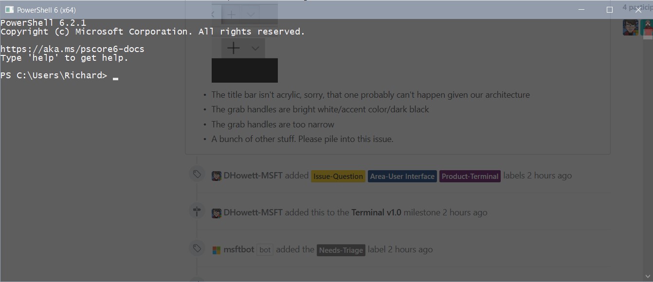
There is no PRACTICAL use for acrylic when coding. However transparency is very useful. It means I can view code beneath the Terminal window like this:
Annotation 2019-06-22 154553
Please add an adjustment for the BLUR factor that acrylic uses. I can't read blurred out text.
Annotation 2019-06-22 154657
Also if the Terminal did not go black when inactive like this:

Annotation 2019-06-22 154746
it would be really useful to be able to have a pin button which pinned the terminal above all other windows. This would enable seamless switching between the terminal and whatever code editor you are using (especially if you can read code beneath the Terminal window.)
I suggest that the acrylic theme should stay active instead of "going black" if an "Always on top" feature is added and enabled.

What it could look like:
dhdghjdy
The pin icon, to pin the Terminal above all windows.
@nacorv,

I would like to know if "Always on top" is a feature that would be considered.

@3dWrecker commented on GitHub (Jun 22, 2019): There is no PRACTICAL use for acrylic when coding. However transparency is very useful. It means I can view code beneath the Terminal window like this: ![Annotation 2019-06-22 154553](https://user-images.githubusercontent.com/34898242/59959153-bd9bf300-9505-11e9-9fb2-8f4c53d3622b.jpg) Please add an adjustment for the BLUR factor that acrylic uses. I can't read blurred out text. ![Annotation 2019-06-22 154657](https://user-images.githubusercontent.com/34898242/59959171-f340dc00-9505-11e9-9973-4fe890fb03f1.jpg) Also if the Terminal did not go black when inactive like this: ![Annotation 2019-06-22 154746](https://user-images.githubusercontent.com/34898242/59959176-179cb880-9506-11e9-9815-cbc1469ad3a6.jpg) it would be really useful to be able to have a pin button which pinned the terminal above all other windows. This would enable seamless switching between the terminal and whatever code editor you are using (especially if you can read code beneath the Terminal window.) I suggest that the acrylic theme should stay active instead of "going black" if an "Always on top" feature is added and enabled. What it could look like: ![dhdghjdy](https://user-images.githubusercontent.com/34898242/59959696-8bdc5980-9510-11e9-86b2-1ebb55ef3937.png) The pin icon, to pin the Terminal above all windows. @nacorv, > I would like to know if "Always on top" is a feature that would be considered.
Author
Owner

@3dWrecker commented on GitHub (Jun 22, 2019):

Selecting and dragging anywhere within the tab area currently does not move the window. This makes it necessary to move the mouse to the right of the tab area, which leaves a very small amount of titlebar which can be used to move the window. Please change this. No rush!

@3dWrecker commented on GitHub (Jun 22, 2019): Selecting and dragging anywhere within the tab area currently does not move the window. This makes it necessary to move the mouse to the right of the tab area, which leaves a very small amount of titlebar which can be used to move the window. Please change this. No rush!
Author
Owner

@Plasma commented on GitHub (Jun 22, 2019):

  1. Turning on acrylic in Powershell makes the purple parameters like -abc appear near invisible.
@Plasma commented on GitHub (Jun 22, 2019): 1. Turning on acrylic in Powershell makes the purple parameters like `-abc` appear near invisible.
Author
Owner

@sachinjoseph commented on GitHub (Jun 22, 2019):

Resolution: 4K
Display Scaling: 100%

Light theme:

image

Dark theme:
image

@sachinjoseph commented on GitHub (Jun 22, 2019): Resolution: 4K Display Scaling: 100% Light theme: ![image](https://user-images.githubusercontent.com/6994498/59960368-6998fc00-947c-11e9-89ed-70c1227cb8f1.png) Dark theme: ![image](https://user-images.githubusercontent.com/6994498/59960360-5423d200-947c-11e9-8565-3f516fb5b2d2.png)
Author
Owner

@liamfoneill commented on GitHub (Jun 22, 2019):

ezgif-2-9dc95bf607e7

Resizing the window causes the UI to disapper/reappear. I am using the Windows Store Preview Version 0.2.1715.0

@liamfoneill commented on GitHub (Jun 22, 2019): ![ezgif-2-9dc95bf607e7](https://user-images.githubusercontent.com/1243172/59960788-78f06780-94c5-11e9-863d-3adfa6f1c6d2.gif) Resizing the window causes the UI to disapper/reappear. I am using the Windows Store Preview Version 0.2.1715.0
Author
Owner

@mauricego commented on GitHub (Jun 22, 2019):

Fullscreen:
image

Resized:
image

If the window is not big enough, all the other tabs are hidden.

@mauricego commented on GitHub (Jun 22, 2019): Fullscreen: ![image](https://user-images.githubusercontent.com/30271265/59961434-148ad380-94d8-11e9-8c27-dede20f600a1.png) Resized: ![image](https://user-images.githubusercontent.com/30271265/59961415-d1c8fb80-94d7-11e9-8bb4-e7394001bb9a.png) If the window is not big enough, all the other tabs are hidden.
Author
Owner

@benc-uk commented on GitHub (Jun 22, 2019):

If the tab bar can't be acrylic, that's a major shame.
Anything that can be done to make them integrate better would be most welcome

The non drag-able tab/title bar is the #1 complaint I've heard from everyone that has tried the early builds

Split panes need some visual polish, make it clear which is in focus, some animation even as it opens

@benc-uk commented on GitHub (Jun 22, 2019): If the tab bar can't be acrylic, that's a major shame. Anything that can be done to make them integrate better would be most welcome The non drag-able tab/title bar is the #1 complaint I've heard from everyone that has tried the early builds Split panes need some visual polish, make it clear which is in focus, some animation even as it opens
Author
Owner

@thejsa commented on GitHub (Jun 22, 2019):

When maximised on my 2nd monitor (1366x768 laptop built-in display, not set as main), the edges of the app are cut off:
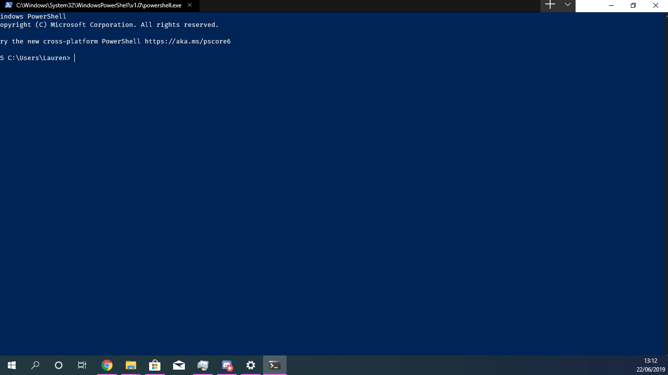
image

@thejsa commented on GitHub (Jun 22, 2019): When maximised on my 2nd monitor (1366x768 laptop built-in display, not set as main), the edges of the app are cut off: ![image](https://user-images.githubusercontent.com/10799473/59963755-77d43000-94ef-11e9-8dbb-0dce38d9e806.png)
Author
Owner

@robster2001 commented on GitHub (Jun 22, 2019):

Tabs show the path to the executable instead of the name of the app; if the path is too long, the "x" to close the tab is pushed off the right side of the tab and is invisible.

Clicking "Settings" attempts to open a JSON file. I'm guessing that the UI for that hasn't been built yet. :)

@robster2001 commented on GitHub (Jun 22, 2019): Tabs show the path to the executable instead of the name of the app; if the path is too long, the "x" to close the tab is pushed off the right side of the tab and is invisible. Clicking "Settings" attempts to open a JSON file. I'm guessing that the UI for that hasn't been built yet. :)
Author
Owner

@allen-chin commented on GitHub (Jun 22, 2019):

As an addition to @robster2001's comments, it'd be nice if each tab showed the actual path like Ubuntu and if it was in administrator mode (e.g. Command Prompt (Admin) - C:\current\path\that\you\are\in).

When you don't have terminal maximized, as I usually don't, the issue #857 combined with the long titles allows for much less tabs than what it could be.

@allen-chin commented on GitHub (Jun 22, 2019): As an addition to @robster2001's comments, it'd be nice if each tab showed the actual path like Ubuntu and if it was in administrator mode (e.g. Command Prompt (Admin) - C:\current\path\that\you\are\in). When you don't have terminal maximized, as I usually don't, the issue #857 combined with the long titles allows for much less tabs than what it could be.
Author
Owner

@GenesisCraig commented on GitHub (Jun 22, 2019):

The tabs are just too wide to be useful. Perhaps just show the executable and give the path/etc information when you hover over the tab in a tooltip or something.

@GenesisCraig commented on GitHub (Jun 22, 2019): The tabs are just too wide to be useful. Perhaps just show the executable and give the path/etc information when you hover over the tab in a tooltip or something.
Author
Owner

@DHowett-MSFT commented on GitHub (Jun 22, 2019):

Two things:
Panes are not bound by default because they are incomplete. If you enable them yourself, YMMV.

If you want a custom tab title, you should look at how to set that up for your shell. It’ll benefit you everywhere you use your shell. By making powershell set the title, you change the title for Windows Terminal, legacy console, VSCode, ConEmu and a bunch of other things. It can even change in the middle of a session!

@DHowett-MSFT commented on GitHub (Jun 22, 2019): Two things: Panes are not bound by default _because_ they are incomplete. If you enable them yourself, YMMV. If you want a custom tab title, you should look at how to set that up for your shell. It’ll benefit you everywhere you use your shell. By making powershell set the title, you change the title for Windows Terminal, legacy console, VSCode, ConEmu and a bunch of other things. It can even change in the middle of a session!
Author
Owner

@DHowett-MSFT commented on GitHub (Jun 22, 2019):

Panes epic: #1000

@DHowett-MSFT commented on GitHub (Jun 22, 2019): Panes epic: #1000
Author
Owner

@csells commented on GitHub (Jun 22, 2019):

I couldn't find anywhere along the caption at the top of the window that allowed me to drag and move the window. I had to resort to keyboard shortcuts.

@csells commented on GitHub (Jun 22, 2019): I couldn't find anywhere along the caption at the top of the window that allowed me to drag and move the window. I had to resort to keyboard shortcuts.
Author
Owner

@csells commented on GitHub (Jun 22, 2019):

two-finger scrolling doesn't work, although it works great on cmd.com and PowerShell.

@csells commented on GitHub (Jun 22, 2019): two-finger scrolling doesn't work, although it works great on cmd.com and PowerShell.
Author
Owner

@thomthom commented on GitHub (Jun 22, 2019):

Tabs cannot be moved/rearranged.

@thomthom commented on GitHub (Jun 22, 2019): Tabs cannot be moved/rearranged.
Author
Owner

@guibirow commented on GitHub (Jun 22, 2019):

Default bar does not respect the Win10 Dark Theme:

image

I tried to find settings, but didn't find it!
Some other apps does not respect either, so I think is not considered on this version

@guibirow commented on GitHub (Jun 22, 2019): Default bar does not respect the Win10 Dark Theme: ![image](https://user-images.githubusercontent.com/943026/59967257-7fabc880-951f-11e9-9d05-b717882bf7e1.png) I tried to find settings, but didn't find it! Some other apps does not respect either, so I think is not considered on this version
Author
Owner

@alejandro5042 commented on GitHub (Jun 22, 2019):

My first impression of Terminal, installed today via the Store preview was:

  • What's wrong with the colors? Why is it part black, part white?
    image
  • Wow, can't wait to try the tabs
  • Oh wow, that's a big plus sign

Is there anything we can do about the color of the titlebar? It should be all black, right?

+1 @guibirow

@alejandro5042 commented on GitHub (Jun 22, 2019): My first impression of Terminal, installed today via the Store preview was: - What's wrong with the colors? Why is it part black, part white? ![image](https://user-images.githubusercontent.com/3143819/59967625-5f194980-94f2-11e9-957e-8159940688ed.png) - Wow, can't wait to try the tabs - Oh wow, that's a big plus sign Is there anything we can do about the color of the titlebar? It should be all black, right? +1 @guibirow
Author
Owner

@guibirow commented on GitHub (Jun 22, 2019):

Messing around with my windows settings I could fix it:

Active (Firefox in the back, Terminal in front)
image

Inactive (Firefox in the back, Terminal in front)
image

Looks like some applications continue to load the settings from windows, maybe windows dark theme does not set all collors correctly, I had to enable the option to apply the accent to title bar and window borders.

image

And set the AccentColorInactive in the registry [Computer\HKEY_CURRENT_USER\Software\Microsoft\Windows\DWM]

The design would be much better if the "+ /" moved to the left (like below) and the rest become just the title bar like all other applicaitons, I think they tried to copy firefox and didn't work very well!

image

@guibirow commented on GitHub (Jun 22, 2019): Messing around with my windows settings I could fix it: Active (Firefox in the back, Terminal in front) ![image](https://user-images.githubusercontent.com/943026/59968004-d1a61b80-952a-11e9-9572-7d4ed5f1e497.png) Inactive (Firefox in the back, Terminal in front) ![image](https://user-images.githubusercontent.com/943026/59968019-ebdff980-952a-11e9-9144-115e0c30f5c7.png) Looks like some applications continue to load the settings from windows, maybe windows dark theme does not set all collors correctly, I had to enable the option to apply the accent to title bar and window borders. ![image](https://user-images.githubusercontent.com/943026/59968034-2ea1d180-952b-11e9-9f21-2cd43738edb7.png) And set the **_AccentColorInactive_** in the registry [_Computer\HKEY_CURRENT_USER\Software\Microsoft\Windows\DWM_] The design would be much better if the "+ \/" moved to the left (like below) and the rest become just the title bar like all other applicaitons, I think they tried to copy firefox and didn't work very well! ![image](https://user-images.githubusercontent.com/943026/59968136-9d335f00-952c-11e9-90ed-68299d0200ec.png)
Author
Owner

@csm10495 commented on GitHub (Jun 22, 2019):

I can't 'pop a tab out' or drag it to another window. I'd like that feature.

@csm10495 commented on GitHub (Jun 22, 2019): I can't 'pop a tab out' or drag it to another window. I'd like that feature.
Author
Owner

@livevasiliy commented on GitHub (Jun 22, 2019):

Where Emoji font when used for example yarn, npm ?

@livevasiliy commented on GitHub (Jun 22, 2019): Where Emoji font when used for example yarn, npm ?
Author
Owner

@dphfox commented on GitHub (Jun 22, 2019):

Tab titlebar definitely needs cleaning up. Based on the official video made to promote the Terminal, and Edgemium, I came up with these changes (mock ups):

Before:
image
After:
image

Full list of changes in mock up:

  • Reduced window border size to 1px to be consistent with the rest of Windows
  • Aligned window controls (close, max, min) properly in the titlebar
  • Made tabs a bit taller to be consistent with new Edge tabs
  • Reduced corner radius to be consistent with new Edge tabs
  • Added inner rounded corners to the base of tabs to be consistent with new Edge and official video
  • Added drop shadow to make tabs more visible against the background, and to be consistent with new Edge
  • Made the plus icon properly sized
  • Moved the tab management buttons next to the tabs
  • Made the background spread across the entire titlebar
@dphfox commented on GitHub (Jun 22, 2019): Tab titlebar definitely needs cleaning up. Based on the official video made to promote the Terminal, and Edgemium, I came up with these changes (mock ups): Before: ![image](https://user-images.githubusercontent.com/11815374/59968443-fd78cf80-9531-11e9-8d30-07333d5b1d95.png) After: ![image](https://user-images.githubusercontent.com/11815374/59968440-efc34a00-9531-11e9-8671-c631cb0ea2ae.png) Full list of changes in mock up: - Reduced window border size to 1px to be consistent with the rest of Windows - Aligned window controls (close, max, min) properly in the titlebar - Made tabs a bit taller to be consistent with new Edge tabs - Reduced corner radius to be consistent with new Edge tabs - Added inner rounded corners to the base of tabs to be consistent with new Edge and official video - Added drop shadow to make tabs more visible against the background, and to be consistent with new Edge - Made the plus icon properly sized - Moved the tab management buttons next to the tabs - Made the background spread across the entire titlebar
Author
Owner

@mikelui commented on GitHub (Jun 23, 2019):

EDIT: This was just an issue with the bottom line not being large enough to fit a whole character, as pointed out by @DHowett-MSFT below


Padding (bottom) is not 0 when maximized. Not sure if this is a known issue or intended, so putting it in this thread.

@mikelui commented on GitHub (Jun 23, 2019): EDIT: This was just an issue with the bottom line not being large enough to fit a whole character, as pointed out by @DHowett-MSFT below ---- Padding (bottom) is not 0 when maximized. Not sure if this is a known issue or intended, so putting it in this thread.
Author
Owner

@DHowett-MSFT commented on GitHub (Jun 23, 2019):

@mikelui huh, that's probably because there aren't enough pixels to fit another whole character cell on screen. the Terminal much prefers to display full rows, as that's how it models the terminal world.

@DHowett-MSFT commented on GitHub (Jun 23, 2019): @mikelui huh, that's probably because there aren't enough pixels to fit another whole character cell on screen. the Terminal much prefers to display full rows, as that's how it models the terminal world.
Author
Owner

@SypeR54 commented on GitHub (Jun 23, 2019):

Fullscreen:
image

Resized:
image

If the window is not big enough, all the other tabs are hidden.

If you rotate the mouse wheel, you will see the tabs slide. It works for atleast for Store Terminal Preview v0.2.1715.0 . But narrowing of icons, such as Chromium-based browsers, would be more nice.

@DHowett-MSFT Also i found out another gui bug, if window too small for showing new tab and we create a new tab, new tab created but not show until we re-size the Terminal window.

Microsoft Windows 10 Pro Insider Preview [Version 10.0.18875.1000]
Microsoft Terminal (Store Preview) [Version 0.2.1715.0]

ezgif com-optimize

@SypeR54 commented on GitHub (Jun 23, 2019): > Fullscreen: > ![image](https://user-images.githubusercontent.com/30271265/59961434-148ad380-94d8-11e9-8c27-dede20f600a1.png) > > Resized: > ![image](https://user-images.githubusercontent.com/30271265/59961415-d1c8fb80-94d7-11e9-8bb4-e7394001bb9a.png) > > If the window is not big enough, all the other tabs are hidden. If you rotate the mouse wheel, you will see the tabs slide. It works for atleast for Store Terminal Preview v0.2.1715.0 . But narrowing of icons, such as Chromium-based browsers, would be more nice. @DHowett-MSFT Also i found out another gui bug, if window too small for showing new tab and we create a new tab, new tab created but not show until we re-size the Terminal window. Microsoft Windows 10 Pro Insider Preview [Version 10.0.18875.1000] Microsoft Terminal (Store Preview) [Version 0.2.1715.0] ![ezgif com-optimize](https://user-images.githubusercontent.com/12627005/59970407-4e0e1e00-956e-11e9-936d-f5af45dc2801.gif)
Author
Owner

@mikelui commented on GitHub (Jun 23, 2019):

@DHowett-MSFT Yes! I see that now while playing around with sizing. I'm used to using fullscreen (vs maximized), where the lack of a title bar makes the spacing better.

@mikelui commented on GitHub (Jun 23, 2019): @DHowett-MSFT Yes! I see that now while playing around with sizing. I'm used to using fullscreen (vs maximized), where the lack of a title bar makes the spacing better.
Author
Owner

@AnikHasibul commented on GitHub (Jun 23, 2019):

Make the initial window size as I left on previous time when closing.

@AnikHasibul commented on GitHub (Jun 23, 2019): Make the initial window size as I left on previous time when closing.
Author
Owner

@Shorotshishir commented on GitHub (Jun 23, 2019):

grabbing and moving the application is not easy, need a larger area to grab the window. The whole path of the exe is overkill, it takes too much space. just Powershell or Cmd would be nice. while running node or python in cmd , tab can show "cmd : node" or "cmd : python"
Tabs can have the color theme of the scheme used in that specific terminal instead of just darker black or fade black, similar color to the terminal scheme may make finding a terminal easy.
edit
few more issues found

@Shorotshishir commented on GitHub (Jun 23, 2019): grabbing and moving the application is not easy, need a larger area to grab the window. The whole path of the exe is overkill, it takes too much space. just Powershell <version> or Cmd would be nice. while running `node` or `python` in cmd , tab can show "cmd : node" or "cmd : python" Tabs can have the color theme of the scheme used in that specific terminal instead of just darker black or fade black, similar color to the terminal scheme may make finding a terminal easy. **edit** [few more issues found](https://imgur.com/gallery/bgES5SD)
Author
Owner

@warpdesign commented on GitHub (Jun 23, 2019):

Also, not that important compared to other missing/broken UI things but still: the mouse pointer should be the text one (Ꮖ) when moving over some text in the terminal and not the pointer (↖) one since text is selectable.

@warpdesign commented on GitHub (Jun 23, 2019): Also, not that important compared to other missing/broken UI things but still: the mouse pointer should be the text one (Ꮖ) when moving over some text in the terminal and not the pointer (↖) one since text is selectable.
Author
Owner

@thelazyanalyst commented on GitHub (Jun 23, 2019):

Any chance Alt+F4 behaviour can mimic other Windows 10 functionality (close everything now) please? Ctrl+w * how ever many tabs are open is quite laborious. As is finding the top right X when I am in keyboard warrior mode :D.

I've tried setting closeWindow in settings.json but alt+F4 does not register as a valid command (console prints "S").

@thelazyanalyst commented on GitHub (Jun 23, 2019): Any chance Alt+F4 behaviour can mimic other Windows 10 functionality (close everything now) please? Ctrl+w * how ever many tabs are open is quite laborious. As is finding the top right X when I am in keyboard warrior mode :D. I've tried setting closeWindow in settings.json but alt+F4 does not register as a valid command (console prints "S").
Author
Owner

@WamWooWam commented on GitHub (Jun 23, 2019):

Out of curiosity, would it not be possible to use the underlying APIs that support WPF’s WindowChrome, cut out the native title bar and window borders entirely and build it all using XAML? I feel there’d be more control available this way and the end result would be cleaner and less dependent on the OS

@WamWooWam commented on GitHub (Jun 23, 2019): Out of curiosity, would it not be possible to use the underlying APIs that support WPF’s WindowChrome, cut out the native title bar and window borders entirely and build it all using XAML? I feel there’d be more control available this way and the end result would be cleaner and less dependent on the OS
Author
Owner

@grigala commented on GitHub (Jun 23, 2019):

I was initially expecting that split screen feature would have been already there, but it's not...
It would be much more convenient than navigating between tabs.

Terminator on Linux and iTerm on macOS has it neatly implemented.

Any plans?

@grigala commented on GitHub (Jun 23, 2019): I was initially expecting that split screen feature would have been already there, but it's not... It would be much more convenient than navigating between tabs. Terminator on Linux and iTerm on macOS has it neatly implemented. Any plans?
Author
Owner

@Karl-WE commented on GitHub (Jun 24, 2019):

Selecting and dragging anywhere within the tab area currently does not move the window. This makes it necessary to move the mouse to the right of the tab area, which leaves a very small amount of titlebar which can be used to move the window. Please change this. No rush!

see #1500

@Karl-WE commented on GitHub (Jun 24, 2019): > Selecting and dragging anywhere within the tab area currently does not move the window. This makes it necessary to move the mouse to the right of the tab area, which leaves a very small amount of titlebar which can be used to move the window. Please change this. No rush! see #1500
Author
Owner

@DHowett-MSFT commented on GitHub (Jun 24, 2019):

@LeeChang-GitHub #608, also, you know powershell and CMD have a way to set the title themselves, right? You don’t need to rename the tab when you can make the shell do it.

@DHowett-MSFT commented on GitHub (Jun 24, 2019): @LeeChang-GitHub #608, also, you know powershell and CMD have a way to set the title themselves, right? You don’t need to rename the tab when you can make the shell do it.
Author
Owner

@unlock-lee commented on GitHub (Jun 24, 2019):

image

I need the name of the terminal to be editable.
I searched for this question but couldn't find it. Is this a reasonable requirement?

@unlock-lee commented on GitHub (Jun 24, 2019): ![image](https://user-images.githubusercontent.com/14037032/59995571-2613dd00-968a-11e9-940c-3e57b58ae44a.png) I need the name of the terminal to be editable. I searched for this question but couldn't find it. Is this a reasonable requirement?
Author
Owner

@DHowett-MSFT commented on GitHub (Jun 24, 2019):

Dude, why did you delete your comment and move it after my response?

@DHowett-MSFT commented on GitHub (Jun 24, 2019): Dude, why did you delete your comment and move it after my response?
Author
Owner

@unlock-lee commented on GitHub (Jun 24, 2019):

Dude, why did you delete your comment and move it after my response?

Sorry, that question was too bad. I edited it again, and I didn't receive your reply at that time.
so sorry

@unlock-lee commented on GitHub (Jun 24, 2019): > Dude, why did you delete your comment and move it after my response? Sorry, that question was too bad. I edited it again, and I didn't receive your reply at that time. so sorry
Author
Owner

@DHowett-MSFT commented on GitHub (Jun 24, 2019):

@LeeChang-GitHub it’s okay! 😄

@DHowett-MSFT commented on GitHub (Jun 24, 2019): @LeeChang-GitHub it’s okay! 😄
Author
Owner

@ncorv commented on GitHub (Jun 24, 2019):

I would like to know if "Always on top" is a feature that would be considered.

@ncorv commented on GitHub (Jun 24, 2019): I would like to know if "Always on top" is a feature that would be considered.
Author
Owner

@beforan commented on GitHub (Jun 24, 2019):

@grigala

I was initially expecting that split screen feature would have been already there, but it's not...
It would be much more convenient than navigating between tabs.

Terminator on Linux and iTerm on macOS has it neatly implemented.

Any plans?

#1000 shows the plans and how far along they are 👍

@beforan commented on GitHub (Jun 24, 2019): @grigala > I was initially expecting that split screen feature would have been already there, but it's not... > It would be much more convenient than navigating between tabs. > > Terminator on Linux and iTerm on macOS has it neatly implemented. > > Any plans? #1000 shows the plans and how far along they are 👍
Author
Owner

@JakubBlaha commented on GitHub (Jun 24, 2019):

Scrollbar should ignore the right padding or expand to the right when hovered. It is fine if it takes in count the top and the bottom.

Scrollbar in its small form

Scrollbar in its collapsed form

Scrollbar in its wide form

Scrollbar in its wide form

The scrollbar in its collapsed form looks alright. The space between the text and the line is ok, but should follow the padding preferences. Right now it doesn't.

The scrollbar in its wide form follows the padding only on the right side and has some, but not the preferred, padding on the left side. The left padding should follow the preferences and the right padding should completely disappear. This would allow users to quickly throw their mouse cursor to the right when they wanna quickly scroll up a long distance and the window is maximized.

Additionally the scrollbar should have no delay of expanding when hovered and the scrollbar background should be transparent, so the blur (if toggled on) can be visible.

Edit:
This has been resolved in #1778. Thanks!!

@JakubBlaha commented on GitHub (Jun 24, 2019): Scrollbar should ignore the *right* padding or expand to the right when hovered. It is fine if it takes in count the *top* and the *bottom*. ![Scrollbar in its small form](https://user-images.githubusercontent.com/28687156/60006334-7aaa5e80-9670-11e9-81f9-98c4c065bc1c.png) > Scrollbar in its collapsed form ![Scrollbar in its wide form](https://user-images.githubusercontent.com/28687156/60006526-e5f43080-9670-11e9-9b30-e5e5d1a2a963.png) > Scrollbar in its wide form The scrollbar in its collapsed form looks alright. The space between the text and the line is ok, but should follow the padding preferences. Right now it doesn't. The scrollbar in its wide form follows the padding only on the right side and has some, but not the preferred, padding on the left side. The left padding should follow the preferences and the right padding should completely disappear. This would allow users to quickly throw their mouse cursor to the right when they wanna quickly scroll up a long distance and the window is maximized. Additionally the scrollbar should have *no* delay of expanding when hovered and the scrollbar background should be transparent, so the blur (if toggled on) can be visible. **Edit:** This has been resolved in #1778. Thanks!!
Author
Owner

@kernelbin commented on GitHub (Jun 24, 2019):

Most Apps (like Chrome, or explorer.exe etc) allow user to resize the window by grab on the Window's shadow. But It seems that terminal only allow user to grab on a narrow NotClient Area(about 2 pixels).
Seem's the system default shadow doesn't work?

I have a possible solution.

  1. Remove the system shadow (By changing Window style to WS_MINIMIZEBOX | WS_MAXIMIZEBOX | WS_POPUP | WS_THICKFRAME and handle WM_NCCALCSIZE message, you can use AdjustWindowRect to calculate the size.)
  2. Add four small shadow window (WS_EX_OVERLAPPED | WS_EX_TOOLWINDOW) around the window, and render shadow manually (by handling main windows's WM_WINDOWPOSCHANGED to move the shadow window, handlling WM_SIZE to render the shadow window, maybe Gaussina Blur ?)
    3 handle the shadow window's WM_SETCURSOR message, and WM_LBUTTONDOWN (Send WM_SYSCOMMAND to the main window to simulate grabbing)

Besides, Use Window Subclassing technology to capture message and send WM_SYSCOMMAND when handling WM_LBUTTONDOWN may fix the proble that title bar can't be grabbed.

@kernelbin commented on GitHub (Jun 24, 2019): Most Apps (like Chrome, or explorer.exe etc) allow user to resize the window by grab on the Window's shadow. But It seems that terminal only allow user to grab on a narrow NotClient Area(about 2 pixels). Seem's the system default shadow doesn't work? I have a possible solution. 1. Remove the system shadow (By changing Window style to WS_MINIMIZEBOX | WS_MAXIMIZEBOX | WS_POPUP | WS_THICKFRAME and handle WM_NCCALCSIZE message, you can use AdjustWindowRect to calculate the size.) 2. Add four small shadow window (WS_EX_OVERLAPPED | WS_EX_TOOLWINDOW) around the window, and render shadow manually (by handling main windows's WM_WINDOWPOSCHANGED to move the shadow window, handlling WM_SIZE to render the shadow window, maybe Gaussina Blur ?) 3 handle the shadow window's WM_SETCURSOR message, and WM_LBUTTONDOWN (Send WM_SYSCOMMAND to the main window to simulate grabbing) Besides, Use Window Subclassing technology to capture message and send WM_SYSCOMMAND when handling WM_LBUTTONDOWN may fix the proble that title bar can't be grabbed.
Author
Owner

@madig commented on GitHub (Jun 24, 2019):

To expand on https://github.com/microsoft/terminal/issues/1375#issuecomment-504686188, Terminal should maybe organize themes into theme family names and light/dark subcategories, sort of like VSCode. I.e. if I set the theme to e.g. "Campbell" and switch Windows app colors from light to dark, I'd expect Termianl to switch from Campbell Light to Campbell Dark. This would save manual fiddling. Specifying "Campbell Dark" as the theme would pin appearance to the dark theme, if you always want it to be dark. Or something.

@madig commented on GitHub (Jun 24, 2019): To expand on https://github.com/microsoft/terminal/issues/1375#issuecomment-504686188, Terminal should maybe organize themes into theme family names and light/dark subcategories, sort of like VSCode. I.e. if I set the theme to e.g. "Campbell" and switch Windows app colors from light to dark, I'd expect Termianl to switch from Campbell Light to Campbell Dark. This would save manual fiddling. Specifying "Campbell Dark" as the theme would pin appearance to the dark theme, if you always want it to be dark. Or something.
Author
Owner

@LoZeno commented on GitHub (Jun 24, 2019):

The tabs space doesn't resize correctly when moving the window between monitors with different scalings, in some cases covering even the minimize button:

Monitor 1, 1920x1080 resolution, 100% scaling:
image

Monitor 2, 4k resolution (3840x2160), 200% scaling:
image

@LoZeno commented on GitHub (Jun 24, 2019): The tabs space doesn't resize correctly when moving the window between monitors with different scalings, in some cases covering even the minimize button: Monitor 1, 1920x1080 resolution, 100% scaling: ![image](https://user-images.githubusercontent.com/3267561/60012681-7e3fe480-9674-11e9-8cf2-ab6d50b5240b.png) Monitor 2, 4k resolution (3840x2160), 200% scaling: ![image](https://user-images.githubusercontent.com/3267561/60012748-ac252900-9674-11e9-9dee-9739eb6a3a37.png)
Author
Owner

@madig commented on GitHub (Jun 24, 2019):

Cursor color should be defined by the theme. The default cursor color set in the profile is white, which is useless on a light theme.

@madig commented on GitHub (Jun 24, 2019): Cursor color should be defined by the theme. The default cursor color set in the profile is white, which is useless on a light theme.
Author
Owner

@benc-uk commented on GitHub (Jun 24, 2019):

@madig - You can change the cursor colour by setting cursorColor in profiles.json

@benc-uk commented on GitHub (Jun 24, 2019): @madig - You can change the cursor colour by setting `cursorColor` in profiles.json
Author
Owner

@madig commented on GitHub (Jun 24, 2019):

@madig - You can change the cursor colour by setting cursorColor in profiles.json

Yes, but the theme should define it so you don't have to edit theme name and cursor color when you want to switch around.

@madig commented on GitHub (Jun 24, 2019): > @madig - You can change the cursor colour by setting `cursorColor` in profiles.json Yes, but the theme should define it so you don't have to edit theme name _and_ cursor color when you want to switch around.
Author
Owner

@HBelusca commented on GitHub (Jun 24, 2019):

I also noted that it's much harder than usual to get the mouse cursor to be in the window-resize configuration when positioning it on the bottom-right corner of the terminal window.

@HBelusca commented on GitHub (Jun 24, 2019): I also noted that it's much harder than usual to get the mouse cursor to be in the window-resize configuration when positioning it on the bottom-right corner of the terminal window.
Author
Owner

@Kryptryx commented on GitHub (Jun 24, 2019):

Maybe #1517.

A context/system menu for the App. Win32 apps have this in the upper-left corner. Some, like Edge, use the ellipsis in the upper-right. Is the current drop-down an intended replacement?

The upper-left style is useful when moving / resizing etc by keyboard.

@Kryptryx commented on GitHub (Jun 24, 2019): Maybe #1517. A context/system menu for the App. Win32 apps have this in the upper-left corner. Some, like Edge, use the ellipsis in the upper-right. Is the current drop-down an intended replacement? The upper-left style is useful when moving / resizing etc by keyboard.
Author
Owner

@jwhipp commented on GitHub (Jun 24, 2019):

I got the impression from the Build presentation we'd have split pane like functionality, is this planned?

@jwhipp commented on GitHub (Jun 24, 2019): I got the impression from the Build presentation we'd have split pane like functionality, is this planned?
Author
Owner

@DHowett-MSFT commented on GitHub (Jun 24, 2019):

@jwhipp #1000

@DHowett-MSFT commented on GitHub (Jun 24, 2019): @jwhipp #1000
Author
Owner

@Gimzie commented on GitHub (Jun 24, 2019):

Icons seem to be missing?

image

@Gimzie commented on GitHub (Jun 24, 2019): Icons seem to be missing? ![image](https://user-images.githubusercontent.com/17916945/60044014-4fc30900-9676-11e9-935a-daebcdbc1b49.png)
Author
Owner

@DHowett-MSFT commented on GitHub (Jun 24, 2019):

Looks like you’ve got an outdated profile from the first open source release. Probably delete it.

@DHowett-MSFT commented on GitHub (Jun 24, 2019): Looks like you’ve got an outdated profile from the first open source release. Probably delete it.
Author
Owner

@Gimzie commented on GitHub (Jun 24, 2019):

Thanks, that worked!

However, I found another bug:

f540557f2b5f4b8d6046294e952bf727

@Gimzie commented on GitHub (Jun 24, 2019): Thanks, that worked! However, I found another bug: ![f540557f2b5f4b8d6046294e952bf727](https://user-images.githubusercontent.com/17916945/60045838-af231800-967a-11e9-9d83-fce59c14ea33.gif)
Author
Owner

@brianly commented on GitHub (Jun 24, 2019):

I frequently double-click on title bars to maximise or restore a window. The clickable area of the window (green) was all the way over the right when I only had one tab open. It looked like I could click to the left of the plus (new tab) menu.

image

ConEmu doesn't have this issue since the title bar is above the tabs. Double-clicks in the tab area result in a new tab which what I'd like to see with the new Windows Terminal, but I'm sure I'll adjust to whatever we eventually land on.

@brianly commented on GitHub (Jun 24, 2019): I frequently double-click on title bars to maximise or restore a window. The clickable area of the window (green) was all the way over the right when I only had one tab open. It looked like I could click to the left of the plus (new tab) menu. ![image](https://user-images.githubusercontent.com/86533/60048056-3f705580-9699-11e9-92de-3027f3dad692.png) ConEmu doesn't have this issue since the title bar is above the tabs. Double-clicks in the tab area result in a new tab which what I'd like to see with the new Windows Terminal, but I'm sure I'll adjust to whatever we eventually land on.
Author
Owner

@HBelusca commented on GitHub (Jun 24, 2019):

Regarding the tabs etc. it would be great if they could visually behave similar as those in e.g. Edge: the "+ v" button always being next to the latest tab; making the area (if any) between the last tab and the "+ v" button receiving mouse events (by passing them to the parent window); having "<" and ">" scrolling buttons appearing (similarly to e.g. in Firefox) when there are too many tabs.

@HBelusca commented on GitHub (Jun 24, 2019): Regarding the tabs etc. it would be great if they could visually behave similar as those in e.g. Edge: the "+ v" button always being next to the latest tab; making the area (if any) between the last tab and the "+ v" button receiving mouse events (by passing them to the parent window); having "<" and ">" scrolling buttons appearing (similarly to e.g. in Firefox) when there are too many tabs.
Author
Owner

@runxel commented on GitHub (Jun 24, 2019):

I frequently double-click on title bars to maximise or restore a window. The clickable area of the window (green) was all the way over the right when I only had one tab open.

Which also means, that we can't drag the terminal window (I mean you can, but then you really need to be sure you just get that tiny sweet spot...)

@runxel commented on GitHub (Jun 24, 2019): > I frequently double-click on title bars to maximise or restore a window. The clickable area of the window (green) was all the way over the right when I only had one tab open. Which also means, that we can't drag the terminal window (I mean you _can_, but then you really need to be sure you just get that tiny sweet spot...)
Author
Owner

@ericblade commented on GitHub (Jun 25, 2019):

Tabs in title bar is bad. Don't do it. PLEASE. don't do it. You're using too much area for multiple tasks.

Having tab titles the entire path to the command interpreter is also bad. That the tab names can get longer than maybe 20 characters, is bad. Much shorter maximum tab size. Tabs below the title bar. Much smaller tabs.

@ericblade commented on GitHub (Jun 25, 2019): Tabs in title bar is *bad*. Don't do it. PLEASE. don't do it. You're using too much area for multiple tasks. Having tab titles the entire path to the command interpreter is also bad. That the tab names can get longer than maybe 20 characters, is bad. Much shorter maximum tab size. Tabs below the title bar. Much smaller tabs.
Author
Owner

@DHowett-MSFT commented on GitHub (Jun 25, 2019):

It’s an option. Options. Configuration. Lists of short sentences. Turn them off. 😄

@DHowett-MSFT commented on GitHub (Jun 25, 2019): It’s an option. Options. Configuration. Lists of short sentences. Turn them off. :smile:
Author
Owner

@NN--- commented on GitHub (Jun 25, 2019):

@brianly Set "showTabsInTitlebar" : false in the settings.

@NN--- commented on GitHub (Jun 25, 2019): @brianly Set "showTabsInTitlebar" : false in the settings.
Author
Owner

@mikemaccana commented on GitHub (Jun 25, 2019):

Thanks @zadjii-msft! Also worth linking: https://github.com/microsoft/terminal/issues/771

@mikemaccana commented on GitHub (Jun 25, 2019): Thanks @zadjii-msft! Also worth linking: https://github.com/microsoft/terminal/issues/771
Author
Owner

@CursedbyFlame commented on GitHub (Jun 25, 2019):

When adding a new tab with few already opened to fill the space on tab space like this
image
new tab is created, but icon is folded.
image
any new created tab after that is invisible.
Resizing window fixes issue.

@CursedbyFlame commented on GitHub (Jun 25, 2019): When adding a new tab with few already opened to fill the space on tab space like this ![image](https://user-images.githubusercontent.com/16415318/60095720-de5b8700-9757-11e9-9103-1786cdda5fc4.png) new tab is created, but icon is folded. ![image](https://user-images.githubusercontent.com/16415318/60095682-cdab1100-9757-11e9-8d9a-11c9d133e60e.png) any new created tab after that is invisible. Resizing window fixes issue.
Author
Owner

@olokos commented on GitHub (Jun 25, 2019):

It's not possible to rearrange tabs.
Additionally when closing the only tab with middle mouse button this happens:
Close last tab bug

@olokos commented on GitHub (Jun 25, 2019): It's not possible to rearrange tabs. Additionally when closing the only tab with middle mouse button this happens: ![Close last tab bug](https://image.prntscr.com/image/_vlrcZNSTpmVZpo75G66mA.png)
Author
Owner

@napei commented on GitHub (Jun 26, 2019):

Something visible on screen or in a menu for controlling zoom would be great. As well as a way to reset zoom from Ctrl+Scroll. No way to tell if I'm at 200% zoom or not.

For example, chrome has this menu item in their hamburger menu. All it needs is one line. Clicking on the value resets it to 100%.

image

@napei commented on GitHub (Jun 26, 2019): Something visible on screen or in a menu for controlling zoom would be great. As well as a way to reset zoom from Ctrl+Scroll. No way to tell if I'm at 200% zoom or not. For example, chrome has this menu item in their hamburger menu. All it needs is one line. Clicking on the value resets it to 100%. ![image](https://user-images.githubusercontent.com/8946502/60148716-88e5af80-9815-11e9-953c-3a173975876c.png)
Author
Owner

@tillig commented on GitHub (Jun 26, 2019):

I'd love to be able to affect the tab color and possibly the border color for a given console. For example, instead of coloring the PowerShell background all blue, just have the tab and border be blue but have the background be whatever easy-on-the-eyes color I want.

If possible... it might be interesting to be able to affect those things from the running console environment. For example, if my PowerShell console starts up and sets an environment value like WINDOWS_TERMINAL_BORDER_COLOR=#ff0000 because it's an admin console, have the border switch colors to red. You could do a lot of interesting things from a PowerShell profile or .bashrc that way.

@tillig commented on GitHub (Jun 26, 2019): I'd love to be able to affect the tab color and possibly the border color for a given console. For example, instead of coloring the PowerShell background all blue, just have the tab and border be blue but have the background be whatever easy-on-the-eyes color I want. If possible... it might be interesting to be able to affect those things from the running console environment. For example, if my PowerShell console starts up and sets an environment value like `WINDOWS_TERMINAL_BORDER_COLOR=#ff0000` because it's an admin console, have the border switch colors to red. You could do a lot of interesting things from a PowerShell profile or .bashrc that way.
Author
Owner

@olokos commented on GitHub (Jun 26, 2019):

@DHowett-MSFT @DHowett I saw that there is a way of extending acrylic into the title bar. Maybe this could work?

@olokos commented on GitHub (Jun 26, 2019): @DHowett-MSFT @DHowett I saw [that there is a way ](https://docs.microsoft.com/en-us/windows/uwp/design/style/acrylic#extend-acrylic-into-the-title-bar)of extending acrylic into the title bar. Maybe this could work?
Author
Owner

@tillig commented on GitHub (Jun 27, 2019):

Clicking on a tab in the terminal doesn't always seem to give the tab focus.

  • Open Terminal with your favorite shell.
  • Click on some other window or app.
  • Click on the tab for your shell in Terminal. The cursor doesn't show up and typing doesn't work. You have to click the Terminal window title bar (that little bit between the "+" and the minimize/maximize buttons, the only part that currently allows the window to move) and that is what gives focus back to the shell.
@tillig commented on GitHub (Jun 27, 2019): Clicking on a tab in the terminal doesn't always seem to give the tab focus. - Open Terminal with your favorite shell. - Click on some other window or app. - Click on the _tab_ for your shell in Terminal. The cursor doesn't show up and typing doesn't work. You have to click the Terminal window title bar (that little bit between the "+" and the minimize/maximize buttons, the only part that currently allows the window to move) and _that_ is what gives focus back to the shell.
Author
Owner

@krzysdz commented on GitHub (Jun 27, 2019):

Maximize window button doesn't look like in most apps. It looks more like a minimize button:
Imgur

@krzysdz commented on GitHub (Jun 27, 2019): Maximize window button doesn't look like in most apps. It looks more like a minimize button: ![Imgur](https://i.imgur.com/bvN76H3.png)
Author
Owner

@DHowett-MSFT commented on GitHub (Jun 27, 2019):

@krzysdz you're running a build out of this repository that just had the first non-client drawing changes merged. I'll have to ask you to not report UI issues in it. #1625.

@DHowett-MSFT commented on GitHub (Jun 27, 2019): @krzysdz you're running a build out of this repository that just had the first non-client drawing changes merged. I'll have to ask you to not report UI issues in it. #1625.
Author
Owner

@dasorik commented on GitHub (Jun 27, 2019):

Not a huge fan of how the + button works. I keep clicking it to add a new tab, forgetting that it just makes a new tab in the default shell (which is pretty annoying). I'd love for an option that lets me have a drop down like the one that appears when clicking the down arrow, so I can select from the list of available shells when adding a new tab.

@dasorik commented on GitHub (Jun 27, 2019): Not a huge fan of how the + button works. I keep clicking it to add a new tab, forgetting that it just makes a new tab in the default shell (which is pretty annoying). I'd love for an option that lets me have a drop down like the one that appears when clicking the down arrow, so I can select from the list of available shells when adding a new tab.
Author
Owner

@DHowett-MSFT commented on GitHub (Jun 27, 2019):

Well at that point why not just click the dropdown arrow?

@DHowett-MSFT commented on GitHub (Jun 27, 2019): Well at that point why not just click the dropdown arrow?
Author
Owner

@dasorik commented on GitHub (Jun 27, 2019):

There is nothing preventing me from clicking the dropdown arrow, this is purely a UX issue. Functionally speaking, it doesn't make a lot of sense to me to click a button that bears no symbolic indication that it adds a tab in order to perform that action.

@dasorik commented on GitHub (Jun 27, 2019): There is nothing preventing me from clicking the dropdown arrow, this is purely a UX issue. Functionally speaking, it doesn't make a lot of sense to me to click a button that bears no symbolic indication that it adds a tab in order to perform that action.
Author
Owner

@utybo commented on GitHub (Jun 27, 2019):

Shouldn't acrylic be enabled by default for PowerShell? Having cmd looking better than PowerShell by default is not a great sign imo. It would also be better to welcome the user by showing off the eye candy.

Default settings:

With cmd:
image

With PowerShell:
image

Related profiles:
image

EDIT: turned the images into links, that took too much space, sorry

@utybo commented on GitHub (Jun 27, 2019): Shouldn't acrylic be enabled by default for PowerShell? Having cmd looking better than PowerShell by default is not a great sign imo. It would also be better to welcome the user by showing off the eye candy. Default settings: With cmd: [image](https://user-images.githubusercontent.com/5175705/60265146-468ba380-98e5-11e9-8ae5-df20a5739a19.png) With PowerShell: [image](https://user-images.githubusercontent.com/5175705/60265154-4e4b4800-98e5-11e9-82d3-b799e4b615a7.png) Related profiles: [image](https://user-images.githubusercontent.com/5175705/60265216-818dd700-98e5-11e9-9c8a-d4071ed85d72.png) EDIT: turned the images into links, that took too much space, sorry
Author
Owner

@deusprogrammer commented on GitHub (Jun 27, 2019):

So is this just a reskin or a container for the original consoles (cmd, wsl, and ps)?

I was hoping for a better terminal like those found in Linux or Mac OSX. Cmdr is a good example of what you should be aiming for. Mostly I would just like a terminal that supports CTRL-C and CTRL-V and seamless WSL integration.

@deusprogrammer commented on GitHub (Jun 27, 2019): So is this just a reskin or a container for the original consoles (cmd, wsl, and ps)? I was hoping for a better terminal like those found in Linux or Mac OSX. Cmdr is a good example of what you should be aiming for. Mostly I would just like a terminal that supports CTRL-C and CTRL-V and seamless WSL integration.
Author
Owner

@mikemaccana commented on GitHub (Jun 27, 2019):

@deusprogrammer it's a terminal, exactly like ConEmu (the terminal cmder uses). Cmder is a bit unique because it bundles a terminal and shell improvements for people who use the cmd shell.

@mikemaccana commented on GitHub (Jun 27, 2019): @deusprogrammer it's a terminal, exactly like ConEmu (the terminal cmder uses). Cmder is a bit unique because it bundles a terminal and shell improvements for people who use the cmd shell.
Author
Owner

@TyanColte commented on GitHub (Jun 27, 2019):

I would like to know if "Always on top" is a feature that would be considered.

I would like to see this feature as well.

@TyanColte commented on GitHub (Jun 27, 2019): > > I would like to know if "Always on top" is a feature that would be considered. I would like to see this feature as well.
Author
Owner

@tillig commented on GitHub (Jun 27, 2019):

Maybe a minor thing, but acrylic doesn't mean anything to anyone not familiar with UWP and/or Windows app dev. A friendlier name (translucent or something) would help.

@tillig commented on GitHub (Jun 27, 2019): Maybe a minor thing, but `acrylic` doesn't mean anything to anyone not familiar with UWP and/or Windows app dev. A friendlier name (`translucent` or something) would help.
Author
Owner

@reli-msft commented on GitHub (Jun 28, 2019):

The title bar isn't acrylic, sorry, that one probably can't happen given our architecture

This should be enabled when WinUI 3 released
Ref: microsoft/microsoft-ui-xaml#888

@reli-msft commented on GitHub (Jun 28, 2019): > The title bar isn't acrylic, sorry, that one probably can't happen given our architecture This should be enabled when WinUI 3 released Ref: microsoft/microsoft-ui-xaml#888
Author
Owner

@darkguy2008 commented on GitHub (Jun 28, 2019):

Just tried the terminal, first thing that knocks me off is...

Y U NO DRAG ON THIS AREA? it's annoying, heck!

image

@darkguy2008 commented on GitHub (Jun 28, 2019): Just tried the terminal, first thing that knocks me off is... Y U NO DRAG ON THIS AREA? it's annoying, heck! ![image](https://user-images.githubusercontent.com/6304136/60370572-31ca1100-99b4-11e9-9dae-5b182d1fd80d.png)
Author
Owner

@DHowett-MSFT commented on GitHub (Jun 28, 2019):

Yes, this knocks off you and the four hundred other folks who reported it. 😄 Track #1625 and #564 for actual progress on the top part of the window.

@DHowett-MSFT commented on GitHub (Jun 28, 2019): Yes, this knocks off you and the four hundred other folks who reported it. :smile: Track #1625 and #564 for actual progress on the top part of the window.
Author
Owner

@Shorotshishir commented on GitHub (Jun 29, 2019):

@DHowett-MSFT , if not mentioned please do consider keeping both acrylic and transparency option in the settings, acrylic makes it consistent with the system but doesn't make much sense for an application like terminal, where the ability to see what is behind can be quite productive. It would be more helpful to have a transparency option. Let it come acrylic on by default and transparency can be toggled manually.

@Shorotshishir commented on GitHub (Jun 29, 2019): @DHowett-MSFT , if not mentioned please do consider keeping both acrylic and transparency option in the settings, acrylic makes it consistent with the system but doesn't make much sense for an application like terminal, where the ability to see what is behind can be quite productive. It would be more helpful to have a transparency option. Let it come acrylic on by default and transparency can be toggled manually.
Author
Owner

@holyavengerone commented on GitHub (Jun 29, 2019):

@DHowett-MSFT wrote :

[...]

  • The tabs don't look as good as you'd like #702

[...]

  • The plus button is too big, too small, too wide, too narrow

[...]

that funny or salty?

@holyavengerone commented on GitHub (Jun 29, 2019): @DHowett-MSFT wrote : > [...] > * The tabs don't look as good as you'd like #702 > > [...] > * The plus button is too big, too small, too wide, too narrow > > [...] that funny or salty?
Author
Owner

@jeffpignataro commented on GitHub (Jul 2, 2019):

It seems that the tab titles don't respect any of the fontSize settings:
image

@jeffpignataro commented on GitHub (Jul 2, 2019): It seems that the tab titles don't respect any of the fontSize settings: ![image](https://user-images.githubusercontent.com/1724466/60523358-d051bd00-9ca7-11e9-9771-74913d371135.png)
Author
Owner

@aliprogrammer69 commented on GitHub (Jul 3, 2019):

it would be really useful to be able to have a hot key to active terminal like yakuake terminal.

@aliprogrammer69 commented on GitHub (Jul 3, 2019): it would be really useful to be able to have a hot key to active terminal like yakuake terminal.
Author
Owner

@holyavengerone commented on GitHub (Jul 3, 2019):

It seems that the tab titles don't respect any of the fontSize settings:
image

I believe that's to be expected. The tabs seem to follow the desktop font size, being considered as part of the window header/bar.

@holyavengerone commented on GitHub (Jul 3, 2019): > It seems that the tab titles don't respect any of the fontSize settings: > ![image](https://user-images.githubusercontent.com/1724466/60523358-d051bd00-9ca7-11e9-9771-74913d371135.png) I believe that's to be expected. The tabs seem to follow the desktop font size, being considered as part of the window header/bar.
Author
Owner

@holyavengerone commented on GitHub (Jul 3, 2019):

it would be really useful to be able to have a hot key to active terminal like yakuake terminal.

Not familiar with that terminal, but there's a ton of things you can hotkey in the settings.json, to open, close, switch, etc.

@holyavengerone commented on GitHub (Jul 3, 2019): > it would be really useful to be able to have a hot key to active terminal like yakuake terminal. Not familiar with that terminal, but there's a ton of things you can hotkey in the settings.json, to open, close, switch, etc.
Author
Owner

@Gargaj commented on GitHub (Jul 3, 2019):

Two thoughts off the bat about adopting the "common tab use" (see also https://github.com/microsoft/terminal/issues/615)

  1. Tabs should squash/shrink when there's not enough space for them
  2. The plus button should anchor to the right side of the last tab, not to the top right of the window
@Gargaj commented on GitHub (Jul 3, 2019): Two thoughts off the bat about adopting the "common tab use" (see also https://github.com/microsoft/terminal/issues/615) 1. Tabs should squash/shrink when there's not enough space for them 2. The plus button should anchor to the right side of the last tab, not to the top right of the window
Author
Owner

@holyavengerone commented on GitHub (Jul 3, 2019):

General feedback for OP. Obviously, it is understood that this is an early release/preview but we can already see a very solid design and concept.

I dig the tabs, the level of customization (esp. with the executable customization!), the real-time updates to changes in settings.json, and the different type of terminals that can be had in a single executable.

Beyond the above items mentioned and polishing, I'd appreciate to have a built-in way of logging what goes to standard output in any terminal window, ideally allowing for all to be logged in one file, or multiple files. Also, I'd add the option to "clone" or "duplicate" and place the tabs in windows/rows/columns the way its possible to do it in vs code.

Thanks for your hard work, gonna be looking forward the next release!

@holyavengerone commented on GitHub (Jul 3, 2019): General feedback for OP. Obviously, it is understood that this is an early release/preview but we can already see a very solid design and concept. I dig the tabs, the level of customization (esp. with the executable customization!), the real-time updates to changes in settings.json, and the different type of terminals that can be had in a single executable. Beyond the above items mentioned and polishing, I'd appreciate to have a built-in way of logging what goes to standard output in any terminal window, ideally allowing for all to be logged in one file, or multiple files. Also, I'd add the option to "clone" or "duplicate" and place the tabs in windows/rows/columns the way its possible to do it in vs code. Thanks for your hard work, gonna be looking forward the next release!
Author
Owner

@ghost commented on GitHub (Jul 3, 2019):

I'm using the dark theme but am still seeing a white border and header are still white. Anyone else having this problem? I couldn't find anything in the JSON that modifies this.

I have the same problem :(

@ghost commented on GitHub (Jul 3, 2019): > I'm using the dark theme but am still seeing a white border and header are still white. Anyone else having this problem? I couldn't find anything in the JSON that modifies this. > I have the same problem :(
Author
Owner

@zadjii-msft commented on GitHub (Jul 3, 2019):

I'm using the dark theme but am still seeing a white border and header are still white.

This is not fixable with the settings currently. This is a future work item, partially being tracked in #1625

I'd appreciate to have a built-in way of logging what goes to standard output in any terminal window, ideally allowing for all to be logged in one file, or multiple files.

#642

place the tabs in windows/rows/columns the way its possible to do it in vs code.

#1000

@zadjii-msft commented on GitHub (Jul 3, 2019): > I'm using the dark theme but am still seeing a white border and header are still white. This is not fixable with the settings currently. This is a future work item, partially being tracked in #1625 > I'd appreciate to have a built-in way of logging what goes to standard output in any terminal window, ideally allowing for all to be logged in one file, or multiple files. #642 > place the tabs in windows/rows/columns the way its possible to do it in vs code. #1000
Author
Owner

@3dWrecker commented on GitHub (Jul 4, 2019):

@DHowett-MSFT take a look at the way this app manages tabs,
https://github.com/JasonStein/Notepads

@3dWrecker commented on GitHub (Jul 4, 2019): @DHowett-MSFT take a look at the way this app manages tabs, https://github.com/JasonStein/Notepads
Author
Owner

@DHowett-MSFT commented on GitHub (Jul 4, 2019):

Okay, done. What was I looking for?

@DHowett-MSFT commented on GitHub (Jul 4, 2019): Okay, done. What was I looking for?
Author
Owner

@ghost commented on GitHub (Jul 4, 2019):

You can also look at Fluent Terminal for inspiration. It has pretty good UI.

@ghost commented on GitHub (Jul 4, 2019): You can also look at [Fluent Terminal](https://github.com/felixse/FluentTerminal) for inspiration. It has pretty good UI.
Author
Owner

@ReySkyboxLabs commented on GitHub (Jul 4, 2019):

  1. When using Powershell Core I would get a second chevron randomly appear at the console, would look D:\>> (sorry, no repro steps)
  2. I cannot drag text then Copy-Paste, this is a feature I've come to expect with Powershell
@ReySkyboxLabs commented on GitHub (Jul 4, 2019): 1. When using Powershell Core I would get a second chevron randomly appear at the console, would look `D:\>>` (sorry, no repro steps) 2. I cannot drag text then Copy-Paste, this is a feature I've come to expect with Powershell
Author
Owner

@yulei900609 commented on GitHub (Jul 5, 2019):

UI is ugly now, and i want a beautiful UI which can makes me work better.

@yulei900609 commented on GitHub (Jul 5, 2019): UI is ugly now, and i want a beautiful UI which can makes me work better.
Author
Owner

@Serega124 commented on GitHub (Jul 7, 2019):

Tabs show the path to the executable instead of the name of the app; if the path is too long, the "x" to close the tab is pushed off the right side of the tab and is invisible.

Also tabTitle actually not work

@Serega124 commented on GitHub (Jul 7, 2019): > > > Tabs show the path to the executable instead of the name of the app; if the path is too long, the "x" to close the tab is pushed off the right side of the tab and is invisible. Also [`tabTitle`](https://github.com/microsoft/terminal/blob/master/doc/cascadia/SettingsSchema.md) actually not work
Author
Owner

@imjasonmiller commented on GitHub (Jul 8, 2019):

Tabs show the path to the executable instead of the name of the app; if the path is too long, the "x" to close the tab is pushed off the right side of the tab and is invisible.

Also tabTitle actually not work

@Serega124 that is odd, as they work just fine for me. I named one tab wsl and the other cmd.
Are you running the latest dev build?

image

@imjasonmiller commented on GitHub (Jul 8, 2019): > > Tabs show the path to the executable instead of the name of the app; if the path is too long, the "x" to close the tab is pushed off the right side of the tab and is invisible. > > Also [`tabTitle`](https://github.com/microsoft/terminal/blob/master/doc/cascadia/SettingsSchema.md) actually not work @Serega124 that is odd, as they work just fine for me. I named one tab `wsl` and the other `cmd`. Are you running the latest dev build? ![image](https://user-images.githubusercontent.com/12190184/60804514-01396280-a17e-11e9-8a4c-38bbc8d63f90.png)
Author
Owner

@Serega124 commented on GitHub (Jul 8, 2019):

@imjasonmiller I am running the Store version

изображение

@Serega124 commented on GitHub (Jul 8, 2019): @imjasonmiller I am running the Store version ![изображение](https://user-images.githubusercontent.com/5006548/60839219-48067700-a1d5-11e9-8de5-a779ccf191a9.png)
Author
Owner

@imjasonmiller commented on GitHub (Jul 8, 2019):

@Serega124, I think the tabTitle feature hasn't been released yet for the Store version. I think you might have to wait until they push another update for the Store version or you can build it from source.

image

@imjasonmiller commented on GitHub (Jul 8, 2019): @Serega124, I think the `tabTitle` feature hasn't been released yet for the Store version. I think you might have to wait until they push another update for the Store version or you can build it from source. ![image](https://user-images.githubusercontent.com/12190184/60840412-ba745880-a1cf-11e9-91ad-19f4cc378494.png)
Author
Owner

@darthtrevino commented on GitHub (Jul 11, 2019):

The resize handle at the bottom-right on the Windows Store build is super small, it's kind of a frustrating UI target to interact with.

@darthtrevino commented on GitHub (Jul 11, 2019): The resize handle at the bottom-right on the Windows Store build is super small, it's kind of a frustrating UI target to interact with.
Author
Owner

@nicenemo commented on GitHub (Jul 11, 2019):

Feature request : Easy toggle between themes or use the Windows theme.

As a developer I work indoors and outdoors. Indoors on a UHD screen I prefer a dark theme. Outdoors a dark theme becomes unreadable on my laptop screen at full brightness. A light theme is useable

@nicenemo commented on GitHub (Jul 11, 2019): Feature request : Easy toggle between themes or use the Windows theme. As a developer I work indoors and outdoors. Indoors on a UHD screen I prefer a dark theme. Outdoors a dark theme becomes unreadable on my laptop screen at full brightness. A light theme is useable
Author
Owner

@gabrieledarrigo commented on GitHub (Jul 11, 2019):

The resize handle at the bottom-right on the Windows Store build is super small, it's kind of a frustrating UI target to interact with.

That's true!
The sensible area in the corners is really small, so resizing the window is quite impossible.
I'm attaching a gif that can be helpful @DHowett-MSFT:

gif

@gabrieledarrigo commented on GitHub (Jul 11, 2019): > The resize handle at the bottom-right on the Windows Store build is super small, it's kind of a frustrating UI target to interact with. That's true! The sensible area in the corners is really small, so resizing the window is quite impossible. I'm attaching a gif that can be helpful @DHowett-MSFT: ![gif](https://user-images.githubusercontent.com/1985555/61074658-7d4ed700-a418-11e9-93c1-9f28e566a4db.gif)
Author
Owner

@snspinn commented on GitHub (Jul 12, 2019):

When I resize the window, the scroll bar stops moving the text up and down. Effectively useless until the command prompt reaches bottom of window.

image

Have to mention it now though, thank you for embarking on this project. A badly needed solution for Windows

@snspinn commented on GitHub (Jul 12, 2019): When I resize the window, the scroll bar stops moving the text up and down. Effectively useless until the command prompt reaches bottom of window. ![image](https://user-images.githubusercontent.com/41950061/61146224-6b7d3a80-a4d1-11e9-9e1c-6a6dffefeeff.png) Have to mention it now though, thank you for embarking on this project. A badly needed solution for Windows
Author
Owner

@kort3x commented on GitHub (Jul 12, 2019):

Text background colors get messed up on resize

GIF

@kort3x commented on GitHub (Jul 12, 2019): Text background colors get messed up on resize ![GIF](https://user-images.githubusercontent.com/13918530/61154209-ca50ad00-a4ed-11e9-8528-bd8e44fe746a.gif)
Author
Owner

@imjasonmiller commented on GitHub (Jul 14, 2019):

I assume it is related to "The non-client area looks wrong;" and is a work in progress, but the most recent build seems to have introduced a one pixel white border at the bottom for me:

image

Could this be related to this recent change?

Thanks for all the work so far!

@imjasonmiller commented on GitHub (Jul 14, 2019): I assume it is related to "The non-client area looks wrong;" and is a work in progress, but the most recent build seems to have introduced a one pixel white border at the bottom for me: ![image](https://user-images.githubusercontent.com/12190184/61181849-e8242c00-a62b-11e9-84a8-8b7ba129ee77.png) Could this be related to [this recent change](https://github.com/microsoft/terminal/blob/f4e02d889c8de4f9fbe4dbe8f37fab2f1a313da2/src/cascadia/WindowsTerminal/NonClientIslandWindow.cpp#L280-L285)? Thanks for all the work so far!
Author
Owner

@DHowett-MSFT commented on GitHub (Jul 14, 2019):

@imjasonmiller if you want a riot (the sad sort), read the TODO at the bottom of #1948 😄

@DHowett-MSFT commented on GitHub (Jul 14, 2019): @imjasonmiller if you want a riot (the sad sort), read the TODO at the bottom of #1948 :smile:
Author
Owner

@viniciusjarina commented on GitHub (Jul 16, 2019):

  • Double click to non-client area should maximize the Window.
  • Click/Right click icon should display Minimize/Maximize/Close menu
  • When you click Cascade Windows , Show windows stacked etc is completely ignored by Terminal
  • Alt+F4 doesn't close the Window

I believe is an expected behavior for a Windows user that a double click on the non-client maximize the window, also when you use shell to resize/tile windows the Terminal should just behave as any other window.

ss

Right now my Terminal is unmovable, and is impossible to reach the settings menu.

It seems Terminal is a foreign application using a non-native UI toolkit.

@viniciusjarina commented on GitHub (Jul 16, 2019): - [ ] Double click to non-client area should maximize the Window. - [ ] Click/Right click icon should display Minimize/Maximize/Close menu - [ ] When you click `Cascade Windows` , `Show windows stacked` etc is completely ignored by Terminal - [ ] Alt+F4 doesn't close the Window I believe is an expected behavior for a Windows user that a double click on the non-client maximize the window, also when you use shell to resize/tile windows the Terminal should just behave as any other window. ![ss](https://user-images.githubusercontent.com/926868/61264893-21f45000-a75c-11e9-9057-7299bb266645.png) Right now my Terminal is unmovable, and is impossible to reach the settings menu. It seems Terminal is a foreign application using a non-native UI toolkit.
Author
Owner

@tyeth commented on GitHub (Jul 16, 2019):

Using the mouse:
You cannot context-menu-click on tabs to close them or see a context menu like in the past consoles, you also can't close tabs higher than the first (their X's get obscured by add tab button / setting menu button due to width constraints)
image

Ideally you should have ALT+ENTER and SHIFT+F10 and mouse/touch right click enabled.

Also +1 for reordering tabs

@tyeth commented on GitHub (Jul 16, 2019): Using the mouse: You cannot context-menu-click on tabs to close them or see a context menu like in the past consoles, you also can't close tabs higher than the first (their X's get obscured by add tab button / setting menu button due to width constraints) ![image](https://user-images.githubusercontent.com/6692083/61285166-51d14100-a7b8-11e9-82a2-ef3a4f6fc0da.png) Ideally you should have ALT+ENTER and SHIFT+F10 and mouse/touch right click enabled. Also +1 for reordering tabs
Author
Owner

@RosalesJ commented on GitHub (Jul 19, 2019):

Updating text breaks sometimes.
flickering
This is especially an issue with editors like emacs
emacs

@RosalesJ commented on GitHub (Jul 19, 2019): Updating text breaks sometimes. ![flickering](https://user-images.githubusercontent.com/17154302/61557588-9ec04c00-aa32-11e9-9b91-121f911e5734.gif) This is especially an issue with editors like emacs ![emacs](https://user-images.githubusercontent.com/17154302/61557851-4f2e5000-aa33-11e9-9dd9-4ec77a5cb756.gif)
Author
Owner

@zadjii-msft commented on GitHub (Jul 19, 2019):

@RosalesJ Hey could you actually file another issue for that one? That doesn't actually fit in with the giant bucket of UI issues, and might be a much more atomic bug we could fix. Make sure to include repro steps and tools your using. Thanks!

@zadjii-msft commented on GitHub (Jul 19, 2019): @RosalesJ Hey could you actually file another issue for that one? That doesn't actually fit in with the giant bucket of UI issues, and might be a much more atomic bug we could fix. Make sure to include repro steps and tools your using. Thanks!
Author
Owner

@dkter commented on GitHub (Jul 20, 2019):

The new tab menu doesn't move with the window:

2019-07-20_16-30-14

@dkter commented on GitHub (Jul 20, 2019): The new tab menu doesn't move with the window: ![2019-07-20_16-30-14](https://user-images.githubusercontent.com/34610081/61583843-ec5cb780-ab0b-11e9-903e-fe7336707270.gif)
Author
Owner

@stevie86 commented on GitHub (Jul 24, 2019):

Trying to close the app by clicking the X on the single tab results in the app crashing!

@stevie86 commented on GitHub (Jul 24, 2019): Trying to close the app by clicking the X on the single tab results in the app crashing!
Author
Owner

@jean-lourenco commented on GitHub (Jul 29, 2019):

When the opacity is configured, it only works when the window is focused.
When focused:
focused

When not focused:
not-focused

Is there a way to make it work or it's supposed to work like that?

Edit: another thing that I noticed in the screenshots above is that non-focused terminal windows don't apply the Windows Accent color, going blank. When focused, the windows accent color is there.

@jean-lourenco commented on GitHub (Jul 29, 2019): When the opacity is configured, it only works when the window is focused. When focused: ![focused](https://i.imgur.com/hHYXj3O.png) When not focused: ![not-focused](https://i.imgur.com/kViOnyZ.png) Is there a way to make it work or it's supposed to work like that? Edit: another thing that I noticed in the screenshots above is that non-focused terminal windows don't apply the Windows Accent color, going blank. When focused, the windows accent color is there.
Author
Owner

@utybo commented on GitHub (Jul 29, 2019):

@jean-lourenco I believe the blur thing is intentional, as other applications like the Settings app do the same thing

@utybo commented on GitHub (Jul 29, 2019): @jean-lourenco I believe the blur thing is intentional, as other applications like the Settings app do the same thing
Author
Owner

@Escapingbug commented on GitHub (Jul 31, 2019):

Really hoping for soon tab scrolling support (the indication, instead of mouse wheel only).

As my scrolling is not working as intended, now I cannot see the tabs I have..

@Escapingbug commented on GitHub (Jul 31, 2019): Really hoping for soon tab scrolling support (the indication, instead of mouse wheel only). As my scrolling is not working as intended, now I cannot see the tabs I have..
Author
Owner

@ErvalhouS commented on GitHub (Jul 31, 2019):

image
Bad spacing with non-monospace font.

@ErvalhouS commented on GitHub (Jul 31, 2019): ![image](https://user-images.githubusercontent.com/7190903/62214777-17e96880-b37c-11e9-9334-d36c916e77df.png) Bad spacing with non-monospace font.
Author
Owner

@rjfmachado commented on GitHub (Aug 1, 2019):

version 0.3.2112.0

image

This happens on initial loading. Maximizing -> Restoring window corrects this.

@rjfmachado commented on GitHub (Aug 1, 2019): version 0.3.2112.0 ![image](https://user-images.githubusercontent.com/3235846/62271622-6446ae00-b439-11e9-8bc0-35c75462eebe.png) This happens on initial loading. Maximizing -> Restoring window corrects this.
Author
Owner

@tomfakes commented on GitHub (Aug 1, 2019):

I just updated to 0.2.1831.0 in 18950.1000. In an Ubuntu shell (now WSL 2), I can't scroll back the buffer. It looks like the flashing cursor is pulling the focus back to the bottom line every time I try to scroll up with both the keyboard and the mouse wheel.

It also looks like a new line is sent on every scroll up too, so the text I want to see gets further away on each attempt!

Powershell and Dos windows do not do this

@tomfakes commented on GitHub (Aug 1, 2019): I just updated to 0.2.1831.0 in 18950.1000. In an Ubuntu shell (now WSL 2), I can't scroll back the buffer. It looks like the flashing cursor is pulling the focus back to the bottom line every time I try to scroll up with both the keyboard and the mouse wheel. It also looks like a new line is sent on every scroll up too, so the text I want to see gets further away on each attempt! Powershell and Dos windows do not do this
Author
Owner

@DHowett-MSFT commented on GitHub (Aug 1, 2019):

@tomfakes migrated this one to #2196, as it is absolutely not a UI polish issue

@DHowett-MSFT commented on GitHub (Aug 1, 2019): @tomfakes migrated this one to #2196, as it is absolutely not a UI polish issue
Author
Owner

@iwusong commented on GitHub (Aug 3, 2019):

怎么才能让窗口失去焦点的时候保持Acrylic效果

@iwusong commented on GitHub (Aug 3, 2019): 怎么才能让窗口失去焦点的时候保持Acrylic效果
Author
Owner

@tillig commented on GitHub (Aug 5, 2019):

The ability to drag the window by the whole tab bar is slightly misleading; you can still not grab the title bar by the area above the tabs or by grabbing tabs proper. If you have a lot of tabs open, that means you're still stuck with a tiny drag area.

Is that something planned on being addressed? It appears #564 was closed.

@tillig commented on GitHub (Aug 5, 2019): The ability to drag the window by the whole tab bar is slightly misleading; you can still not grab the title bar by the area above the tabs or by grabbing tabs proper. If you have a lot of tabs open, that means you're still stuck with a tiny drag area. Is that something planned on being addressed? It appears #564 was closed.
Author
Owner

@rjfmachado commented on GitHub (Aug 5, 2019):

Maximizing terminal when window is across two monitors causes bars to bleed across monitor.
multimonitor

@rjfmachado commented on GitHub (Aug 5, 2019): Maximizing terminal when window is across two monitors causes bars to bleed across monitor. ![multimonitor](https://user-images.githubusercontent.com/3235846/62490241-2f37b400-b7c9-11e9-9a42-152760e56628.gif)
Author
Owner

@ammoniak commented on GitHub (Aug 6, 2019):

I know this is sort of "off topic", but the issue tracker is the only place to leave feedback and this seems to be the best suited thread: Thank you. I know the Terminal is not finished yet and there are a lot of things that need to be fixed, but it's on a good way. I like how it feels and looks. I like the configuration, the support for "CMD", powershell, WSL, etc.
Keep up the good work ^^ (and sorry cluttering up the issue tracker ;))

@ammoniak commented on GitHub (Aug 6, 2019): I know this is sort of "off topic", but the issue tracker is the only place to leave feedback and this seems to be the best suited thread: Thank you. I know the Terminal is not finished yet and there are a lot of things that need to be fixed, but it's on a good way. I like how it feels and looks. I like the configuration, the support for "CMD", powershell, WSL, etc. Keep up the good work ^^ (and sorry cluttering up the issue tracker ;))
Author
Owner

@jwlodek commented on GitHub (Aug 7, 2019):

Glad this project is in the works - big step up over traditional cmd/powershell. I noticed that when closing the window after resizing rapidly causes a ghost window to show up with many borders:

ezgif com-optimize

This isn't really a major issue, just thought I'd report seeing it for the record.

@jwlodek commented on GitHub (Aug 7, 2019): Glad this project is in the works - big step up over traditional cmd/powershell. I noticed that when closing the window after resizing rapidly causes a ghost window to show up with many borders: ![ezgif com-optimize](https://user-images.githubusercontent.com/29227305/62592182-3b427500-b8a0-11e9-8ef5-4b8f1ffb0f50.gif) This isn't really a major issue, just thought I'd report seeing it for the record.
Author
Owner

@ghost commented on GitHub (Aug 7, 2019):

+1

@ghost commented on GitHub (Aug 7, 2019): +1
Author
Owner

@ghost commented on GitHub (Aug 7, 2019):

+1

@ghost commented on GitHub (Aug 7, 2019): +1
Author
Owner

@DHowett-MSFT commented on GitHub (Aug 7, 2019):

@ammoniak thank you 😄

@DHowett-MSFT commented on GitHub (Aug 7, 2019): @ammoniak thank you :smile:
Author
Owner

@PedersenThomas commented on GitHub (Aug 7, 2019):

I'm not sure if this is a bug or a feature.
TerminalWindowClose

@PedersenThomas commented on GitHub (Aug 7, 2019): I'm not sure if this is a bug or a feature. ![TerminalWindowClose](https://user-images.githubusercontent.com/1665562/62601895-b46ab800-b8f2-11e9-8174-b4e4418fa4ed.gif)
Author
Owner

@rjfmachado commented on GitHub (Aug 7, 2019):

AltGr+4 (§) (portuguese keyboard) does not get deleted as I'm trying AltGr sequences.
2019-08-07_09-21-07

@rjfmachado commented on GitHub (Aug 7, 2019): AltGr+4 (§) (portuguese keyboard) does not get deleted as I'm trying AltGr sequences. ![2019-08-07_09-21-07](https://user-images.githubusercontent.com/3235846/62602891-0dd3e680-b8f5-11e9-8732-1760874bc7c1.gif)
Author
Owner

@offero commented on GitHub (Aug 7, 2019):

image

Victor Mono font renders really strangely.

https://github.com/rubjo/victor-mono/

@offero commented on GitHub (Aug 7, 2019): ![image](https://user-images.githubusercontent.com/4681330/62652326-23630380-b929-11e9-9999-d0866f2774c9.png) Victor Mono font renders really strangely. https://github.com/rubjo/victor-mono/
Author
Owner

@DHowett-MSFT commented on GitHub (Aug 7, 2019):

@offero that's a nice-looking font; this may be #696

@DHowett-MSFT commented on GitHub (Aug 7, 2019): @offero that's a nice-looking font; this may be #696
Author
Owner

@DHowett-MSFT commented on GitHub (Aug 7, 2019):

(or a variation thereof)

@DHowett-MSFT commented on GitHub (Aug 7, 2019): (or a variation thereof)
Author
Owner

@JakubBlaha commented on GitHub (Aug 7, 2019):

Can we get an option to hide the plus sign and/or the down arrow in the tabs area? When the down arrow would be hidden, it would be possible to right-click the plus sign which would then do the dropdown thing like the down arrow does. When the plus sign would be hidden, we would still be able to launch more tabs using the dropdown. Maybe we could hide both and then the right-clicking would happen on the rest of the titlebar?

@JakubBlaha commented on GitHub (Aug 7, 2019): Can we get an option to hide the *plus sign* and/or the *down arrow* in the tabs area? When the *down arrow* would be hidden, it would be possible to right-click the *plus sign* which would then do the dropdown thing like the *down arrow* does. When the *plus sign* would be hidden, we would still be able to launch more tabs using the dropdown. Maybe we could hide both and then the right-clicking would happen on the rest of the titlebar?
Author
Owner

@jwhipp commented on GitHub (Aug 7, 2019):

I am honestly not loving the tabs in title bar as it's unruly when you have many, grabbing the title bar to move the window isn't working well still. Some of the Linux terminals have put tabs above the terminal itself and this configurable. I am sure this has a lot to do with Linux window managers being many and having different rules. Another option is make the terminals a drop down (see screenshot of Tilix). As it stands right now, if I 10 tabs open, how is this UI going to be usable? Mouse scrolling through is ok but it doesn't even give you a total of how many tabs are open.

Just my two cents. :)

Drop Down showing terminals/tabs:
image

@jwhipp commented on GitHub (Aug 7, 2019): I am honestly not loving the tabs in title bar as it's unruly when you have many, grabbing the title bar to move the window isn't working well still. Some of the Linux terminals have put tabs above the terminal itself and this configurable. I am sure this has a lot to do with Linux window managers being many and having different rules. Another option is make the terminals a drop down (see screenshot of Tilix). As it stands right now, if I 10 tabs open, how is this UI going to be usable? Mouse scrolling through is ok but it doesn't even give you a total of how many tabs are open. Just my two cents. :) Drop Down showing terminals/tabs: ![image](https://user-images.githubusercontent.com/556332/62655166-aa5eae80-b91e-11e9-9948-ba991d2e0955.png)
Author
Owner

@seajhawk commented on GitHub (Aug 8, 2019):

I didn't see this mentioned in the thread, but if you want a smaller title tab, just add this setting to a profile:
"tabTitle": "MyCmd",

While this is very helpful, I would love to have the ability to dynamically increment a number so I can have:
| MyCmd 1 | MyCmd 2 | MyPosh 1 | MyPosh 2 |

And/or dynamically change the tab color based as new tabs are added - same color order each time so I know that Red = 1st tab, White = 2nd tab, Blue = 3rd tab, etc.

@seajhawk commented on GitHub (Aug 8, 2019): I didn't see this mentioned in the thread, but if you want a smaller title tab, just add this setting to a profile: "tabTitle": "MyCmd", While this is very helpful, I would love to have the ability to dynamically increment a number so I can have: | MyCmd 1 | MyCmd 2 | MyPosh 1 | MyPosh 2 | And/or dynamically change the tab color based as new tabs are added - same color order each time so I know that Red = 1st tab, White = 2nd tab, Blue = 3rd tab, etc.
Author
Owner

@zadjii-msft commented on GitHub (Aug 8, 2019):

@jwhipp You can always set "showTabsInTitlebar" to false to get tabs below the titlebar.

@PedersenThomas That's #2028

@zadjii-msft commented on GitHub (Aug 8, 2019): @jwhipp You can always set `"showTabsInTitlebar"` to false to get tabs below the titlebar. @PedersenThomas That's #2028
Author
Owner

@jwhipp commented on GitHub (Aug 8, 2019):

@jwhipp You can always set "showTabsInTitlebar" to false to get tabs below the titlebar.

Ah! Didn't know about this...tried it just now. While it does is move the tab UI down, which ultimately allows one to more easily move the window, it still leaves the unruly tab ui. I just think this could be done better and in a more usable way. One thing that could work if you don't like the Tilix way is to shrink the tab size as more terminals appear. That would at least give the end user a sense of what's there more easily.

@jwhipp commented on GitHub (Aug 8, 2019): > @jwhipp You can always set `"showTabsInTitlebar"` to false to get tabs below the titlebar. Ah! Didn't know about this...tried it just now. While it does is move the tab UI down, which ultimately allows one to more easily move the window, it still leaves the unruly tab ui. I just think this could be done better and in a more usable way. One thing that could work if you don't like the Tilix way is to shrink the tab size as more terminals appear. That would at least give the end user a sense of what's there more easily.
Author
Owner

@musm commented on GitHub (Aug 8, 2019):

I'm guessing the massively thick window borders are a known issue?

@musm commented on GitHub (Aug 8, 2019): I'm guessing the massively thick window borders are a known issue?
Author
Owner

@innovoix commented on GitHub (Aug 9, 2019):

When moving the terminal window with the dropdown list open, the dropdown list moves with a delay. I know that this has been reported but I think that to close the dropdown list when clicking outside the list is also a solution.

Most other application I have tested with similar dropdown list/menu/navigation closes when moving the window or clicking outside the list.

To my knowledge previously reported bugs have been to fix the delay. Not to close the list when moving the window by dragging the top bar. Which I think is a viable solution.

By dropdown list I mean the list with profiles (WSL, Powershell), Settings and Feedback.

@innovoix commented on GitHub (Aug 9, 2019): When moving the terminal window with the dropdown list open, the dropdown list moves with a delay. I know that this has been reported but I think that to close the dropdown list when clicking outside the list is also a solution. Most other application I have tested with similar dropdown list/menu/navigation closes when moving the window or clicking outside the list. To my knowledge previously reported bugs have been to fix the delay. Not to close the list when moving the window by dragging the top bar. Which I think is a viable solution. _By dropdown list I mean the list with profiles (WSL, Powershell), Settings and Feedback._
Author
Owner

@ghost commented on GitHub (Aug 11, 2019):

I honestly expected the terminal tab GUI to match what edge chromium looks like:
image

@ghost commented on GitHub (Aug 11, 2019): I honestly expected the terminal tab GUI to match what edge chromium looks like: ![image](https://user-images.githubusercontent.com/7173984/62828556-d6e12780-bbb7-11e9-9fe9-270cdedb7008.png)
Author
Owner

@utybo commented on GitHub (Aug 11, 2019):

I'd agree that the height of the tabs seems a bit small

@utybo commented on GitHub (Aug 11, 2019): I'd agree that the height of the tabs seems a bit small
Author
Owner

@robertbaker commented on GitHub (Aug 15, 2019):

Change the Ubuntu icon to the one orange one used in the store please.

@robertbaker commented on GitHub (Aug 15, 2019): Change the Ubuntu icon to the one orange one used in the store please.
Author
Owner

@DHowett-MSFT commented on GitHub (Aug 15, 2019):

You can do that yourself.
This baby can hold so many icons

@DHowett-MSFT commented on GitHub (Aug 15, 2019): You can do that yourself. This baby can hold so many `icon`s
Author
Owner

@mikemaccana commented on GitHub (Aug 15, 2019):

Change the Ubuntu icon to the one orange one used in the store please.

You can do that yourself.

Yeah but the default icon should be consistent, better to change it in once place than a few hundred thousand users' systems.

@mikemaccana commented on GitHub (Aug 15, 2019): > > Change the Ubuntu icon to the one orange one used in the store please. > You can do that yourself. Yeah but the default icon should be consistent, better to change it in once place than a few hundred thousand users' systems.
Author
Owner

@zadjii-msft commented on GitHub (Aug 15, 2019):

I'm pretty sure we're legally not allowed to ship any specific distro's branding directly. Something something copyright law. We are allowed to ship the tux penguin, hence why all the distros use that penguin. @bitcrazed can @ me if I'm wrong on that.

@zadjii-msft commented on GitHub (Aug 15, 2019): I'm pretty sure we're legally not allowed to ship any specific distro's branding directly. Something something copyright law. We are allowed to ship the tux penguin, hence why _all_ the distros use that penguin. @bitcrazed can @ me if I'm wrong on that.
Author
Owner

@jwlodek commented on GitHub (Aug 15, 2019):

Not sure if this has been suggested/asked already, but I am not a fan of each of the tabs being a different length, and I was wondering if there is a setting I can change to make it more browser-like in that each tab is the same length, and just has the type of terminal in the name.

I use a lot of tabs when working on unix, so I'm used to not getting any information from the tab heading and would prefer smaller tabs

@jwlodek commented on GitHub (Aug 15, 2019): Not sure if this has been suggested/asked already, but I am not a fan of each of the tabs being a different length, and I was wondering if there is a setting I can change to make it more browser-like in that each tab is the same length, and just has the type of terminal in the name. I use a lot of tabs when working on unix, so I'm used to not getting any information from the tab heading and would prefer smaller tabs
Author
Owner

@Fisico commented on GitHub (Aug 15, 2019):

windows_terminal

Hi there,
some design advice and a concept.
Separate the + from the settings menu, I think there is no good reason to put settings and profiles/new tabs in one place.
Take advantage of the whole title bar height for the tab.
Hover/Active should be darker than the normal title bar, not vice versa like now. (For dark mode invert colors).
Remove window border or make it optional in the settings, it does not look great at all.
In the third image the font color is red to indicate that the terminal is running in “Administrative Mode”.
Add some padding by default, looks strange at the moment without padding.

i'm working on a settings ui at the moment, i will post images as i have time to finish it.

@Fisico commented on GitHub (Aug 15, 2019): ![windows_terminal](https://user-images.githubusercontent.com/329471/63122380-e5a84f80-bfa6-11e9-8aa0-d8af63ef4417.png) Hi there, some design advice and a concept. Separate the + from the settings menu, I think there is no good reason to put settings and profiles/new tabs in one place. Take advantage of the whole title bar height for the tab. Hover/Active should be darker than the normal title bar, not vice versa like now. (For dark mode invert colors). Remove window border or make it optional in the settings, it does not look great at all. In the third image the font color is red to indicate that the terminal is running in “Administrative Mode”. Add some padding by default, looks strange at the moment without padding. i'm working on a settings ui at the moment, i will post images as i have time to finish it.
Author
Owner

@ExE-Boss commented on GitHub (Aug 15, 2019):

#1564 is the issue for implementing settings UI.

It should probably be linked to from this issue.

@ExE-Boss commented on GitHub (Aug 15, 2019): #1564 is the issue for implementing settings UI. It should probably be linked to from this issue.
Author
Owner

@bitcrazed commented on GitHub (Aug 15, 2019):

Re. 3rd party logos etc., @zadjii-msft is correct - Microsoft cannot ship logos for 3rd party products. However, we might be able to find a way for distro vendors to provide their logo somewhere Terminal can easily locate and incorporate it. Will noodle on this a little.

@bitcrazed commented on GitHub (Aug 15, 2019): Re. 3rd party logos etc., @zadjii-msft is correct - Microsoft cannot ship logos for 3rd party products. However, we ___might___ be able to find a way for distro vendors to provide their logo somewhere Terminal can easily locate and incorporate it. Will noodle on this a little.
Author
Owner

@bitcrazed commented on GitHub (Aug 15, 2019):

@jwlodek & @Fisico - Appreciate your feedback, but PLEASE do not discuss specific feature asks here - let's stick to one-subject-per-issue otherwise we'll never keep track of things. Thanks.

@bitcrazed commented on GitHub (Aug 15, 2019): @jwlodek & @Fisico - Appreciate your feedback, but PLEASE do not discuss specific feature asks here - let's stick to one-subject-per-issue otherwise we'll never keep track of things. Thanks.
Author
Owner

@oblitum commented on GitHub (Aug 26, 2019):

Folks, I wish to ask for you to please provide a mode without any tabs and minimal or no window decorations? All I want is a single and clean terminal screen. I already miss a fullscreen toggle too.

@oblitum commented on GitHub (Aug 26, 2019): Folks, I wish to ask for you to please provide a mode without any tabs and minimal or no window decorations? All I want is a single and clean terminal screen. I already miss a fullscreen toggle too.
Author
Owner

@DHowett-MSFT commented on GitHub (Aug 26, 2019):

@oblitum you should check your configuration file. If you toggle alwaysShowTabs and showTabsInTitlebar, you’ll have something closer to what you want.

@DHowett-MSFT commented on GitHub (Aug 26, 2019): @oblitum you should check your configuration file. If you toggle `alwaysShowTabs` and `showTabsInTitlebar`, you’ll have something closer to what you want.
Author
Owner

@oblitum commented on GitHub (Aug 26, 2019):

@DHowett I tried it before but it didn't help, I got the tabs removed, but window decoration got white, which is worse than leaving the tabs, at least I get all decoration as dark with it.

@oblitum commented on GitHub (Aug 26, 2019): @DHowett I tried it before but it didn't help, I got the tabs removed, but window decoration got white, which is worse than leaving the tabs, at least I get all decoration as dark with it.
Author
Owner

@oblitum commented on GitHub (Aug 28, 2019):

Is it possible to have the terminal fullscreen in some way? Toggle or configuration. I see there's FullScreen in codebase, but I didn't find a setting.

@oblitum commented on GitHub (Aug 28, 2019): Is it possible to have the terminal fullscreen in some way? Toggle or configuration. I see there's FullScreen in codebase, but I didn't find a setting.
Author
Owner

@mdtauk commented on GitHub (Aug 28, 2019):

Re. 3rd party logos etc., @zadjii-msft is correct - Microsoft cannot ship logos for 3rd party products. However, we might be able to find a way for distro vendors to provide their logo somewhere Terminal can easily locate and incorporate it. Will noodle on this a little.

@bitcrazed
What if the list of available "profiles" existed in a user folder, which other distros in the Windows Store could be added to on install. Then this is separate from the settings/profile JSON file. And the Settings UI could display these available profiles and allow a user to add them.

Part of adding their distribution to the list of available ones, would include an icon entry, or even adding colour-schemes like Ubuntu's colorscheme.

@mdtauk commented on GitHub (Aug 28, 2019): > Re. 3rd party logos etc., @zadjii-msft is correct - Microsoft cannot ship logos for 3rd party products. However, we _**might**_ be able to find a way for distro vendors to provide their logo somewhere Terminal can easily locate and incorporate it. Will noodle on this a little. @bitcrazed What if the list of available "profiles" existed in a user folder, which other distros in the Windows Store could be added to on install. Then this is separate from the settings/profile JSON file. And the Settings UI could display these available profiles and allow a user to add them. Part of adding their distribution to the list of available ones, would include an icon entry, or even adding colour-schemes like Ubuntu's colorscheme.
Author
Owner

@mdtauk commented on GitHub (Aug 29, 2019):

@DHowett-MSFT Looking at the MinMaxClose control, is there a reason why those button sizes were chosen?

The three buttons are 36 x 45.

Looking at Win32 (Notepad and Wordpad), it's window controls are 29 x 45.

Looking at UWP (Calculator and Your Phone), it's window controls are 32 x 46.

@mdtauk commented on GitHub (Aug 29, 2019): @DHowett-MSFT Looking at the MinMaxClose control, is there a reason why those button sizes were chosen? The three buttons are 36 x 45. Looking at Win32 (Notepad and Wordpad), it's window controls are 29 x 45. Looking at UWP (Calculator and Your Phone), it's window controls are 32 x 46.
Author
Owner

@HBelusca commented on GitHub (Aug 29, 2019):

@mdtauk : There doesn't seem to have a standard / consensus on the size of these buttons on other Windows apps as well (as you can see) 🤣

@HBelusca commented on GitHub (Aug 29, 2019): @mdtauk : There doesn't seem to have a standard / consensus on the size of these buttons on other Windows apps as well (as you can see) 🤣
Author
Owner

@bitcrazed commented on GitHub (Aug 29, 2019):

@mdtauk Depending on what UI framework an app is built, you may see system buttons of slightly different sizes and shapes. For example:

  • Win32 apps like Notepad rely on the OS (GDI/DComp) to draw system controls and so get a standard sized title bar
  • Chrome / Edgeium draws its own non-client area in order to get its tabs up into the title bar, and draws its own system buttons ... aligned to the top edge of its Window for ... 'reasons'
  • Terminal also draws its own non-client area to get its tabs up into the title bar region, and in order to make the tabs fit, we have a taller title/tab bar.

In Terminal, we chose to scale & center the system buttons in the available title bar space, which results in them being a little bigger, but still square and in proportion:

image

Interestingly, despite Terminal's system controls each being a little larger, they're proportionally grouped a little closer together which keeps the system control cluster about the same width as the Win32 system-drawn control cluster:

image

Compared to UWP apps like Mail, again, Terminal needs a slightly taller title bar area , but our system buttons are slightly larger, but squarer, and the symbols themselves are only 2 pixels larger when rendered on my 4K screen @ 200% scaling.

image

All this said, we may tweak things just a little in the future, but we think that our design and layout is clean, accessible, and proportionally sound.

Let us know if you disagree by filing an issue so it can be tracked and discussed.

@bitcrazed commented on GitHub (Aug 29, 2019): @mdtauk Depending on what UI framework an app is built, you may see system buttons of slightly different sizes and shapes. For example: * Win32 apps like Notepad rely on the OS (GDI/DComp) to draw system controls and so get a standard sized title bar * Chrome / Edgeium draws its own non-client area in order to get its tabs up into the title bar, and draws its own system buttons ... aligned to the top edge of its Window for ... 'reasons' * Terminal also draws its own non-client area to get its tabs up into the title bar region, and in order to make the tabs fit, we have a taller title/tab bar. In Terminal, we chose to scale & center the system buttons in the available title bar space, which results in them being a little bigger, but still square and in proportion: ![image](https://user-images.githubusercontent.com/961950/63960060-7456ab00-ca42-11e9-8d51-a3ae4eb05478.png) Interestingly, despite Terminal's system controls each being a little larger, they're proportionally grouped a little closer together which keeps the system control cluster about the same width as the Win32 system-drawn control cluster: ![image](https://user-images.githubusercontent.com/961950/63960241-e3cc9a80-ca42-11e9-9bf7-17a1737ef02f.png) Compared to UWP apps like Mail, again, Terminal needs a slightly taller title bar area , but our system buttons are slightly larger, but squarer, and the symbols themselves are only 2 pixels larger when rendered on my 4K screen @ 200% scaling. ![image](https://user-images.githubusercontent.com/961950/63960644-d7950d00-ca43-11e9-9260-35985416270d.png) All this said, we may tweak things just a little in the future, but we think that our design and layout is clean, accessible, and proportionally sound. Let us know if you disagree by filing an issue so it can be tracked and discussed.
Author
Owner

@bitcrazed commented on GitHub (Aug 29, 2019):

@mdtauk Re. settings, note that we're working on a bunch of cool improvements in this space. Stay tuned for the next couple of releases ;)

@bitcrazed commented on GitHub (Aug 29, 2019): @mdtauk Re. settings, note that we're working on a bunch of cool improvements in this space. Stay tuned for the next couple of releases ;)
Author
Owner

@mdtauk commented on GitHub (Aug 29, 2019):

@bitcrazed Thank you 💙 That response was very interesting. I am just glad it wasn't a "that's good enough" decision :P Window controls are one of the least consistent element in Windows, so I was curious.
image

image

image

And by comparison, Edgium keeps the window controls as normal, but top aligned, rather than centred.

image


Once the border is drawn properly, it wont look as different.

@mdtauk commented on GitHub (Aug 29, 2019): @bitcrazed Thank you 💙 That response was very interesting. I am just glad it wasn't a "that's good enough" decision :P Window controls are one of the least consistent element in Windows, so I was curious. ![image](https://user-images.githubusercontent.com/7389110/63962153-45fcbe00-ca8a-11e9-9537-10609ae48527.png) ![image](https://user-images.githubusercontent.com/7389110/63962190-51e88000-ca8a-11e9-92e3-5efc42ba6b94.png) ![image](https://user-images.githubusercontent.com/7389110/63962296-80665b00-ca8a-11e9-965c-523d0ff625c7.png) And by comparison, Edgium keeps the window controls as normal, but top aligned, rather than centred. ![image](https://user-images.githubusercontent.com/7389110/63962474-db984d80-ca8a-11e9-8e9b-1a1359a05119.png) ---- Once the border is drawn properly, it wont look as different.
Author
Owner

@oblitum commented on GitHub (Aug 29, 2019):

Can anyone please answer whether I can have fullscreen in any way? I just want the whole screen without any of those windows controls at all.

@oblitum commented on GitHub (Aug 29, 2019): Can anyone please answer whether I can have fullscreen in any way? I just want the whole screen without any of those windows controls at all.
Author
Owner

@mdtauk commented on GitHub (Aug 29, 2019):

Can anyone please answer whether I can have fullscreen in any way? I just want the whole screen without any of those windows controls at all.

@oblitum I know I mentioned Tablet Mode as needing to support a true Full Screen option, where window controls only appear when you mouse over the top or swipe from the top. If that is implemented, there could be an option to Full screen on maximize - perhaps even with a change of glyph for the Maximize button

@mdtauk commented on GitHub (Aug 29, 2019): > Can anyone please answer whether I can have fullscreen in any way? I just want the whole screen without any of those windows controls at all. @oblitum I know I mentioned Tablet Mode as needing to support a true Full Screen option, where window controls only appear when you mouse over the top or swipe from the top. If that is implemented, there could be an option to **Full screen on maximize** - perhaps even with a change of glyph for the Maximize button
Author
Owner

@LasseRosenow commented on GitHub (Aug 29, 2019):

Why don't you use WinUi to draw the titlebar and the tabs? It would make things more consistent.

https://github.com/microsoft/microsoft-ui-xaml

@LasseRosenow commented on GitHub (Aug 29, 2019): Why don't you use WinUi to draw the titlebar and the tabs? It would make things more consistent. https://github.com/microsoft/microsoft-ui-xaml
Author
Owner

@oblitum commented on GitHub (Aug 29, 2019):

@mdtauk ok. I'm just asking for whatever trick, registry setting or something, no need for a Tablet Mode implemented to get it working. I'm asking because I see there's FullScreen in the codebase, and some reference to registry, but no idea whether it can work today.

@oblitum commented on GitHub (Aug 29, 2019): @mdtauk ok. I'm just asking for whatever trick, registry setting or something, no need for a Tablet Mode implemented to get it working. I'm asking because I see there's FullScreen in the codebase, and some reference to registry, but no idea whether it can work today.
Author
Owner

@mdtauk commented on GitHub (Aug 29, 2019):

Why don't you use WinUi to draw the titlebar and the tabs? It would make things more consistent.

https://github.com/microsoft/microsoft-ui-xaml

Due to the necessity of the project, they have to override the default Win32 window drawing, but the TabBar, and the Window controls are implemented as Xaml controls.

@mdtauk commented on GitHub (Aug 29, 2019): > Why don't you use WinUi to draw the titlebar and the tabs? It would make things more consistent. > > https://github.com/microsoft/microsoft-ui-xaml Due to the necessity of the project, they have to override the default Win32 window drawing, but the TabBar, and the Window controls are implemented as Xaml controls.
Author
Owner

@bitcrazed commented on GitHub (Aug 29, 2019):

WinUI controls

@lazylazyllama The Terminal's tab control is built for us by the WinUI team: https://github.com/Microsoft/microsoft-ui-xaml/issues/304

We prototyped early Terminal implementations using @michael-hawker's tab control Windows Community Toolkit, and then worked with @stmoy & team to create the WinUI tab control that we use today.

Re. drawing in the non-client area:

This isn't as simple as one might imagine, especially when your app's UX is composed of XAML controls hosted in XAML Islands atop a Win32 host-app. We've worked closely with the WinUI, XAMLIslands and other partner teams to make Terminal's tabs work.

@bitcrazed commented on GitHub (Aug 29, 2019): ## WinUI controls @lazylazyllama The Terminal's tab control is built for us by the WinUI team: https://github.com/Microsoft/microsoft-ui-xaml/issues/304 We prototyped early Terminal implementations using @michael-hawker's tab control Windows Community Toolkit, and then worked with @stmoy & team to create the WinUI tab control that we use today. ## Re. drawing in the non-client area: This isn't as simple as one might imagine, especially when your app's UX is composed of XAML controls hosted in XAML Islands atop a Win32 host-app. We've worked closely with the WinUI, XAMLIslands and other partner teams to make Terminal's tabs work.
Author
Owner

@bitcrazed commented on GitHub (Aug 29, 2019):

@oblitum Please don't ask for features in this thread - please open a new issue if one describing your ask doesn't already exist. If an existing issue does describe much of what you're looking for, then please add your thoughts to that existing ask. For example, #2001 or #288

@bitcrazed commented on GitHub (Aug 29, 2019): @oblitum Please don't ask for features in this thread - please open a new issue if one describing your ask doesn't already exist. If an existing issue does describe much of what you're looking for, then please add your thoughts to that existing ask. For example, #2001 or #288
Author
Owner

@bitcrazed commented on GitHub (Aug 29, 2019):

@mdtauk NP :) Alas, with the changing sands of Windows UI design, and the flexibility demanded by apps that want more control over every aspect of how they're drawn, we often see quite a lot of 'drift' between different apps' user-experiences. This is good and bad: Good in that we can move things forward (thank goodness we're not all still using GDI-based apps 😉 ) but bad in that one often has to switch UX contexts/expectations when switching between apps.

Hopefully, as we move forward, and as the modern Windows UX stack matures, and design languages consolidate, we'll see enough consistency that we won't have to reset expectations between apps.

@bitcrazed commented on GitHub (Aug 29, 2019): @mdtauk NP :) Alas, with the changing sands of Windows UI design, and the flexibility demanded by apps that want more control over every aspect of how they're drawn, we often see quite a lot of 'drift' between different apps' user-experiences. This is good and bad: Good in that we can move things forward (thank goodness we're not all still using GDI-based apps 😉 ) but bad in that one often has to switch UX contexts/expectations when switching between apps. Hopefully, as we move forward, and as the modern Windows UX stack matures, and design languages consolidate, we'll see enough consistency that we won't have to reset expectations between apps.
Author
Owner

@mdtauk commented on GitHub (Aug 29, 2019):

@mdtauk NP :) Alas, with the changing sands of Windows UI design, and the flexibility demanded by apps that want more control over every aspect of how they're drawn, we often see quite a lot of 'drift' between different apps' user-experiences. This is good and bad: Good in that we can move things forward (thank goodness we're not all still using GDI-based apps 😉 ) but bad in that one often has to switch UX contexts/expectations when switching between apps.

Hopefully, as we move forward, and as the modern Windows UX stack matures, and design languages consolidate, we'll see enough consistency that we won't have to reset expectations between apps.

I am sure when WinUI with Win32 lifecycle is here, you will be very excited to cut out all that DWM and HWND drawing code. Let's hope those apps also have the ability to recolour the window controls in XAML, that UWP can do.

@mdtauk commented on GitHub (Aug 29, 2019): > @mdtauk NP :) Alas, with the changing sands of Windows UI design, and the flexibility demanded by apps that want more control over every aspect of how they're drawn, we often see quite a lot of 'drift' between different apps' user-experiences. This is good and bad: Good in that we can move things forward (thank goodness we're not all still using GDI-based apps 😉 ) but bad in that one often has to switch UX contexts/expectations when switching between apps. > > Hopefully, as we move forward, and as the modern Windows UX stack matures, and design languages consolidate, we'll see enough consistency that we won't have to reset expectations between apps. I am sure when WinUI with Win32 lifecycle is here, you will be very excited to cut out all that DWM and HWND drawing code. Let's hope those apps also have the ability to recolour the window controls in XAML, that UWP can do.
Author
Owner

@shaheedmalik commented on GitHub (Aug 30, 2019):

Hopefully, as we move forward, and as the modern Windows UX stack matures, and design languages consolidate, we'll see enough consistency that we won't have to reset expectations between apps.

That consistency is needed big time.

@shaheedmalik commented on GitHub (Aug 30, 2019): > Hopefully, as we move forward, and as the modern Windows UX stack matures, and design languages consolidate, we'll see enough consistency that we won't have to reset expectations between apps. That consistency is needed big time.
Author
Owner

@gulshanmudgal commented on GitHub (Sep 3, 2019):

I would suggest to make the Tab Interface two Layered stacked vertically, basically two rows. how it is implemented as of now is, the whole tab interface is on the header itself, i would suggest if header area(First Row) displays the path of the active tab and in 2nd row tabs are there displaying just the binary name would work better.

@gulshanmudgal commented on GitHub (Sep 3, 2019): I would suggest to make the Tab Interface two Layered stacked vertically, basically two rows. how it is implemented as of now is, the whole tab interface is on the header itself, i would suggest if header area(First Row) displays the path of the active tab and in 2nd row tabs are there displaying just the binary name would work better.
Author
Owner

@josh-hemphill commented on GitHub (Sep 5, 2019):

I don't know what the support is like across different shells, but could directory vs file highlighting eventually be possible?

@josh-hemphill commented on GitHub (Sep 5, 2019): I don't know what the support is like across different shells, but could directory vs file highlighting eventually be possible?
Author
Owner

@DHowett-MSFT commented on GitHub (Sep 5, 2019):

directory vs file highlighting

For PowerShell, you'll want a module like DirColors (*shameless plug), which will add coreutils-style coloring to powershell file listings.

@DHowett-MSFT commented on GitHub (Sep 5, 2019): > directory vs file highlighting For PowerShell, you'll want a module like [DirColors](https://www.powershellgallery.com/packages/DirColors) (*shameless plug), which will add [coreutils-style coloring](https://github.com/DHowett/DirColors/blob/master/README.md) to powershell file listings.
Author
Owner

@ghost commented on GitHub (Sep 5, 2019):

https://docs.microsoft.com/en-us/uwp/toolkits/winui/release-notes/winui-2.2

h

Why does the tabview design look so different than what's in terminal right now? the winui tab design is much closer to what's in edge chromium.

@ghost commented on GitHub (Sep 5, 2019): https://docs.microsoft.com/en-us/uwp/toolkits/winui/release-notes/winui-2.2 ![h](https://docs.microsoft.com/en-us/uwp/toolkits/winui/images/tabview-gif.gif) Why does the tabview design look so different than what's in terminal right now? the winui tab design is much closer to what's in edge chromium.
Author
Owner

@ExE-Boss commented on GitHub (Sep 5, 2019):

Because the TabView currently used in Windows Terminal is a custom implementation and it hasn’t yet been migrated to WinUI.

@ExE-Boss commented on GitHub (Sep 5, 2019): Because the **TabView** currently used in **Windows Terminal** is a custom implementation and it hasn’t yet been migrated to **WinUI**.
Author
Owner

@ghost commented on GitHub (Sep 5, 2019):

that's pretty misleading from the WinUI people then.

@ghost commented on GitHub (Sep 5, 2019): that's pretty misleading from the WinUI people then.
Author
Owner

@mdtauk commented on GitHub (Sep 5, 2019):

that's pretty misleading from the WinUI people then.

Not really, the one used in Windows Terminal is behind compared to the WinUI release. But Terminal was the first to use it, before it entered pre-release stage - so they were the testing ground for the control, and provided feedback.

There is also another issue. The WinUI TabView control is built for UWP and XAML, but right now, Windows Terminal is a mix of Native Win32 app and XAML Islands for using modern controls. There are certain limitations at present, with how the two technologies work together.

The hope is WinUI 3.0 and a 2020 release of something called WinUI Desktop - will blend these together, making it much more fluid and simple to build the app with.

@mdtauk commented on GitHub (Sep 5, 2019): > that's pretty misleading from the WinUI people then. Not really, the one used in Windows Terminal is behind compared to the WinUI release. But Terminal was the first to use it, before it entered pre-release stage - so they were the testing ground for the control, and provided feedback. There is also another issue. The WinUI TabView control is built for UWP and XAML, but right now, Windows Terminal is a mix of Native Win32 app and XAML Islands for using modern controls. There are certain limitations at present, with how the two technologies work together. The hope is WinUI 3.0 and a 2020 release of something called WinUI Desktop - will blend these together, making it much more fluid and simple to build the app with.
Author
Owner

@zadjii-msft commented on GitHub (Sep 5, 2019):

Woah no that's a misunderstanding.

What we're using in the Terminal currently was a pre-release version of the TabView. We helped guide some of the implementation details. What was released in WinUI 2.2 was the polished version of the TabView.

We on the Terminal just haven't had the chance to pull the latest WinUI bits and update ourselves quite yet. Fundamentally they're the same control, we're just a few versions behind now :P

The UWP XAML + Win32 mixed stack we're using for our UI has no impact on our ability to ingest the Tab View.

@zadjii-msft commented on GitHub (Sep 5, 2019): Woah no that's a misunderstanding. What we're using in the Terminal currently was a pre-release version of the TabView. We helped guide some of the implementation details. What was released in WinUI 2.2 was the polished version of the TabView. We on the Terminal just haven't had the chance to pull the latest WinUI bits and update ourselves quite yet. Fundamentally they're the same control, we're just a few versions behind now :P The UWP XAML + Win32 mixed stack we're using for our UI has _no impact_ on our ability to ingest the Tab View.
Author
Owner

@mdtauk commented on GitHub (Sep 5, 2019):

The UWP XAML + Win32 mixed stack we're using for our UI has no impact on our ability to ingest the Tab View.

It does explain why the Integration into the TitleBar won't completely match the image shown on the WinUI listing for the TabView however

@mdtauk commented on GitHub (Sep 5, 2019): > The UWP XAML + Win32 mixed stack we're using for our UI has _no impact_ on our ability to ingest the Tab View. It does explain why the Integration into the TitleBar won't completely match the image shown on the WinUI listing for the TabView however
Author
Owner

@MarioLiebisch commented on GitHub (Sep 15, 2019):

Wanted to create a standalone issue first, but I guess this better fits in here anyway:

Allow single tabs to be "locked"

As a random idea, there could be an additional padlock icon next to the close button, when hovering a (not locked) tab. If a tab is locked, the lock would always be visible and prevent accidentally closing the associated tab/process (either by hand or by shutting down the system). Think pinned/stored tabs in Chrome or Edge.

Scenario

This is basically based on actual things that happened, with several console windows rather than the new Terminal app, though.

  • Mario runs several tabs of any shell grouped together, one for misc console commands, a second tab hosts a website in development, another one with SSH to the remote server, etc.
  • Since there have been a few issues, he decides to open yet another shell to run some slow clean-up/service process (like git gc, sfc /scannow, ftp pushing files, or whatever).
  • While its running, he returns to the other tabs with his regular work.
  • At the end of the day, he closes the whole terminal/tab group out of convenience (and due to being used to this), forgetting about how he wanted to check the output of the long running task.
  • The results are lost immediately (let's ignore log files or event entries, which isn't really standardized and it could be a temporary remote session like SSH).

What should be different

  • After Mario opens the new tab/shell for the slow process, he uses a small padlock icon in the tab (that's only visible while hovering) to "lock" it.
  • Once clicked, the close button for the tab is removed and instead replaced by said padlock icon.
  • Later, when trying to close the Terminal app as a whole, regular tabs are removed, but the locked one stays open,
  • In this state, the Terminal would also prevent a (non-forced) system shutdown.
  • If the process associated with the locked tab dies, the tab is unlocked/removed automatically (i.e. current behavior).
  • If the padlock is double-clicked, the tab is unlocked and restored to default behavior.
@MarioLiebisch commented on GitHub (Sep 15, 2019): Wanted to create a standalone issue first, but I guess this better fits in here anyway: # Allow single tabs to be "locked" As a random idea, there could be an additional padlock icon next to the close button, when hovering a (not locked) tab. If a tab is locked, the lock would always be visible and prevent accidentally closing the associated tab/process (either by hand or by shutting down the system). Think pinned/stored tabs in Chrome or Edge. ## Scenario This is basically based on actual things that happened, with several console windows rather than the new Terminal app, though. * Mario runs several tabs of any shell grouped together, one for misc console commands, a second tab hosts a website in development, another one with SSH to the remote server, etc. * Since there have been a few issues, he decides to open yet another shell to run some slow clean-up/service process (like `git gc`, `sfc /scannow`, `ftp` pushing files, or whatever). * While its running, he returns to the other tabs with his regular work. * At the end of the day, he closes the whole terminal/tab group out of convenience (and due to being used to this), forgetting about how he wanted to check the output of the long running task. * The results are lost immediately (let's ignore log files or event entries, which isn't really standardized and it could be a temporary remote session like SSH). ## What should be different * After Mario opens the new tab/shell for the slow process, he uses a small padlock icon in the tab (that's only visible while hovering) to "lock" it. * Once clicked, the close button for the tab is removed and instead replaced by said padlock icon. * Later, when trying to close the Terminal app as a whole, regular tabs are removed, but the locked one stays open, * In this state, the Terminal would also prevent a (non-forced) system shutdown. * If the process associated with the locked tab dies, the tab is unlocked/removed automatically (i.e. current behavior). * If the padlock is double-clicked, the tab is unlocked and restored to default behavior.
Author
Owner

@vadimkantorov commented on GitHub (Sep 18, 2019):

I also made an umbrella issue of hiccups I stumbled on: https://github.com/microsoft/terminal/issues/2209

Unfortunately, I don't have bandwidth these days to read/search all issues that are potentially duplicate or were already fixed. If someone on this thread by chance has energy to point non-duplicate/admissible ones, I can create separate issues.

@vadimkantorov commented on GitHub (Sep 18, 2019): I also made an umbrella issue of hiccups I stumbled on: https://github.com/microsoft/terminal/issues/2209 Unfortunately, I don't have bandwidth these days to read/search all issues that are potentially duplicate or were already fixed. If someone on this thread by chance has energy to point non-duplicate/admissible ones, I can create separate issues.
Author
Owner

@drk-mtr commented on GitHub (Sep 23, 2019):

I didn't think this warranted a new issue since it's fairly subjective... but I'd love to understand the rationale behind using acrylic when the window is focused, rather than the other way around.

It seems so counter to what you'd want; it makes the window you're working in less readable, and disables any sort of transparency at the time you'd want it i.e. when an inactive window is obscuring another window.

@drk-mtr commented on GitHub (Sep 23, 2019): I didn't think this warranted a new issue since it's fairly subjective... but I'd love to understand the rationale behind using acrylic when the window is focused, rather than the other way around. It seems so counter to what you'd want; it makes the window you're working in less readable, and disables any sort of transparency at the time you'd want it i.e. when an inactive window is obscuring another window.
Author
Owner

@DHowett-MSFT commented on GitHub (Sep 23, 2019):

love to understand the rationale

We would too! This is a systemwide policy applied to the acrylic brush. Presumably, it was done so that a heap of applications wouldn't stack tens of transparent windows on top of eachother and kill system performance. It was supposed to be an affordance for active windows only.

@DHowett-MSFT commented on GitHub (Sep 23, 2019): > love to understand the rationale We would too! This is a systemwide policy applied to the acrylic brush. Presumably, it was done so that a heap of applications wouldn't stack tens of transparent windows on top of eachother and kill system performance. It was supposed to be an affordance for active windows only.
Author
Owner

@drk-mtr commented on GitHub (Sep 23, 2019):

Haha everyone's on the same page then -and thanks for the response. Hopefully the appropriate people will hear the rumblings at some point and make it happen (and fingers crossed standard transparency will become an option in Microsoft Terminal)!

@drk-mtr commented on GitHub (Sep 23, 2019): Haha everyone's on the same page then -and thanks for the response. Hopefully the appropriate people will hear the rumblings at some point and make it happen (and fingers crossed standard transparency will become an option in Microsoft Terminal)!
Author
Owner

@LasseRosenow commented on GitHub (Sep 23, 2019):

@drk-mtr there is an uwp app called "Notepads" and somehow it manages to keep its acrylic transparency even if its not focused anymore.

https://github.com/JasonStein/Notepads

@LasseRosenow commented on GitHub (Sep 23, 2019): @drk-mtr there is an uwp app called "Notepads" and somehow it manages to keep its acrylic transparency even if its not focused anymore. https://github.com/JasonStein/Notepads
Author
Owner

@utybo commented on GitHub (Sep 25, 2019):

The prompt when using zsh/Oh My Zsh looks wrong in Windows Terminal, especially the arrows' colors and some tiny lines between characters. I'm using Powerlevel9k.

Windows Terminal (using the Solarized Dark color scheme)

image

Classic WSL (using default colors)

image

@utybo commented on GitHub (Sep 25, 2019): The prompt when using zsh/Oh My Zsh looks wrong in Windows Terminal, especially the arrows' colors and some tiny lines between characters. I'm using Powerlevel9k. Windows Terminal (using the Solarized Dark color scheme) ![image](https://user-images.githubusercontent.com/5175705/65596398-0e086e00-df97-11e9-8a90-c5989f140354.png) Classic WSL (using default colors) ![image](https://user-images.githubusercontent.com/5175705/65596430-1e204d80-df97-11e9-84b1-af3c6ab9d23a.png)
Author
Owner

@DHowett-MSFT commented on GitHub (Sep 25, 2019):

subsequently removed

Just for the record, and to head off any assumptions of malfeasance: neither I nor my team removed this comment. @mcgov moved his comment to a more appropriate issue, #1753.

@DHowett-MSFT commented on GitHub (Sep 25, 2019): > subsequently removed Just for the record, and to head off any assumptions of malfeasance: neither I nor my team removed this comment. @mcgov moved his comment to a more appropriate issue, #1753.
Author
Owner

@mikemaccana commented on GitHub (Sep 25, 2019):

Ah that's good to hear @DHowett-MSFT. I've removed that comment to avoid any unnecessary drama.

@mikemaccana commented on GitHub (Sep 25, 2019): Ah that's good to hear @DHowett-MSFT. I've removed that comment to avoid any unnecessary drama.
Author
Owner

@rdnlsmith commented on GitHub (Sep 26, 2019):

I'm having trouble with keywords for this, so apologies if there's an issue already. I'm also not 100% sure this is a terminal issue.

Often, but not always, after typing 3 characters, the text shifts one column to the left:

prompt-bug

Here's what I've observed:

  • It only seems to happen inside of a git repo (posh-git issue?)
  • It happens with ligature-enabled fonts like Cascadia Code or Fira Code, but not Consolas
  • It doesn't happen in the VS Code integrated terminal when using Cascadia Code; it seems like the integrated terminal doesn't support ligatures
  • It happens with PowerShell Core and Windows PowerShell, but I was not able to produce it in Git Bash or an SSH session
  • It doesn't matter if it's a git command or something else, like clear

The above makes me think it's a ligature-rendering thing, but I'm not certain.

I am using:

  • Windows 10 build 18362.175
  • Windows Terminal 0.5.2681.0 (Store version), but this also occurred previously
  • posh-git 1.0.0-beta3
@rdnlsmith commented on GitHub (Sep 26, 2019): I'm having trouble with keywords for this, so apologies if there's an issue already. I'm also not 100% sure this is a terminal issue. Often, but not always, after typing 3 characters, the text shifts one column to the left: ![prompt-bug](https://user-images.githubusercontent.com/4039042/65693931-11593380-e043-11e9-9d05-be99d7fd95da.gif) Here's what I've observed: * It only seems to happen inside of a git repo (posh-git issue?) * It happens with ligature-enabled fonts like Cascadia Code or Fira Code, but not Consolas * It doesn't happen in the VS Code integrated terminal when using Cascadia Code; it seems like the integrated terminal doesn't support ligatures * It happens with PowerShell Core and Windows PowerShell, but I was not able to produce it in Git Bash or an SSH session * It doesn't matter if it's a git command or something else, like `clear` The above makes me think it's a ligature-rendering thing, but I'm not certain. I am using: * Windows 10 build 18362.175 * Windows Terminal 0.5.2681.0 (Store version), but this also occurred previously * posh-git 1.0.0-beta3
Author
Owner

@ExE-Boss commented on GitHub (Sep 26, 2019):

@rdnlsmith

That is caused by the  character.

See also:

@ExE-Boss commented on GitHub (Sep 26, 2019): @rdnlsmith > ![](https://user-images.githubusercontent.com/4039042/65693931-11593380-e043-11e9-9d05-be99d7fd95da.gif) That is caused by the `≡` character. ## See also: - #2066 (and #42) - Microsoft/Cascadia-Code#117
Author
Owner

@rdnlsmith commented on GitHub (Sep 26, 2019):

@ExE-Boss Interesting, thanks!

@rdnlsmith commented on GitHub (Sep 26, 2019): @ExE-Boss Interesting, thanks!
Author
Owner

@chigy commented on GitHub (Sep 26, 2019):

@drk-mtr, @DHowett-MSFT, @lazylazyllama,

Thank you for your feedback on Acrylic. I am a Program Manager working with Fluent design team. You might have seen me talk about Fluent at //Build in the last couple of years including sharing the decisions on guidance change for where Acrylic was to be utilized.

Long story short, the guidance for Acrylic today outlines that it is to be used for transient UI surfaces as well as surfaces that are transitory in nature. Acrylic uses transparency and blur which is expensive in computing power usage. So it was decided from the technical POV that this UI is only to be used when the application is being focused where this effect be most effective. This is why Acrylic turns off when the focus goes to another app as well as when the device is operating in less than optimal conditions. This material was never intended to be used on the surface where it is ON at all times.

Acrylic was also meant to be more “attention grabbing” rather than used on surface that doesn’t have user’s attention. We use acrylic combined with shadow to add the elevated feeling on controls like MenuFlyout/ContextMenu for performing short tasks. Because of this, applications such as Calculator also uses this effect for short, calculating actions.

As to legibility, we spend quite a bit of time ensuring the text on top of Acrylic are legible by tweaking the values very carefully. That said, it being transparent, it will never be as good as pure black or pure white. We therefore do not recommend it being used on a main surface to be used for a long period of time.

Fluent design system also prides in providing familiarity to our users, even if they are not from Windows. Because of this, we discussed it with folks on Terminal who are driving design of it and made a collective decision for Terminal app to keep the acrylic surface as a default on the pane that most Linux customers will feel at home with. As I understand, Linux customers are used to a blurred background, however the main page does not turn it on by default because of the above mentioned reasons (still possible to turn it on as user choice).

I hope this explained a little bit about the background and reasoning behind the current design. That said we welcome your feedback on Acrylic. If you want to provide feedback on this or any WinUI topic, please submit a new issue on the main WinUI repo.

@chigy commented on GitHub (Sep 26, 2019): @drk-mtr, @DHowett-MSFT, @lazylazyllama, Thank you for your feedback on Acrylic. I am a Program Manager working with Fluent design team. You might have seen me talk about Fluent at //Build in the last couple of years including sharing the decisions on guidance change for where Acrylic was to be utilized. Long story short, the [guidance for Acrylic](https://docs.microsoft.com/en-us/windows/uwp/design/style/acrylic) today outlines that it is to be used for transient UI surfaces as well as surfaces that are transitory in nature. Acrylic uses transparency and blur which is expensive in computing power usage. So it was decided from the technical POV that this UI is only to be used when the application is being focused where this effect be most effective. This is why Acrylic turns off when the focus goes to another app as well as when the device is operating in less than optimal conditions. This material was never intended to be used on the surface where it is ON at all times. Acrylic was also meant to be more “attention grabbing” rather than used on surface that doesn’t have user’s attention. We use acrylic combined with shadow to add the elevated feeling on controls like MenuFlyout/ContextMenu for performing short tasks. Because of this, applications such as Calculator also uses this effect for short, calculating actions. As to legibility, we spend quite a bit of time ensuring the text on top of Acrylic are legible by tweaking the values very carefully. That said, it being transparent, it will never be as good as pure black or pure white. We therefore do not recommend it being used on a main surface to be used for a long period of time. Fluent design system also prides in providing familiarity to our users, even if they are not from Windows. Because of this, we discussed it with folks on Terminal who are driving design of it and made a collective decision for Terminal app to keep the acrylic surface as a default on the pane that most Linux customers will feel at home with. As I understand, Linux customers are used to a blurred background, however the main page does not turn it on by default because of the above mentioned reasons (still possible to turn it on as user choice). I hope this explained a little bit about the background and reasoning behind the current design. That said we welcome your feedback on Acrylic. If you want to provide feedback on this or any WinUI topic, please submit a new issue on the main [WinUI repo](https://github.com/Microsoft/microsoft-ui-xaml).
Author
Owner

@reli-msft commented on GitHub (Sep 26, 2019):

@chigy, @drk-mtr, @DHowett-MSFT, @lazylazyllama,

Acrylic uses transparency and blur which is expensive in computing power usage.

Are there any data about how slow multi-layer blur can be?
Can we only enable them on newer computer models?
Developers' computers are considered fast.

@reli-msft commented on GitHub (Sep 26, 2019): @chigy, @drk-mtr, @DHowett-MSFT, @lazylazyllama, > Acrylic uses transparency and blur which is expensive in computing power usage. Are there any data about how slow multi-layer blur can be? Can we only enable them on newer computer models? Developers' computers are considered fast.
Author
Owner

@HBelusca commented on GitHub (Sep 27, 2019):

Developers' computers are considered fast.

Gaming computers, yeah, but developers' computers can be slower -- you just write code!

@HBelusca commented on GitHub (Sep 27, 2019): > Developers' computers are considered fast. Gaming computers, yeah, but developers' computers can be slower -- you just write code!
Author
Owner

@ZhaoMJ commented on GitHub (Sep 27, 2019):

Just out of curiosity, how can the "Notepads" mentioned by @lazylazyllama keep its acrylic transparency given the systemwide policy? It's in the store so it shouldn't be using any "magic" API.

@ZhaoMJ commented on GitHub (Sep 27, 2019): Just out of curiosity, how can the "Notepads" mentioned by @lazylazyllama keep its acrylic transparency given the systemwide policy? It's in the store so it shouldn't be using any "magic" API.
Author
Owner

@shaheedmalik commented on GitHub (Sep 27, 2019):

Fluent design system also prides in providing familiarity to our users, even if they are not from Windows. Because of this, we discussed it with folks on Terminal who are driving design of it and made a collective decision for Terminal app to keep the acrylic surface as a default on the pane that most Linux customers will feel at home with. As I understand, Linux customers are used to a blurred background, however the main page does not turn it on by default because of the above mentioned reasons (still possible to turn it on as user choice).

So that whole Terminal promo video is a lie then?

https://www.youtube.com/watch?v=8gw0rXPMMPE

People are expecting it to look like this out of the gate.

@shaheedmalik commented on GitHub (Sep 27, 2019): > > Fluent design system also prides in providing familiarity to our users, even if they are not from Windows. Because of this, we discussed it with folks on Terminal who are driving design of it and made a collective decision for Terminal app to keep the acrylic surface as a default on the pane that most Linux customers will feel at home with. As I understand, Linux customers are used to a blurred background, **however the main page does not turn it on by default because of the above mentioned reasons** (still possible to turn it on as user choice). > So that whole Terminal promo video is a lie then? https://www.youtube.com/watch?v=8gw0rXPMMPE People are expecting it to look like this out of the gate.
Author
Owner

@YuliKl commented on GitHub (Sep 27, 2019):

Just out of curiosity, how can the "Notepads" mentioned by @lazylazyllama keep its acrylic transparency given the systemwide policy? It's in the store so it shouldn't be using any "magic" API.

@ZhaoMJ, Notepads is likely using low-level Composition APIs, rather than AcrylicBrush to achieve the effect.

@YuliKl commented on GitHub (Sep 27, 2019): > Just out of curiosity, how can the "Notepads" mentioned by @lazylazyllama keep its acrylic transparency given the systemwide policy? It's in the store so it shouldn't be using any "magic" API. @ZhaoMJ, Notepads is likely using low-level [Composition APIs](https://docs.microsoft.com/en-us/uwp/api/Windows.UI.Composition), rather than [AcrylicBrush](https://docs.microsoft.com/en-us/uwp/api/microsoft.ui.xaml.media.acrylicbrush?view=winui-2.2) to achieve the effect.
Author
Owner

@3dWrecker commented on GitHub (Sep 27, 2019):

@drk-mtr, @DHowett-MSFT, @lazylazyllama,
Thank you for your feedback on Acrylic. I am a Program Manager working with Fluent design team. You might have seen me talk about Fluent at //Build in the last couple of years including sharing the decisions on guidance change for where Acrylic was to be utilized.
Long story short, the guidance for Acrylic today outlines that it is to be used for transient UI surfaces as well as surfaces that are transitory in nature. Acrylic uses transparency and blur which is expensive in computing power usage. So it was decided from the technical POV that this UI is only to be used when the application is being focused where this effect be most effective. This is why Acrylic turns off when the focus goes to another app as well as when the device is operating in less than optimal conditions. This material was never intended to be used on the surface where it is ON at all times.
Acrylic was also meant to be more “attention grabbing” rather than used on surface that doesn’t have user’s attention. We use acrylic combined with shadow to add the elevated feeling on controls like MenuFlyout/ContextMenu for performing short tasks. Because of this, applications such as Calculator also uses this effect for short, calculating actions.
As to legibility, we spend quite a bit of time ensuring the text on top of Acrylic are legible by tweaking the values very carefully. That said, it being transparent, it will never be as good as pure black or pure white. We therefore do not recommend it being used on a main surface to be used for a long period of time.
Fluent design system also prides in providing familiarity to our users, even if they are not from Windows. Because of this, we discussed it with folks on Terminal who are driving design of it and made a collective decision for Terminal app to keep the acrylic surface as a default on the pane that most Linux customers will feel at home with. As I understand, Linux customers are used to a blurred background, however the main page does not turn it on by default because of the above mentioned reasons (still possible to turn it on as user choice).
I hope this explained a little bit about the background and reasoning behind the current design. That said we welcome your feedback on Acrylic. If you want to provide feedback on this or any WinUI topic, please submit a new issue on the main WinUI repo.

@chigy @DHowett-MSFT Instead of "turning off" acrylic why not pause it. i.e. the last frame rendered before the window becomes inactive, is displayed while the window is inactive. Active windows are almost always above inactive ones and thus the acrylic effect would appear to be active even while the window is no longer active. The only issue I can see with this is a situation where a window is "always on top" which is quite tolerable.

@3dWrecker commented on GitHub (Sep 27, 2019): > @drk-mtr, @DHowett-MSFT, @lazylazyllama, > Thank you for your feedback on Acrylic. I am a Program Manager working with Fluent design team. You might have seen me talk about Fluent at //Build in the last couple of years including sharing the decisions on guidance change for where Acrylic was to be utilized. > Long story short, the guidance for Acrylic today outlines that it is to be used for transient UI surfaces as well as surfaces that are transitory in nature. Acrylic uses transparency and blur which is expensive in computing power usage. So it was decided from the technical POV that this UI is only to be used when the application is being focused where this effect be most effective. This is why Acrylic turns off when the focus goes to another app as well as when the device is operating in less than optimal conditions. This material was never intended to be used on the surface where it is ON at all times. > Acrylic was also meant to be more “attention grabbing” rather than used on surface that doesn’t have user’s attention. We use acrylic combined with shadow to add the elevated feeling on controls like MenuFlyout/ContextMenu for performing short tasks. Because of this, applications such as Calculator also uses this effect for short, calculating actions. > As to legibility, we spend quite a bit of time ensuring the text on top of Acrylic are legible by tweaking the values very carefully. That said, it being transparent, it will never be as good as pure black or pure white. We therefore do not recommend it being used on a main surface to be used for a long period of time. > Fluent design system also prides in providing familiarity to our users, even if they are not from Windows. Because of this, we discussed it with folks on Terminal who are driving design of it and made a collective decision for Terminal app to keep the acrylic surface as a default on the pane that most Linux customers will feel at home with. As I understand, Linux customers are used to a blurred background, however the main page does not turn it on by default because of the above mentioned reasons (still possible to turn it on as user choice). > I hope this explained a little bit about the background and reasoning behind the current design. That said we welcome your feedback on Acrylic. If you want to provide feedback on this or any WinUI topic, please submit a new issue on the main WinUI repo. @chigy @DHowett-MSFT Instead of "turning off" acrylic why not pause it. i.e. the last frame rendered before the window becomes inactive, is displayed while the window is inactive. Active windows are almost always above inactive ones and thus the acrylic effect would appear to be active even while the window is no longer active. The only issue I can see with this is a situation where a window is "always on top" which is quite tolerable.
Author
Owner

@beforan commented on GitHub (Sep 27, 2019):

@drk-mtr, @DHowett-MSFT, @lazylazyllama,

As to legibility, we spend quite a bit of time ensuring the text on top of Acrylic are legible by tweaking the values very carefully. That said, it being transparent, it will never be as good as pure black or pure white. We therefore do not recommend it being used on a main surface to be used for a long period of time.

@chigy

This could be resolved by outlining or applying a drop shadow / outer glow on the text. @miniksa demo'd a hacky version of this when the Terminal was unveiled at Build, so it doesn't seem far reaching to consider it might become an optional Terminal feature someday, especially in a world where the community could contribute it.

@beforan commented on GitHub (Sep 27, 2019): > @drk-mtr, @DHowett-MSFT, @lazylazyllama, > > As to legibility, we spend quite a bit of time ensuring the text on top of Acrylic are legible by tweaking the values very carefully. That said, it being transparent, it will never be as good as pure black or pure white. We therefore do not recommend it being used on a main surface to be used for a long period of time. @chigy This could be resolved by outlining or applying a drop shadow / outer glow on the text. @miniksa demo'd a [hacky version](https://youtu.be/KMudkRcwjCw?t=2644) of this when the Terminal was unveiled at Build, so it doesn't seem far reaching to consider it might become an optional Terminal feature someday, especially in a world where the community could contribute it.
Author
Owner

@YuliKl commented on GitHub (Sep 27, 2019):

@chigy @DHowett-MSFT Instead of "turning off" acrylic why not pause it. i.e. the last frame rendered before the window becomes inactive, is displayed while the window is inactive. Active windows are almost always above inactive ones and thus the acrylic effect would appear to be active even while the window is no longer active. The only issue I can see with this is a situation where a window is "always on top" which is quite tolerable.

@3dWrecker that's not how AcrylicBrush works. The concept of pausing doesn't apply to AcrylicBrush, much like you can't pause a sheet of acrylic in the physical world.

@YuliKl commented on GitHub (Sep 27, 2019): > @chigy @DHowett-MSFT Instead of "turning off" acrylic why not pause it. i.e. the last frame rendered before the window becomes inactive, is displayed while the window is inactive. Active windows are almost always above inactive ones and thus the acrylic effect would appear to be active even while the window is no longer active. The only issue I can see with this is a situation where a window is "always on top" which is quite tolerable. @3dWrecker that's not how AcrylicBrush works. The concept of pausing doesn't apply to AcrylicBrush, much like you can't pause a sheet of acrylic in the physical world.
Author
Owner

@drk-mtr commented on GitHub (Sep 27, 2019):

Huge thanks for the comprehensive replies!

I'll be honest, I posted this on an existing thread since I didn't see it as a core concern (until other elements such as mouse support in WSL etc. are complete). I didn't account for the fact that a few people may be subscribed to the thread and that it might get a decent respose! Feel I should clarify my perspective - I've written these as "User Stories" that completely ignore any technical constraints, so I fully appreciate these may not be achievable.

And I realise some of the below are mutually contradictory if applied at the same time, I'm being a typical difficult user ;)

I would like to be able to see the text in a window behind the focused window

It sounds like acrylic is not really the correct vehicle for this. A normal transparency effect would therefore be perfect for this, and it sounds like it's easier to implement.

The ideal is that the background could have configurable transparency, but that rendered text could be opaque - no idea how achievable this is.

I love the acrylic effect, and I would like to be able to use it in a focused window

I cannot use acrylic when the window is focused, because even on the most minimal setting that the Terminal allows, text is not readable enough.

I would therefore like to be able to reduce the intensity of the acrylic effect that is applied while the window is focused. Just as an example, if we could use the acrylic effect with a transparent dark grey layer applied over the top of it, so that the effect is made more subtle, this might work well.

Alternatively, being able to make the blur more intense and/or reduce it to near zero would massively increase the flexibility in real-world use.

I want to use acrylic when the window is not focused

Appreciate this might not be achievable, just including here for completeness.

The ideal here is that different blur settings can be applied when compared to the focused window, and an optional alpha layer over the top to make it less intense.

Sorry to mention the fruit based OS here but for context, they use alpha layers on both focused and non-focused windows, and have different alpha layers even on the individual icons within those windows. So it's not easy, but it's certainly achievable.

@drk-mtr commented on GitHub (Sep 27, 2019): Huge thanks for the comprehensive replies! I'll be honest, I posted this on an existing thread since I didn't see it as a core concern (until other elements such as mouse support in WSL etc. are complete). I didn't account for the fact that a few people may be subscribed to the thread and that it might get a decent respose! Feel I should clarify my perspective - I've written these as "User Stories" that completely ignore any technical constraints, so I fully appreciate these may not be achievable. And I realise some of the below are mutually contradictory if applied at the same time, I'm being a typical difficult user ;) ## I would like to be able to see the text in a window behind the focused window It sounds like acrylic is not really the correct vehicle for this. A normal transparency effect would therefore be perfect for this, and it sounds like it's easier to implement. The ideal is that the background could have configurable transparency, but that rendered text could be opaque - no idea how achievable this is. ## I love the acrylic effect, and I would like to be able to use it in a focused window I cannot use acrylic when the window is focused, because even on the most minimal setting that the Terminal allows, text is not readable enough. I would therefore like to be able to reduce the intensity of the acrylic effect that is applied while the window is focused. Just as an example, if we could use the acrylic effect with a transparent dark grey layer applied over the top of it, so that the effect is made more subtle, this might work well. Alternatively, being able to make the blur more intense and/or reduce it to near zero would massively increase the flexibility in real-world use. ## I want to use acrylic when the window is not focused Appreciate this might not be achievable, just including here for completeness. The ideal here is that different blur settings can be applied when compared to the focused window, and an optional alpha layer over the top to make it less intense. Sorry to mention the fruit based OS here but for context, they use alpha layers on both focused and non-focused windows, and have different alpha layers even on the individual icons within those windows. So it's not easy, but it's certainly achievable.
Author
Owner

@drk-mtr commented on GitHub (Sep 27, 2019):

@chigy @DHowett-MSFT Instead of "turning off" acrylic why not pause it. i.e. the last frame rendered before the window becomes inactive, is displayed while the window is inactive. Active windows are almost always above inactive ones and thus the acrylic effect would appear to be active even while the window is no longer active. The only issue I can see with this is a situation where a window is "always on top" which is quite tolerable.

@3dWrecker that's not how AcrylicBrush works. The concept of pausing doesn't apply to AcrylicBrush, much like you can't pause a sheet of acrylic in the physical world.

I think that's exactly the point - 3dWrecker is suggesting an alternative approach... to go with the analogy, you can "pause" an acrylic sheet in the physical world by taking a photo. And renedering that photo is less intensive than rendering a video of the acrylic, even if the sheet of acrylic remains static in both.

Of course I know nothing about the implementation detail, so if what you're suggesting is that it can't be implemented using the current model then fair enough :)

@drk-mtr commented on GitHub (Sep 27, 2019): > > > > @chigy @DHowett-MSFT Instead of "turning off" acrylic why not pause it. i.e. the last frame rendered before the window becomes inactive, is displayed while the window is inactive. Active windows are almost always above inactive ones and thus the acrylic effect would appear to be active even while the window is no longer active. The only issue I can see with this is a situation where a window is "always on top" which is quite tolerable. > > @3dWrecker that's not how AcrylicBrush works. The concept of pausing doesn't apply to AcrylicBrush, much like you can't pause a sheet of acrylic in the physical world. I think that's exactly the point - 3dWrecker is suggesting an alternative approach... to go with the analogy, you can "pause" an acrylic sheet in the physical world by taking a photo. And renedering that photo is less intensive than rendering a video of the acrylic, even if the sheet of acrylic remains static in both. Of course I know nothing about the implementation detail, so if what you're suggesting is that it can't be implemented using the current model then fair enough :)
Author
Owner

@YuliKl commented on GitHub (Sep 27, 2019):

Of course I know nothing about the implementation detail, so if what you're suggesting is that it can't be implemented using the current model then fair enough :)

That ^ is exactly what I'm suggesting, @drk-mtr 😊. Changing AcrylicBrush implementation is a fine goal that won't be achieved in terminal. As @chigy suggested earlier, the main WinUI repo is the right place to discuss acrylic.

@YuliKl commented on GitHub (Sep 27, 2019): > Of course I know nothing about the implementation detail, so if what you're suggesting is that it can't be implemented using the current model then fair enough :) That ^ is exactly what I'm suggesting, @drk-mtr 😊. Changing AcrylicBrush implementation is a fine goal that won't be achieved in terminal. As @chigy suggested earlier, the main [WinUI repo](https://github.com/Microsoft/microsoft-ui-xaml) is the right place to discuss acrylic.
Author
Owner

@LoZeno commented on GitHub (Sep 27, 2019):

Of course I know nothing about the implementation detail, so if what you're suggesting is that it can't be implemented using the current model then fair enough :)

That ^ is exactly what I'm suggesting, @drk-mtr blush. Changing AcrylicBrush implementation is a fine goal that won't be achieved in terminal. As @chigy suggested earlier, the main WinUI repo is the right place to discuss acrylic.

I think an issue with the "pausing the acrylic" idea would be that in case of multiple windows stacked, if one (or more) of the windows stacked under the one with the paused acrylic effect is moved, it would still look like it's under the paused acrylic window, thus creating an... Odd inconsistency.

Unless I misunderstood what your idea was

@LoZeno commented on GitHub (Sep 27, 2019): > > Of course I know nothing about the implementation detail, so if what you're suggesting is that it can't be implemented using the current model then fair enough :) > > That ^ is exactly what I'm suggesting, @drk-mtr blush. Changing AcrylicBrush implementation is a fine goal that won't be achieved in terminal. As @chigy suggested earlier, the main [WinUI repo](https://github.com/Microsoft/microsoft-ui-xaml) is the right place to discuss acrylic. I think an issue with the "pausing the acrylic" idea would be that in case of multiple windows stacked, if one (or more) of the windows stacked under the one with the paused acrylic effect is moved, it would still look like it's under the paused acrylic window, thus creating an... Odd inconsistency. Unless I misunderstood what your idea was
Author
Owner

@chigy commented on GitHub (Sep 27, 2019):

@chigy

This could be resolved by outlining or applying a drop shadow / outer glow on the text. @miniksa demo'd a hacky version of this when the Terminal was unveiled at Build, so it doesn't seem far reaching to consider it might become an optional Terminal feature someday, especially in a world where the community could contribute it.

@beforan , thank you for suggestion, Please feel free to suggest it at our main WinUI repo.

That said, we recently looked at use of shadow and they don't quite work very well with smaller text where these types of UI typically uses.

@chigy commented on GitHub (Sep 27, 2019): > @chigy > > This could be resolved by outlining or applying a drop shadow / outer glow on the text. @miniksa demo'd a [hacky version](https://youtu.be/KMudkRcwjCw?t=2644) of this when the Terminal was unveiled at Build, so it doesn't seem far reaching to consider it might become an optional Terminal feature someday, especially in a world where the community could contribute it. @beforan , thank you for suggestion, Please feel free to suggest it at our main [WinUI repo](https://github.com/Microsoft/microsoft-ui-xaml). That said, we recently looked at use of shadow and they don't quite work very well with smaller text where these types of UI typically uses.
Author
Owner

@chigy commented on GitHub (Sep 27, 2019):

I would like to be able to see the text in a window behind the focused window

It sounds like acrylic is not really the correct vehicle for this. A normal transparency effect would therefore be perfect for this, and it sounds like it's easier to implement.

@drk-mtr , we do not want many applications to be creating different version of the similar concept to give users inconsistent experiences. Thus we settled in using Acrylic here. Acrylic also helps with the legibility than a regular transparency.

The ideal is that the background could have configurable transparency, but that rendered text could be opaque - no idea how achievable this is.

Again, you will likely run into legibility issues here that you will need to make sure...

I love the acrylic effect, and I would like to be able to use it in a focused window

I cannot use acrylic when the window is focused, because even on the most minimal setting that the Terminal allows, text is not readable enough.

I would therefore like to be able to reduce the intensity of the acrylic effect that is applied while the window is focused. Just as an example, if we could use the acrylic effect with a transparent dark grey layer applied over the top of it, so that the effect is made more subtle, this might work well.

Alternatively, being able to make the blur more intense and/or reduce it to near zero would massively increase the flexibility in real-world use.

I thought you already had a capability? This is what I got from my contact "To make Acrylic more usable for users with different preferences, one can press and old CTRL + SHIFT and scroll-wheel with mouse or “zoom” with a trackpad to dynamically adjust the transparency level from 0% to ~50%." This is terminal specific feature but if this is interesting and has support of the community, we could consider systematizing it.

I want to use acrylic when the window is not focused

Appreciate this might not be achievable, just including here for completeness.

The ideal here is that different blur settings can be applied when compared to the focused window, and an optional alpha layer over the top to make it less intense.

Sorry to mention the fruit based OS here but for context, they use alpha layers on both focused and non-focused windows, and have different alpha layers even on the individual icons within those windows. So it's not easy, but it's certainly achievable.

I'd like to understand the user scenarios here. I encourage those who want this to suggest it at our main WinUI repo.

@chigy commented on GitHub (Sep 27, 2019): > ## I would like to be able to see the text in a window behind the focused window > It sounds like acrylic is not really the correct vehicle for this. A normal transparency effect would therefore be perfect for this, and it sounds like it's easier to implement. > @drk-mtr , we do not want many applications to be creating different version of the similar concept to give users inconsistent experiences. Thus we settled in using Acrylic here. Acrylic also helps with the legibility than a regular transparency. > The ideal is that the background could have configurable transparency, but that rendered text could be opaque - no idea how achievable this is. > Again, you will likely run into legibility issues here that you will need to make sure... > ## I love the acrylic effect, and I would like to be able to use it in a focused window > I cannot use acrylic when the window is focused, because even on the most minimal setting that the Terminal allows, text is not readable enough. > > I would therefore like to be able to reduce the intensity of the acrylic effect that is applied while the window is focused. Just as an example, if we could use the acrylic effect with a transparent dark grey layer applied over the top of it, so that the effect is made more subtle, this might work well. > > Alternatively, being able to make the blur more intense and/or reduce it to near zero would massively increase the flexibility in real-world use. > I thought you already had a capability? This is what I got from my contact "To make Acrylic more usable for users with different preferences, one can press and old CTRL + SHIFT and scroll-wheel with mouse or “zoom” with a trackpad to dynamically adjust the transparency level from 0% to ~50%." This is terminal specific feature but if this is interesting and has support of the community, we could consider systematizing it. > ## I want to use acrylic when the window is not focused > Appreciate this might not be achievable, just including here for completeness. > > The ideal here is that different blur settings can be applied when compared to the focused window, and an optional alpha layer over the top to make it less intense. > > Sorry to mention the fruit based OS here but for context, they use alpha layers on both focused and non-focused windows, and have different alpha layers even on the individual icons within those windows. So it's not easy, but it's certainly achievable. I'd like to understand the user scenarios here. I encourage those who want this to suggest it at our main [WinUI repo](https://github.com/Microsoft/microsoft-ui-xaml).
Author
Owner

@drk-mtr commented on GitHub (Sep 27, 2019):

I didn't know about being able to ctrl+shift+scroll - thanks!

I fully agree with aiming for consistency of aesthetic, but I'd never prioritise this above the functional experience. I don't really have an opinion on opacity/acrylic in WinUI generally - I hope this doesn't sound rude but I'm a bit "take it or leave it". I'm really just thinking about the usability implications within the bounded context of the Terminal here.

Hopefully these observations with a focused console clarify:

  • 0.999 opacity: I can clearly read console text. However, I cannot get any sense of windows layered under this one. The effect has no "wow" factor.
  • 0.9 opacity: This provides a generally usable balance. I can read console text fairly clearly, although the background is brightened up a little too much. It's serving very little functional purpose, because windows behind this one are barely discernible.
  • 0.5 opacity: The transparency is starting to become useful, I can get a feel for the windows behind this one... but foreground text is definitely starting to lose readability.
  • 0.1 opacity: It looks brilliant, really nice effect. It's becoming a real struggle to read against certain background windows though... and there's little functional benefit since background text is still unreadable. So you think "wouldn't this be great on a non-focused window!", realise it can't be done, and ramp the opacity right back up. And from a purely aesthetic perspective, by this point the transition from acrylic to "nothing" when I move focus away from this window is horribly janky, since it "adds focus" to the non-focused window, and the sudden transition is very pronounced because the acrylic effect was on more strongly.

There's no good balance point for me. I'm worried someone's going to tell my about a fully configurable blur setting or something soon and I'll feel very silly...

As I say, this is probably a job for regular transparency - or maybe I'll have to switch it off and put up with a plainer console experience :)

@drk-mtr commented on GitHub (Sep 27, 2019): I didn't know about being able to ctrl+shift+scroll - thanks! I fully agree with aiming for consistency of aesthetic, but I'd never prioritise this above the functional experience. I don't really have an opinion on opacity/acrylic in WinUI generally - I hope this doesn't sound rude but I'm a bit "take it or leave it". I'm really just thinking about the usability implications within the bounded context of the Terminal here. Hopefully these observations with a focused console clarify: - **0.999 opacity:** I can clearly read console text. However, I cannot get any sense of windows layered under this one. The effect has no "wow" factor. - **0.9 opacity:** This provides a generally usable balance. I can read console text fairly clearly, although the background is brightened up a little too much. It's serving very little functional purpose, because windows behind this one are barely discernible. - **0.5 opacity:** The transparency is starting to become useful, I can get a feel for the windows behind this one... but foreground text is definitely starting to lose readability. - **0.1 opacity:** It looks brilliant, really nice effect. It's becoming a real struggle to read against certain background windows though... and there's little functional benefit since background text is still unreadable. So you think "wouldn't this be great on a non-focused window!", realise it can't be done, and ramp the opacity right back up. And from a purely aesthetic perspective, by this point the transition from acrylic to "nothing" when I move focus away from this window is horribly janky, since it "adds focus" to the non-focused window, and the sudden transition is very pronounced because the acrylic effect was on more strongly. There's no good balance point for me. I'm worried someone's going to tell my about a fully configurable blur setting or something soon and I'll feel very silly... As I say, this is probably a job for regular transparency - or maybe I'll have to switch it off and put up with a plainer console experience :)
Author
Owner

@utybo commented on GitHub (Sep 28, 2019):

I think the user should just use whatever they feel comfortable using. I don't think the terminal has to "force" a kind of background on the user. Hypothetically, there could be 3 "modes"

  • Fully opaque background (i.e. "useAcrylic": false)
  • Acrylic background (i.e. "useAcrylic": true). Should remain the default for the "wow" factor and just because it looks good.
  • (Semi)Transparent background. This one does not exist right now, and would probably answer all of the complaints.

I don't think acrylic disappearing when the window goes out of focus is a huge deal: to be honest, I don't think the point of acrylic is to allow you to see what is under the windows anyway, it's in my opinion visual candy. So the people who dislike this acrylic effect disappearing would probably be happy with the semitransparent background, which would allow them to see everything they need.

However, for this to work, the window would need to keep its transparency at all times, even when it is not in focus.

Options wise, if a triple state system is adopted, something like backgroundMode could be added with either filled, transparent or acrylic as options instead of the simple boolean useAcrylic.

Just my two cents. I just hope that a transparent version is technically feasible, as I think it would be a major selling point for power users who are perfectly happy with their current transparent solution and would see the Terminal as a downgrade.

@utybo commented on GitHub (Sep 28, 2019): I think the user should just use whatever they feel comfortable using. I don't think the terminal has to "force" a kind of background on the user. Hypothetically, there could be 3 "modes" * Fully opaque background (i.e. `"useAcrylic": false`) * Acrylic background (i.e. `"useAcrylic": true`). Should remain the default for the "wow" factor and just because it looks good. * (Semi)Transparent background. This one does not exist right now, and would probably answer all of the complaints. I don't think acrylic disappearing when the window goes out of focus is a huge deal: to be honest, I don't think the point of acrylic is to allow you to see what is under the windows anyway, it's in my opinion visual candy. So the people who dislike this acrylic effect disappearing would probably be happy with the semitransparent background, which would allow them to see everything they need. However, for this to work, the window would need to keep its transparency at all times, even when it is not in focus. Options wise, if a triple state system is adopted, something like `backgroundMode` could be added with either `filled`, `transparent` or `acrylic` as options instead of the simple boolean `useAcrylic`. Just my two cents. I just hope that a transparent version is technically feasible, as I think it would be a major selling point for power users who are perfectly happy with their current transparent solution and would see the Terminal as a downgrade.
Author
Owner

@utybo commented on GitHub (Sep 29, 2019):

Huh, it looks like Powerline fonts' arrows are broken
image

EDIT: This is tracked by #633 and I am blind, although for some reason this worked just fine until now

@utybo commented on GitHub (Sep 29, 2019): Huh, it looks like Powerline fonts' arrows are broken ![image](https://user-images.githubusercontent.com/5175705/65830063-76639200-e2ac-11e9-8f69-020bc99dbdd1.png) EDIT: This is tracked by #633 and I am blind, although for some reason this worked just fine until now
Author
Owner

@leduyquang753 commented on GitHub (Oct 1, 2019):

When running console apps with mouse functions (for example FPC's menu bars, but in text mode), the mouse's clicks will select the character under it and won't get to the underlying app.

@leduyquang753 commented on GitHub (Oct 1, 2019): When running console apps with mouse functions (for example FPC's menu bars, but in text mode), the mouse's clicks will select the character under it and won't get to the underlying app.
Author
Owner

@Reelix commented on GitHub (Oct 3, 2019):

@leduyquang753 That is the final item in "Things we know:" at the top of this page - References #376, #545

@Reelix commented on GitHub (Oct 3, 2019): @leduyquang753 That is the final item in "Things we know:" at the top of this page - References #376, #545
Author
Owner

@ghost commented on GitHub (Oct 23, 2019):

https://twitter.com/LyalinDotCom/status/1186688002870792192 Visual Studio XAML PM

WinUI 3.0 is planning a Desktop app model as an option so that developers can use the power of UWP in full desktop mode similar to WPF. WinUI is is really exciting for this and a few other reasons :)

I assume this solves the issue of pulling in WinUI tabs on win32?

@ghost commented on GitHub (Oct 23, 2019): https://twitter.com/LyalinDotCom/status/1186688002870792192 Visual Studio XAML PM > WinUI 3.0 is planning a Desktop app model as an option so that developers can use the power of UWP in full desktop mode similar to WPF. WinUI is is really exciting for this and a few other reasons :) I assume this solves the issue of pulling in WinUI tabs on win32?
Author
Owner

@mdtauk commented on GitHub (Oct 23, 2019):

https://twitter.com/LyalinDotCom/status/1186688002870792192 Visual Studio XAML PM

WinUI 3.0 is planning a Desktop app model as an option so that developers can use the power of UWP in full desktop mode similar to WPF. WinUI is is really exciting for this and a few other reasons :)

I assume this solves the issue of pulling in WinUI tabs on win32?

I dare say the Windows Terminal project will be a testing ground for a lot of this WinUI Desktop approach

@mdtauk commented on GitHub (Oct 23, 2019): > https://twitter.com/LyalinDotCom/status/1186688002870792192 Visual Studio XAML PM > > > WinUI 3.0 is planning a Desktop app model as an option so that developers can use the power of UWP in full desktop mode similar to WPF. WinUI is is really exciting for this and a few other reasons :) > > I assume this solves the issue of pulling in WinUI tabs on win32? I dare say the Windows Terminal project will be a testing ground for a lot of this WinUI Desktop approach
Author
Owner

@iCodeSometime commented on GitHub (Oct 24, 2019):

@chigy

@drk-mtr , we do not want many applications to be creating different version of the similar concept to give users inconsistent experiences. Thus we settled in using Acrylic here. Acrylic also helps with the legibility than a regular transparency.

At the end of the day, the acrylic looks pretty, but it is not useful in any way.
Transparency - a feature supported by every other terminal I've ever used - is useful.

I understand it's not currently implemented, but it's honestly a bit silly to say that it's not a feature that should be supported for consistency, especially when the promotional video displayed a fully transparent glass-like window.

I wonder why marketing would make that choice? My guess is because they know everyone wants a transparent terminal.

@iCodeSometime commented on GitHub (Oct 24, 2019): @chigy > @drk-mtr , we do not want many applications to be creating different version of the similar concept to give users inconsistent experiences. Thus we settled in using Acrylic here. Acrylic also helps with the legibility than a regular transparency. At the end of the day, the acrylic looks pretty, but it is not _useful_ in any way. Transparency - a feature supported by every other terminal I've ever used - is useful. I understand it's not currently implemented, but it's honestly a bit silly to say that it's not a feature that should be supported for consistency, especially when the promotional video displayed a fully transparent glass-like window. I wonder why marketing would make that choice? My guess is because they know __everyone wants a transparent terminal__.
Author
Owner

@jwhipp commented on GitHub (Oct 24, 2019):

I see a lot of "I don't want this because of my reasons" in this project (transparency and split panes comes to mind). So, don't enable it in your setup? Why would it be hard to have acrylic and transparency available and leave the choice to the user?

A good example of this is iterm2. It has transparency with a sliders for degree of blur and opaqueness. User choice. Modern terminals should have these features.

@jwhipp commented on GitHub (Oct 24, 2019): I see a lot of "I don't want this because of my reasons" in this project (transparency and split panes comes to mind). So, don't enable it in your setup? Why would it be hard to have acrylic and transparency available and leave the choice to the user? A good example of this is iterm2. It has transparency with a sliders for degree of blur and opaqueness. User choice. Modern terminals should have these features.
Author
Owner

@utybo commented on GitHub (Oct 24, 2019):

@jwhipp the exact reason why (and issue for tracking this) is right here I think https://github.com/microsoft/terminal/issues/1753#issuecomment-508070516

@utybo commented on GitHub (Oct 24, 2019): @jwhipp the exact reason why (and issue for tracking this) is right here I think https://github.com/microsoft/terminal/issues/1753#issuecomment-508070516
Author
Owner

@jwhipp commented on GitHub (Oct 24, 2019):

@jwhipp the exact reason why (and issue for tracking this) is right here I think #1753 (comment)

I didn't look at that comment as ruling out with finality. In fact, that issue is still open. Following the linked issue, it was closed as the user was requesting ultimately elliptical windows.

@jwhipp commented on GitHub (Oct 24, 2019): > @jwhipp the exact reason why (and issue for tracking this) is right here I think [#1753 (comment)](https://github.com/microsoft/terminal/issues/1753#issuecomment-508070516) I didn't look at that comment as ruling out with finality. In fact, that issue is still open. Following the linked issue, it was closed as the user was requesting ultimately elliptical windows.
Author
Owner

@utybo commented on GitHub (Oct 24, 2019):

It seems that it was a fairly final decision since that issue is listed as "Things that people want, but we won't be able to fix" on the first message of this megathread. I'd assume that it's open because it's still a problem.

@utybo commented on GitHub (Oct 24, 2019): It seems that it was a fairly final decision since that issue is listed as "Things that people want, but we *won't* be able to fix" on the first message of this megathread. I'd assume that it's open because it's still a problem.
Author
Owner

@stmoy commented on GitHub (Oct 24, 2019):

@rogersachan @mdtauk

I dare say the Windows Terminal project will be a testing ground for a lot of this WinUI Desktop approach

The Windows Terminal is a great example of an app that uses Xaml Islands to host a WinUI component (TabView). To that end, it already looks a bit like a WinUI Desktop app 😊 We hope to have more information to share about WinUI Desktop soon! In the meantime, please direct comments about WinUI Desktop to the main WinUI repo: https://github.com/Microsoft/microsoft-ui-xaml

@stmoy commented on GitHub (Oct 24, 2019): @rogersachan @mdtauk > I dare say the Windows Terminal project will be a testing ground for a lot of this WinUI Desktop approach The Windows Terminal is a great example of an app that uses Xaml Islands to host a WinUI component (TabView). To that end, it already looks a bit like a WinUI Desktop app 😊 We hope to have more information to share about WinUI Desktop soon! In the meantime, please direct comments about WinUI Desktop to the main WinUI repo: https://github.com/Microsoft/microsoft-ui-xaml
Author
Owner

@chigy commented on GitHub (Oct 24, 2019):

@chigy

@drk-mtr , we do not want many applications to be creating different version of the similar concept to give users inconsistent experiences. Thus we settled in using Acrylic here. Acrylic also helps with the legibility than a regular transparency.

At the end of the day, the acrylic looks pretty, but it is not useful in any way.
Transparency - a feature supported by every other terminal I've ever used - is useful.

I understand it's not currently implemented, but it's honestly a bit silly to say that it's not a feature that should be supported for consistency, especially when the promotional video displayed a fully transparent glass-like window.

I wonder why marketing would make that choice? My guess is because they know everyone wants a transparent terminal.

@iCodeSometime , Thank you for your feedback. The Terminal “Sizzle Video” was designed by the Terminal engineering team to share their vision of what they wanted the Terminal to be … once it was built … which it wasn’t at that time! The transparent background did, in fact, have a blur effect applied, though it was a little less-blurry & more-transparent than Acrylic currently supports.

The Terminal team added pure transparency support to Console some time ago, but have received copious feedback from users that pure transparency can result in the text of the foreground Console “collides” with the text of a Console/Terminal/Editor underneath:
image

Many users have asked for an adjustable blur texture to avoid this kind of collision, whilst still being able to get a sense of motion / content of windows under the currently open Terminal:
image

Terminal team also included a way for user to adjust to a point, @jwhipp commented. Did you know that one can press and hold CTRL + SHIFT and scroll-wheel with mouse or “zoom” with a trackpad to dynamically adjust the transparency level from 0% to ~50%?

All this said, Terminal is aware of all the feedback that users would like greater and independent control over the amount of blur and transparency than is currently provided via Acrylic. We (WinUI) are working together with Terminal, and soon with others including community members like yourself, on new semi-transparent background textures. Please come join the WinUI GitHub for future conversation about additional materials for Windows.

@chigy commented on GitHub (Oct 24, 2019): > @chigy > > > @drk-mtr , we do not want many applications to be creating different version of the similar concept to give users inconsistent experiences. Thus we settled in using Acrylic here. Acrylic also helps with the legibility than a regular transparency. > > At the end of the day, the acrylic looks pretty, but it is not _useful_ in any way. > Transparency - a feature supported by every other terminal I've ever used - is useful. > > I understand it's not currently implemented, but it's honestly a bit silly to say that it's not a feature that should be supported for consistency, especially when the promotional video displayed a fully transparent glass-like window. > > I wonder why marketing would make that choice? My guess is because they know **everyone wants a transparent terminal**. @iCodeSometime , Thank you for your feedback. The Terminal “Sizzle Video” was designed by the Terminal engineering team to share their vision of what they wanted the Terminal to be … once it was built … which it wasn’t at that time! The transparent background did, in fact, have a blur effect applied, though it was a little less-blurry & more-transparent than Acrylic currently supports. The Terminal team added pure transparency support to Console some time ago, but have received copious feedback from users that pure transparency can result in the text of the foreground Console “collides” with the text of a Console/Terminal/Editor underneath: ![image](https://user-images.githubusercontent.com/22958680/67526513-d0683500-f669-11e9-9931-9db6f070a191.png) Many users have asked for an adjustable blur texture to avoid this kind of collision, whilst still being able to get a sense of motion / content of windows under the currently open Terminal: ![image](https://user-images.githubusercontent.com/22958680/67526544-de1dba80-f669-11e9-8665-d96d099b9535.png) Terminal team also included a way for user to adjust to a point, @jwhipp commented. Did you know that one can press and hold CTRL + SHIFT and scroll-wheel with mouse or “zoom” with a trackpad to dynamically adjust the transparency level from 0% to ~50%? All this said, Terminal is aware of all the feedback that users would like greater and independent control over the amount of blur and transparency than is currently provided via Acrylic. We (WinUI) are working together with Terminal, and soon with others including community members like yourself, on new semi-transparent background textures. Please come join the [WinUI GitHub](https://github.com/microsoft/microsoft-ui-xaml) for future conversation about additional materials for Windows.
Author
Owner

@bitcrazed commented on GitHub (Oct 24, 2019):

Please don't confuse us not immediately implementing every requested feature with a lack of desire to do so: We'd LOVE to implement many of the requested features, but we have to prioritize work according to our limited resources, schedules, and other demands.

Just because we can't implement something NOW does NOT mean we won't be able to get to it in the future, or that someone in the community can't implement it!

Case-in-point: We're going to be working with the WinUI team on improving the background blur feature used by Terminal. Follow along on this issue, and please share your perspectives, etc.: https://github.com/microsoft/microsoft-ui-xaml/issues/1493

@bitcrazed commented on GitHub (Oct 24, 2019): Please don't confuse us not immediately implementing every requested feature with a lack of desire to do so: We'd LOVE to implement many of the requested features, but we have to prioritize work according to our limited resources, schedules, and other demands. Just because we can't implement something NOW does NOT mean we won't be able to get to it in the future, or that someone in the community can't implement it! Case-in-point: We're going to be working with the WinUI team on improving the background blur feature used by Terminal. Follow along on this issue, and please share your perspectives, etc.: https://github.com/microsoft/microsoft-ui-xaml/issues/1493
Author
Owner

@bitcrazed commented on GitHub (Oct 24, 2019):

@jwhipp Re:

Why would it be hard to have acrylic and transparency available and leave the choice to the user?

You can enable Acrylic via the useAcrylic setting, and adjust its level of blur via the acrylicOpacity setting if you wish.

@bitcrazed commented on GitHub (Oct 24, 2019): @jwhipp Re: > Why would it be hard to have acrylic and transparency available and leave the choice to the user? You can enable Acrylic via the `useAcrylic` setting, and adjust its level of blur via the `acrylicOpacity` setting if you wish.
Author
Owner

@iCodeSometime commented on GitHub (Oct 24, 2019):

@chigy, In my opinion, a much simpler workaround that doesn't negate the benefits of having transparency, would be choosing a more reasonable amount of transparency than was used in your screenshot.

For example, this is what the same screenshot looks like with opacity set to 80%
image

Everything in the terminal is legible, even though it is directly on top of the text from the other terminal. Everything behind the terminal is also legible (in contrast with your acrylic screenshot)

I understand this is pre-release software, and I've been impressed, you guys have done a great job quickly correcting other reported issues (e.g. #2771). I'm in no way expecting transparency to be added tomorrow, but hopefully this screenshot helps demonstrate why normal transparency is a requirement for me before I could use this as my default terminal, and why acrylic is not a good substitute - though I agree, it looks pretty cool.

@iCodeSometime commented on GitHub (Oct 24, 2019): @chigy, In my opinion, a much simpler workaround that doesn't negate the benefits of having transparency, would be choosing a more reasonable amount of transparency than was used in your screenshot. For example, this is what the same screenshot looks like with opacity set to 80% ![image](https://user-images.githubusercontent.com/4149002/67530724-a1f85300-f685-11e9-8d4b-c3555f4ba789.png) Everything in the terminal is legible, even though it is directly on top of the text from the other terminal. Everything behind the terminal is also legible (in contrast with your acrylic screenshot) I understand this is pre-release software, and I've been impressed, you guys have done a great job quickly correcting other reported issues (e.g. #2771). I'm in no way expecting transparency to be added tomorrow, but hopefully this screenshot helps demonstrate why normal transparency is a requirement for me before I could use this as my default terminal, and why acrylic is not a good substitute - though I agree, it looks pretty cool.
Author
Owner

@jwhipp commented on GitHub (Oct 24, 2019):

You can enable Acrylic via the useAcrylic setting, and adjust its level of blur via the acrylicOpacity setting if you wish.

Yeah I misspoke, I couldn't really tell you how difficult it will be to implement full transparency, so my apologies for that comment. I was more commenting for the people that say "I don't want this so don't implement" when it should/would truly be a toggle on/off setting.

The request here is about blur/no blur and having full transparency. If I set the acrylicOpacity to 0.0 for example, I still have blur, it's just minimum shaded. We'd like to have an option of no blur with various degrees of shading.

Like I said, the best reference for this is iterm2 and how it handles blur with transparency.

@jwhipp commented on GitHub (Oct 24, 2019): > You can enable Acrylic via the `useAcrylic` setting, and adjust its level of blur via the `acrylicOpacity` setting if you wish. Yeah I misspoke, I couldn't really tell you how difficult it will be to implement full transparency, so my apologies for that comment. I was more commenting for the people that say "I don't want this so don't implement" when it should/would truly be a toggle on/off setting. The request here is about blur/no blur and having full transparency. If I set the acrylicOpacity to 0.0 for example, I still have blur, it's just minimum shaded. We'd like to have an option of no blur with various degrees of shading. Like I said, the best reference for this is iterm2 and how it handles blur with transparency.
Author
Owner

@escalonn commented on GitHub (Oct 25, 2019):

The new release changed the color of the title bar in a dark-mode context to become brighter.

image

I liked the old color (on the left) better.

@escalonn commented on GitHub (Oct 25, 2019): The new release changed the color of the title bar in a dark-mode context to become brighter. ![image](https://user-images.githubusercontent.com/2515013/67605342-be5ac500-f743-11e9-8541-ba261ee65c85.png) I liked the old color (on the left) better.
Author
Owner

@DHowett-MSFT commented on GitHub (Oct 25, 2019):

@escalonn Thanks for the feedback. Our original color design wasn't very accessible, and a lot of people weren't pleased that they couldn't differentiate their tabs.

Right now, we're locking to the overarching WinUI dark and light themes for broader system consistency.

@DHowett-MSFT commented on GitHub (Oct 25, 2019): @escalonn Thanks for the feedback. Our original color design wasn't very accessible, and a lot of people weren't pleased that they couldn't differentiate their tabs. Right now, we're locking to the overarching [WinUI](https://github.com/microsoft/microsoft-ui-xaml) dark and light themes for broader system consistency.
Author
Owner

@bitcrazed commented on GitHub (Oct 26, 2019):

@jwhipp No problemo - just wanted to make sure you were aware of some of the knobs and dials we're exposing. Which kinda amplifies your point: Where there's no clear right or wrong, and where end-user choice really matters, we often err towards exposing settings/options. However, we're aware that this doesn't scale, and will take a more opinionated stance from time to time, like, for example the color changes in the tab strip - deferring instead to the (awesome) WinUI team's work to build an accessible, consistent, handsome user experience through their suite of controls.

@bitcrazed commented on GitHub (Oct 26, 2019): @jwhipp No problemo - just wanted to make sure you were aware of some of the knobs and dials we're exposing. Which kinda amplifies your point: Where there's no clear right or wrong, and where end-user choice really matters, we often err towards exposing settings/options. However, we're aware that this doesn't scale, and will take a more opinionated stance from time to time, like, for example the color changes in the tab strip - deferring instead to the (awesome) WinUI team's work to build an accessible, consistent, handsome user experience through their suite of controls.
Author
Owner

@bitcrazed commented on GitHub (Oct 26, 2019):

@iCodeSometime - one of the difficulties with building user experiences is that there are many needs and opinions.

Decreasing a windows' amount of transparency certainly makes things more legible, but not enough for many.

Some people prefer an amount of blur/frosting to obscure the specific contents of the windows underneath, while still being able to see, for example, when a build finishes or an app closes, etc. without having to continually flick back and forth. Especially when the uppermost/focussed window is maximized.

We also don't want to re-create GDI's brute-force transparency model we had to adopt in Console wherein the entire window is made transparent - borders, title bar, background and .., importantly ... text contents.

And we must make sure that the Terminal is accessible, flexible, configurable, and productive. Bear with us while we drive towards completing & stabilizing Terminal's v1.0 features, and then getting to work on v2.0.

@bitcrazed commented on GitHub (Oct 26, 2019): @iCodeSometime - one of the difficulties with building user experiences is that there are many needs and opinions. Decreasing a windows' amount of transparency certainly makes things more legible, but not enough for many. Some people prefer an amount of blur/frosting to obscure the specific contents of the windows underneath, while still being able to see, for example, when a build finishes or an app closes, etc. without having to continually flick back and forth. Especially when the uppermost/focussed window is maximized. We also don't want to re-create GDI's brute-force transparency model we had to adopt in Console wherein the entire window is made transparent - borders, title bar, background and .., importantly ... text contents. And we must make sure that the Terminal is accessible, flexible, configurable, and productive. Bear with us while we drive towards completing & stabilizing Terminal's v1.0 features, and then getting to work on v2.0.
Author
Owner

@xa0082249956 commented on GitHub (Oct 26, 2019):

I don't know why... But Notepads in Windows store have acrylic effect even it's unfocused.
It's source code is at https://github.com/JasonStein/Notepads.

image.png

@xa0082249956 commented on GitHub (Oct 26, 2019): I don't know why... But **Notepads** [in Windows store](https://www.microsoft.com/store/apps/9nhl4nsc67wm) have acrylic effect even it's unfocused. It's source code is at <https://github.com/JasonStein/Notepads>. ![image.png](https://i.loli.net/2019/10/26/nPMSEAHXfBmcNUd.png)
Author
Owner

@beviu commented on GitHub (Oct 31, 2019):

Would it be possible to use this: https://docs.microsoft.com/en-us/uwp/api/windows.ui.composition.compositionbackdropbrush to make an acrylic title bar? I don't really know how this or XAML works but maybe it's possible to use it to create a SpriteVisual (?) with a CompositionBackdropBrush which covers the drag bar and then the rest of the title bar can have its background set to acrylic in the XAML?

@beviu commented on GitHub (Oct 31, 2019): Would it be possible to use this: https://docs.microsoft.com/en-us/uwp/api/windows.ui.composition.compositionbackdropbrush to make an acrylic title bar? I don't really know how this or XAML works but maybe it's possible to use it to create a SpriteVisual (?) with a CompositionBackdropBrush which covers the drag bar and then the rest of the title bar can have its background set to acrylic in the XAML?
Author
Owner

@beviu commented on GitHub (Oct 31, 2019):

I put the standard windows borders on the terminal.

Light mode, color in title bar disabled:
frame

Light mode, color in title bar enabled:
frame color

Dark mode, color in title bar disabled:
frame dark

Dark mode, color in title bar enabled:
frame dark color

What do you think? Should I make a PR or not?

More details:

  • it also fixes the issue where the grab handles are too narrow at the left, right and bottom
  • I also removed the big handle at the top to resize and instead now you resize by grabbing the handle at top of the drag bar
@beviu commented on GitHub (Oct 31, 2019): I put the standard windows borders on the terminal. Light mode, color in title bar disabled: ![frame](https://user-images.githubusercontent.com/56923875/67972211-87d2ed80-fc0e-11e9-8a89-d0a218a6fc36.png) Light mode, color in title bar enabled: ![frame color](https://user-images.githubusercontent.com/56923875/67972645-63c3dc00-fc0f-11e9-9218-f229cdf7dfa7.png) Dark mode, color in title bar disabled: ![frame dark](https://user-images.githubusercontent.com/56923875/67972668-6cb4ad80-fc0f-11e9-943e-3b5bd9f5079e.png) Dark mode, color in title bar enabled: ![frame dark color](https://user-images.githubusercontent.com/56923875/67972679-72aa8e80-fc0f-11e9-9da0-8308a85359a5.png) What do you think? Should I make a PR or not? More details: - it also fixes the issue where the grab handles are too narrow at the left, right and bottom - I also removed the big handle at the top to resize and instead now you resize by grabbing the handle at top of the drag bar
Author
Owner

@DHowett-MSFT commented on GitHub (Oct 31, 2019):

@greg904 dude, you keep doing my work for me! I'd love to look at a PR for this! Thanks

@DHowett-MSFT commented on GitHub (Oct 31, 2019): @greg904 dude, you keep doing my work for me! I'd love to look at a PR for this! Thanks
Author
Owner

@DHowett-MSFT commented on GitHub (Oct 31, 2019):

(We've been discussing this with the DWM team -- they want us to be better citizens, we want to be better citizens, it'll fix a whole heap of teh checklist items in #1625!)

@DHowett-MSFT commented on GitHub (Oct 31, 2019): (We've been discussing this with the DWM team -- they want us to be better citizens, _we_ want to be better citizens, it'll fix a whole heap of teh checklist items in #1625!)
Author
Owner

@beviu commented on GitHub (Oct 31, 2019):

PR #3394

It's not really true standards borders though, I used some hacks.

@beviu commented on GitHub (Oct 31, 2019): PR #3394 It's not really true standards borders though, I used some hacks.
Author
Owner

@ZhaoMJ commented on GitHub (Oct 31, 2019):

I actually noticed one thing interesting - although Terminal loses its transparency when not focused, it keeps the transparency (surprisingly) in Tablet Mode, which looks pretty nice.
Screenshot (2)

@ZhaoMJ commented on GitHub (Oct 31, 2019): I actually noticed one thing interesting - although Terminal loses its transparency when not focused, it keeps the transparency (surprisingly) in Tablet Mode, which looks pretty nice. ![Screenshot (2)](https://user-images.githubusercontent.com/48666391/67983142-15541480-fbf2-11e9-95e1-b2e33239c068.png)
Author
Owner

@JushBJJ commented on GitHub (Nov 12, 2019):

Im not sure if anyone else noticed this but.
image

@JushBJJ commented on GitHub (Nov 12, 2019): Im not sure if anyone else noticed this but. ![image](https://user-images.githubusercontent.com/36951064/68630554-6f7aa100-0533-11ea-895f-acfcd95c06ef.png)
Author
Owner

@michael-hawker commented on GitHub (Nov 12, 2019):

@greg904 just FYI, Notepads is using a customized version of the TabView from the Windows Community Toolkit.

@michael-hawker commented on GitHub (Nov 12, 2019): @greg904 just FYI, Notepads is using a customized version of the TabView from the Windows Community Toolkit.
Author
Owner

@str8edgedave commented on GitHub (Nov 12, 2019):

Is there a possibility of having sub folders in the menu? I would like to have the ability to organize items such as WSL distros, Powershell versions, programming environments together.

@str8edgedave commented on GitHub (Nov 12, 2019): Is there a possibility of having sub folders in the menu? I would like to have the ability to organize items such as WSL distros, Powershell versions, programming environments together.
Author
Owner

@zadjii-msft commented on GitHub (Nov 12, 2019):

@str8edgedave You're looking for "Allow dropdown menu customization in profiles.json" #1571

@zadjii-msft commented on GitHub (Nov 12, 2019): @str8edgedave You're looking for "Allow dropdown menu customization in profiles.json" #1571
Author
Owner

@cdmihai commented on GitHub (Nov 12, 2019):

+1 for "Can't reorder tabs". Please don't do it like Windows where you can't ever change the order of your virtual desktops.

@cdmihai commented on GitHub (Nov 12, 2019): +1 for "Can't reorder tabs". Please don't do it like Windows where you can't ever change the order of your virtual desktops.
Author
Owner

@sprite-1 commented on GitHub (Nov 13, 2019):

There should be a way to remove the gap on top of the tabs IMO.

image

@sprite-1 commented on GitHub (Nov 13, 2019): There should be a way to remove the gap on top of the tabs IMO. ![image](https://user-images.githubusercontent.com/33685433/68814201-281b1e80-06b3-11ea-85e5-be955f5c42c4.png)
Author
Owner

@shaheedmalik commented on GitHub (Nov 14, 2019):

There should be a way to remove the gap on top of the tabs IMO.

image

They shouldn't be in the spec in first place, imo. That space is buggy in Tablet Mode.

@shaheedmalik commented on GitHub (Nov 14, 2019): > There should be a way to remove the gap on top of the tabs IMO. > > ![image](https://user-images.githubusercontent.com/33685433/68814201-281b1e80-06b3-11ea-85e5-be955f5c42c4.png) They shouldn't be in the spec in first place, imo. That space is buggy in Tablet Mode.
Author
Owner

@MrSmith33 commented on GitHub (Nov 18, 2019):

Is there a way to create new tab in existing terminal window instead of opening new window when wt.exe is started?

@MrSmith33 commented on GitHub (Nov 18, 2019): Is there a way to create new tab in existing terminal window instead of opening new window when wt.exe is started?
Author
Owner

@LasseRosenow commented on GitHub (Nov 20, 2019):

Why don't make the tab bar colors like they are in edge?

image

In Edge there is a dark titlebar with a bit brighter tabs. So its the opposite of what the terminal currently looks like and I think the way edge does it looks way better.

@LasseRosenow commented on GitHub (Nov 20, 2019): Why don't make the tab bar colors like they are in edge? ![image](https://user-images.githubusercontent.com/10547444/69227178-b98e0300-0b81-11ea-944e-ebebbffef45b.png) In Edge there is a dark titlebar with a bit brighter tabs. So its the opposite of what the terminal currently looks like and I think the way edge does it looks way better.
Author
Owner

@carlinmack commented on GitHub (Nov 26, 2019):

This is because your brain naturally sees brighter things as being in the foreground

@carlinmack commented on GitHub (Nov 26, 2019): This is because your brain naturally sees brighter things as being in the foreground
Author
Owner

@dafzor commented on GitHub (Dec 3, 2019):

From the discussion above seems the focus is to just have a dark and light theme, but why can't the title bar color simply respect the user selected accent color?
image

@dafzor commented on GitHub (Dec 3, 2019): From the discussion above seems the focus is to just have a dark and light theme, but why can't the title bar color simply respect the user selected accent color? ![image](https://user-images.githubusercontent.com/1612206/70098461-eaf7db80-1623-11ea-9b72-08b9d105d28d.png)
Author
Owner

@hanubeki commented on GitHub (Dec 10, 2019):

I think accent color is good for titlebar but not for tabs background.

@hanubeki commented on GitHub (Dec 10, 2019): I think accent color is good for titlebar but not for tabs background.
Author
Owner

@0x7c13 commented on GitHub (Dec 29, 2019):

@xa0082249956 @greg904

Hey guys, I am the author of Notepads, this is how I make background acrylic effect "always on" for both title bar and window body of Notepads App: 12940adc67/src/Notepads/Services/ThemeSettingsService.cs (L253)

I created the Acrylic brush myself using "AcrylicBackgroundSource.HostBackdrop" with help of UICompositionAnimations library to make my life easier (ref: https://github.com/Sergio0694/UICompositionAnimations).

It is basically creating the brush from scratch using composition APIs (AcrylicBackgroundSource.HostBackdrop + Noise texture).

****** Updates *******

My custom version of HostBackdropAcrylicBrush:
https://github.com/JasonStein/Notepads/blob/master/src/Notepads/Brushes/HostBackdropAcrylicBrush.cs

@0x7c13 commented on GitHub (Dec 29, 2019): @xa0082249956 @greg904 Hey guys, I am the author of Notepads, this is how I make background acrylic effect "always on" for both title bar and window body of Notepads App: https://github.com/JasonStein/Notepads/blob/12940adc674a9ba6fa336e3aaa8652978e8a8c8e/src/Notepads/Services/ThemeSettingsService.cs#L253 I created the Acrylic brush myself using "AcrylicBackgroundSource.HostBackdrop" with help of UICompositionAnimations library to make my life easier (ref: https://github.com/Sergio0694/UICompositionAnimations). It is basically creating the brush from scratch using composition APIs (AcrylicBackgroundSource.HostBackdrop + Noise texture). ****** Updates ******* My custom version of HostBackdropAcrylicBrush: https://github.com/JasonStein/Notepads/blob/master/src/Notepads/Brushes/HostBackdropAcrylicBrush.cs
Author
Owner

@EricLauber commented on GitHub (Jan 28, 2020):

I have multiple monitors. When I have Windows Terminal open with acrylic enabled, my computer goes to sleep, and I wake it back up, the acrylic turns to a solid color. If I drag the window around within one monitor, the background stays the same. If I drag it to another monitor, the acrylic re-appears.

@EricLauber commented on GitHub (Jan 28, 2020): I have multiple monitors. When I have Windows Terminal open with acrylic enabled, my computer goes to sleep, and I wake it back up, the acrylic turns to a solid color. If I drag the window around within one monitor, the background stays the same. If I drag it to another monitor, the acrylic re-appears.
Author
Owner

@chigy commented on GitHub (Jan 28, 2020):

@EricLauber , could you re-post your issue with acrylic to WinUI repo?
https://github.com/microsoft/microsoft-ui-xaml/issues/new/choose

@chigy commented on GitHub (Jan 28, 2020): @EricLauber , could you re-post your issue with acrylic to WinUI repo? https://github.com/microsoft/microsoft-ui-xaml/issues/new/choose
Author
Owner

@EricLauber commented on GitHub (Jan 28, 2020):

@chigy Yes I can. Sorry, I didn't realize it was separate. Thanks.

@EricLauber commented on GitHub (Jan 28, 2020): @chigy Yes I can. Sorry, I didn't realize it was separate. Thanks.
Author
Owner

@chigy commented on GitHub (Jan 28, 2020):

@EricLauber , thank you! Terminal uses the acrylic feature provided by the system, so it is better to bring this up to a group that delivers it.

@chigy commented on GitHub (Jan 28, 2020): @EricLauber , thank you! Terminal uses the acrylic feature provided by the system, so it is better to bring this up to a group that delivers it.
Author
Owner

@EricLauber commented on GitHub (Jan 29, 2020):

Please disregard my earlier comment. I was misunderstanding the behavior - the acrylic feature goes away when the window does not have topmost focus. It wasn't the act of dragging between monitors that brought acrylic back, it was selecting the window itself.

@EricLauber commented on GitHub (Jan 29, 2020): Please disregard my earlier comment. I was misunderstanding the behavior - the acrylic feature goes away when the window does not have topmost focus. It wasn't the act of dragging between monitors that brought acrylic back, it was selecting the window itself.
Author
Owner

@d3x0r commented on GitHub (Feb 22, 2020):

See #4593 :) I don't have anything further at this time. It could be an option that's defaulted off, to have an outer border to improve multi-window separation...
Under Personalization, there's a feedback option, and that leads to a forum board, I searched for 'border thickness' and found several independent threads, but this one has comments... https://aka.ms/AA7fj9x

@d3x0r commented on GitHub (Feb 22, 2020): See #4593 :) I don't have anything further at this time. It could be an option that's defaulted off, to have an outer border to improve multi-window separation... Under Personalization, there's a feedback option, and that leads to a forum board, I searched for 'border thickness' and found several independent threads, but this one has comments... https://aka.ms/AA7fj9x
Author
Owner

@J3Rik0 commented on GitHub (Mar 20, 2020):

Please add alpha blend to the cursor, the text beneath it isn't visible at all.

image

@J3Rik0 commented on GitHub (Mar 20, 2020): Please add alpha blend to the cursor, the text beneath it isn't visible at all. ![image](https://user-images.githubusercontent.com/1242984/77171953-df8eca00-6ac5-11ea-8a12-c2c1d8dbd344.png)
Author
Owner

@bbseal commented on GitHub (Apr 1, 2020):

Hello - I would love to see the acrylic effect applied when it's not the active window. When I'm typing, I want to focus. When it's off to the side, I want it to look cool :) Or better yet, explicit options for both active and background, since people would also like to have it on permanently. Thanks - awesome app.

@bbseal commented on GitHub (Apr 1, 2020): Hello - I would love to see the acrylic effect applied when it's _not_ the active window. When I'm typing, I want to focus. When it's off to the side, I want it to look cool :) Or better yet, explicit options for both active and background, since people would also like to have it on permanently. Thanks - awesome app.
Author
Owner

@DanDavies commented on GitHub (Apr 15, 2020):

When using the window snap functionality, there is a small border around the edges, i.e. the window does not snap fully, showing part of the desktop or whatever is behind the terminal.

@DanDavies commented on GitHub (Apr 15, 2020): When using the window snap functionality, there is a small border around the edges, i.e. the window does not snap fully, showing part of the desktop or whatever is behind the terminal.
Author
Owner

@zadjii-msft commented on GitHub (Apr 15, 2020):

@DanDavies You should see https://github.com/microsoft/terminal/issues/5250#issuecomment-610691840

@zadjii-msft commented on GitHub (Apr 15, 2020): @DanDavies You should see https://github.com/microsoft/terminal/issues/5250#issuecomment-610691840
Author
Owner

@zadjii-msft commented on GitHub (Apr 29, 2020):

From @SFM61319 in #3337

Also, the profile menu and the buttons don't look much "fluent". Please add some AcrylicBrush and RevealBrush brushes to those for a more fluent effect.


This is the official documentation on when to use acrylic and when not to: https://docs.microsoft.com/en-us/windows/uwp/design/style/acrylic#transient-surfaces. From that page:

Many of our controls will use acrylic by default. MenuFlyouts, AutoSuggestBox, ComboBox and similar controls with light-dismiss popups will all use the transient acrylic when they are invoked.

Curious then that our MenuFlyout doesn't use that, we're not doing anything to customize it...

@zadjii-msft commented on GitHub (Apr 29, 2020): From @SFM61319 in #3337 > Also, the profile menu and the buttons don't look much "fluent". Please add some `AcrylicBrush` and `RevealBrush` brushes to those for a more fluent effect. <hr> This is the official documentation on when to use acrylic and when not to: https://docs.microsoft.com/en-us/windows/uwp/design/style/acrylic#transient-surfaces. From that page: > Many of our controls will use acrylic by default. MenuFlyouts, AutoSuggestBox, ComboBox and similar controls with light-dismiss popups will all use the transient acrylic when they are invoked. Curious then that our `MenuFlyout` doesn't use that, we're not doing anything to customize it...
Author
Owner

@mxrsoon commented on GitHub (May 20, 2020):

With #5485 merged, is acrylic on tabs bar doable now?

@mxrsoon commented on GitHub (May 20, 2020): With #5485 merged, is acrylic on tabs bar doable now?
Author
Owner

@dkter commented on GitHub (May 20, 2020):

@wazybr I briefly tried swapping out the title bar brush for an acrylic one just to try it out. It didn't work but maybe there's a less naive way of doing it (@DHowett-MSFT's screenshot in #5485 seems to imply it's possible.)

@dkter commented on GitHub (May 20, 2020): @wazybr I briefly tried swapping out the title bar brush for an acrylic one just to try it out. It didn't work but maybe there's a less naive way of doing it (@DHowett-MSFT's screenshot in #5485 seems to imply it's possible.)
Author
Owner

@DHowett commented on GitHub (May 20, 2020):

Yep -- it works now but there's still one place where we get the brush out of the title bar and convert it to a SolidColorBrush. This will, of course, cause it to explode.

There's also the TabViewBackground brush in app.xaml. 😄

@DHowett commented on GitHub (May 20, 2020): Yep -- it _works_ now but there's still one place where we get the brush out of the title bar and convert it to a SolidColorBrush. This will, of course, cause it to explode. There's also the `TabViewBackground` brush in app.xaml. :smile:
Author
Owner

@DHowett commented on GitHub (May 20, 2020):

We wouldn't accept a contribution that just casually adds that today because there are too many groups of people who want all sorts of different things:

  • tab color = terminal color
  • titlebar color = terminal color
  • tab color = acrylic
  • titlebar color = acrylic
  • titlebar color = tab color

This is why we're working on #3327, "themes".

@DHowett commented on GitHub (May 20, 2020): We wouldn't accept a contribution that just casually adds that today because there are too many groups of people who want all sorts of different things: * tab color = terminal color * titlebar color = terminal color * tab color = acrylic * titlebar color = acrylic * titlebar color = tab color This is why we're working on #3327, "themes".
Author
Owner

@mxrsoon commented on GitHub (May 20, 2020):

I understand. Acrylic on the title bar will be a nice touch to the UI and add consistency in relation to other Windows apps like Photos and Movies & TV.

@mxrsoon commented on GitHub (May 20, 2020): I understand. Acrylic on the title bar will be a nice touch to the UI and add consistency in relation to other Windows apps like _Photos_ and _Movies & TV_.
Author
Owner

@mxrsoon commented on GitHub (May 20, 2020):

@DHowett Can you change the OP to better reflect the possibility?

@mxrsoon commented on GitHub (May 20, 2020): @DHowett Can you change the OP to better reflect the possibility?
Author
Owner

@DHowett commented on GitHub (May 21, 2020):

Sure, I edited it. Thanks.

@DHowett commented on GitHub (May 21, 2020): Sure, I edited it. Thanks.
Author
Owner

@SFM61319 commented on GitHub (May 24, 2020):

Hey @zadjii-msft, first of all, I apologise for being late by a month.
Now, I already read the documentation for when to use acrylic and when not to, and I also know that those controls use Acrylic by default. This is confusing me because Windows Terminal's menu is NOT using acrylic by default. And if it was supposed to use Acrylic by default - which it is not using - then, that is more inconsistent than consistent (because it is not being what it was supposed to be and what the rest of its type are being - indicating unpolished UI and inconsistency).

Curious then that our MenuFlyout doesn't use that, we're not doing anything to customize it...

I don't know if it is just a bug hidden in the code or some error, but, I think you (the Microsoft team and/or whoever codes this) maybe should try to use the Style attribute to add AcrylicBrush manually (since it is failing to use it automatically) to make the UI more consistent (because other UWP apps use Acrylic for such menus - indicating UI consistency) maybe in future updates.

Also, your comment didn't really answer the second question(?) about the usage of RevealBrush (maybe you didn't notice it).
Reveal brush adds more consistency to a UWP app's UI (IMO) and is used by many apps (including the Settings app). It is even more effective for dark mode users (again, IMO) as it highlights the dark backgrounds with white "lights" (or gradients), unlike light mode, where reveal just adds a dark border gradient and does nothing to the white backgrounds. So, if Reveal brushes are used in the newTab and MenuFlyout buttons, the UI may look a bit more polished and consistent (again, IMO).

So please consider adding AcrylicBrush (for the MenuFlyout) and RevealBrush (for the buttons).

Thank you!

Edit: Also, if anyone wants to reply to me, please mention me using @ when replying to me (as GitHub lets me know when someone replies to me when mentioning me).
Also, this is really off-topic (but please don't mark this as off-topic for this one line): Are you the same u/zadjii on Reddit (cause if you are, I saw you on r/windows and felt familiar)?

@SFM61319 commented on GitHub (May 24, 2020): Hey @zadjii-msft, first of all, I apologise for being late by a month. Now, I already read [the documentation](https://docs.microsoft.com/en-us/windows/uwp/design/style/acrylic#transient-surfaces "Acrylic docs") for when to use acrylic and when not to, and I also know that those controls use Acrylic by default. This is confusing me because Windows Terminal's menu is **NOT** using acrylic by default. And if it was supposed to use Acrylic by default - which it is not using - then, that is more inconsistent than consistent (because it is not being what it was supposed to be and what the rest of its type are being - indicating unpolished UI and inconsistency). > Curious then that our `MenuFlyout` doesn't use that, we're not doing anything to customize it... I don't know if it is just a bug hidden in the code or some error, but, I think you (the Microsoft team and/or whoever codes this) maybe should try to use the `Style` attribute to add `AcrylicBrush` manually (since it is failing to use it automatically) to make the UI more consistent (because other UWP apps use Acrylic for such menus - indicating UI consistency) maybe in future updates. Also, [your comment](https://github.com/microsoft/terminal/issues/1375#issuecomment-621266748 "Acrylic-related issues") didn't really answer the second question(?) about the usage of `RevealBrush` (maybe you didn't notice it). Reveal brush adds more consistency to a UWP app's UI (IMO) and is used by many apps (including the Settings app). It is even more effective for dark mode users (again, IMO) as it highlights the dark backgrounds with white "lights" (or gradients), unlike light mode, where reveal just adds a dark border gradient and does nothing to the white backgrounds. So, if Reveal brushes are used in the `newTab` and `MenuFlyout` buttons, the UI may look a bit more polished and consistent (again, IMO). So please consider adding `AcrylicBrush` (for the `MenuFlyout`) and `RevealBrush` (for the buttons). Thank you! Edit: Also, if anyone wants to reply to me, please mention me using `@` when replying to me (as GitHub lets me know when someone replies to me when mentioning me). Also, this is **really *off-topic*** (but please don't mark this as off-topic for this one line): Are you the same [u/zadjii](https://reddit.com/user/zadjii/ "A Redditor(?)") on Reddit (cause if you are, I saw you on [r/windows](https://reddit.com/r/windows "The Windows subreddit") and felt familiar)?
Author
Owner

@beviu commented on GitHub (Jun 10, 2020):

Should the min/max/close buttons be smaller (like other UWP apps) and have space below them when the window is not maximized like in chrome/edge chromium? And the tiny area below them would be draggable.
Like this:
image

@beviu commented on GitHub (Jun 10, 2020): Should the min/max/close buttons be smaller (like other UWP apps) and have space below them when the window is not maximized like in chrome/edge chromium? And the tiny area below them would be draggable. Like this: ![image](https://user-images.githubusercontent.com/56923875/84264505-9cbb1c00-ab21-11ea-8b1d-07ea103aeff4.png)
Author
Owner

@dphfox commented on GitHub (Jun 26, 2020):

Should the min/max/close buttons be smaller (like other UWP apps) and have space below them when the window is not maximized like in chrome/edge chromium? And the tiny area below them would be draggable.
Like this:
image

FWIW, this is how Edgium works:

image

@dphfox commented on GitHub (Jun 26, 2020): > Should the min/max/close buttons be smaller (like other UWP apps) and have space below them when the window is not maximized like in chrome/edge chromium? And the tiny area below them would be draggable. > Like this: > ![image](https://user-images.githubusercontent.com/56923875/84264505-9cbb1c00-ab21-11ea-8b1d-07ea103aeff4.png) FWIW, this is how Edgium works: ![image](https://user-images.githubusercontent.com/11815374/85808172-fb041380-b74b-11ea-93af-70f4eba8e08c.png)
Author
Owner

@dafzor commented on GitHub (Jun 26, 2020):

Should the min/max/close buttons be smaller (like other UWP apps) and have space below them when the window is not maximized like in chrome/edge chromium?

Edge is the only application I can see which does that and it's likely a side effect of having it's own cross platform UI toolkit instead of "native" controls.

So to answer your question, I'd say probably not.

@dafzor commented on GitHub (Jun 26, 2020): > Should the min/max/close buttons be smaller (like other UWP apps) and have space below them when the window is not maximized like in chrome/edge chromium? Edge is the only application I can see which does that and it's likely a side effect of having it's own cross platform UI toolkit instead of "native" controls. So to answer your question, I'd say probably not.
Author
Owner

@mxrsoon commented on GitHub (Jun 26, 2020):

Should the min/max/close buttons be smaller (like other UWP apps) and have space below them when the window is not maximized like in chrome/edge chromium? And the tiny area below them would be draggable.
Like this:
image

On Windows, the immediate left of the buttons is reserved as a draggable area. So having the same thing at the bottom is redundant.

@mxrsoon commented on GitHub (Jun 26, 2020): > Should the min/max/close buttons be smaller (like other UWP apps) and have space below them when the window is not maximized like in chrome/edge chromium? And the tiny area below them would be draggable. > Like this: > ![image](https://user-images.githubusercontent.com/56923875/84264505-9cbb1c00-ab21-11ea-8b1d-07ea103aeff4.png) > On Windows, the immediate left of the buttons is reserved as a draggable area. So having the same thing at the bottom is redundant.
Author
Owner

@shaheedmalik commented on GitHub (Jun 26, 2020):

Should the min/max/close buttons be smaller (like other UWP apps) and have space below them when the window is not maximized like in chrome/edge chromium?

Edge is the only application I can see which does that and it's likely a side effect of having it's own cross platform UI toolkit instead of "native" controls.

So to answer your question, I'd say probably not.

It's annoying in Edge too. They should be centered in Edge. I wish new Windows apps were consistent.

@shaheedmalik commented on GitHub (Jun 26, 2020): > > Should the min/max/close buttons be smaller (like other UWP apps) and have space below them when the window is not maximized like in chrome/edge chromium? > > Edge is the only application I can see which does that and it's likely a side effect of having it's own cross platform UI toolkit instead of "native" controls. > > So to answer your question, I'd say probably not. It's annoying in Edge too. They should be centered in Edge. I wish new Windows apps were consistent.
Author
Owner

@dafzor commented on GitHub (Jul 26, 2020):

I still see a checkbox to making the title bar acrylic but none for actually having it respect the system coloring like every other application does.

image
"Windows Terminal has it's own fixed titlebar color ignoring the system Active and Inactive titlebar colors given by the system"

Can that feature at least be changed to "Titlebar customization options" so those of us who just want consistency can still have a way to do it?

@dafzor commented on GitHub (Jul 26, 2020): I still see a checkbox to making the title bar acrylic but none for actually having it respect the system coloring like every other application does. ![image](https://user-images.githubusercontent.com/1612206/88475608-8af2d400-cf29-11ea-9d7d-50ff8f06dc27.png) _"Windows Terminal has it's own fixed titlebar color ignoring the system Active and Inactive titlebar colors given by the system"_ Can that feature at least be changed to "Titlebar customization options" so those of us who just want consistency can still have a way to do it?
Author
Owner

@LasseRosenow commented on GitHub (Jul 26, 2020):

I still see a checkbox to making the title bar acrylic but none for actually having it respect the system coloring like every other application does.

image
"Windows Terminal has it's own fixed titlebar color ignoring the system Active and Inactive titlebar colors given by the system"

Can that feature at least be changed to "Titlebar customization options" so those of us who just want consistency can still have a way to do it?

Most of the modern windows app don't follow the system color and have their own. So it is consistent.

@LasseRosenow commented on GitHub (Jul 26, 2020): > I still see a checkbox to making the title bar acrylic but none for actually having it respect the system coloring like every other application does. > > ![image](https://user-images.githubusercontent.com/1612206/88475608-8af2d400-cf29-11ea-9d7d-50ff8f06dc27.png) > _"Windows Terminal has it's own fixed titlebar color ignoring the system Active and Inactive titlebar colors given by the system"_ > > Can that feature at least be changed to "Titlebar customization options" so those of us who just want consistency can still have a way to do it? Most of the modern windows app don't follow the system color and have their own. So it is consistent.
Author
Owner

@shaheedmalik commented on GitHub (Jul 26, 2020):

I still see a checkbox to making the title bar acrylic but none for actually having it respect the system coloring like every other application does.
image
"Windows Terminal has it's own fixed titlebar color ignoring the system Active and Inactive titlebar colors given by the system"
Can that feature at least be changed to "Titlebar customization options" so those of us who just want consistency can still have a way to do it?

Most of the modern windows app don't follow the system color and have their own. So it is consistent.

So you are saying we should continue to have Consistent Inconsistency?

@shaheedmalik commented on GitHub (Jul 26, 2020): > > I still see a checkbox to making the title bar acrylic but none for actually having it respect the system coloring like every other application does. > > ![image](https://user-images.githubusercontent.com/1612206/88475608-8af2d400-cf29-11ea-9d7d-50ff8f06dc27.png) > > _"Windows Terminal has it's own fixed titlebar color ignoring the system Active and Inactive titlebar colors given by the system"_ > > Can that feature at least be changed to "Titlebar customization options" so those of us who just want consistency can still have a way to do it? > > Most of the modern windows app don't follow the system color and have their own. So it is consistent. So you are saying we should continue to have Consistent Inconsistency?
Author
Owner

@mxrsoon commented on GitHub (Jul 26, 2020):

It's like saying you're gonna do something wrong just because everybody does.

@mxrsoon commented on GitHub (Jul 26, 2020): It's like saying you're gonna do something wrong just because everybody does.
Author
Owner

@dafzor commented on GitHub (Jul 26, 2020):

So after some digging in this and other issue comments.

There's was already an issue for titlebar not respecting respecting system theming #1963 that was piled up on another issue #3327. With this "Mega Thread" issue listing being outdated/deprecated.

Given the age of both issues seems there's very low developer interests which makes implementation unlikely.

So I've personally decided to discard the tab functionality to get the visual consistency.

    "alwaysShowTabs": false,
    "showTabsInTitlebar": false,

image

Just leaving this info here in case it's relevant for someone else.

@dafzor commented on GitHub (Jul 26, 2020): So after some digging in this and other issue comments. There's was already an issue for titlebar not respecting respecting system theming #1963 that was piled up on another issue #3327. With this "Mega Thread" issue listing being outdated/deprecated. Given the age of both issues seems there's very low developer interests which makes implementation unlikely. So I've personally decided to discard the tab functionality to get the visual consistency. ```json "alwaysShowTabs": false, "showTabsInTitlebar": false, ``` ![image](https://user-images.githubusercontent.com/1612206/88484960-7551ce80-cf6a-11ea-8626-90dcfe038e72.png) Just leaving this info here in case it's relevant for someone else.
Author
Owner

@zadjii-msft commented on GitHub (Jul 27, 2020):

Hey so for the record, there's a pretty heavy amount of discussion about ways to configure the color of tabs and the tab row (title bar) over in #3327 and #5772. Options discussed in there include matching the titlebar to the system accent color, or tabs to the color of the control that's focused in the window.

Just because an issue's old doesn't mean it's abandoned. #3327 is one of my favorite issues that I'm really looking forward to getting time to work on.

@zadjii-msft commented on GitHub (Jul 27, 2020): Hey so for the record, there's a pretty heavy amount of discussion about ways to configure the color of tabs and the tab row (title bar) over in #3327 and #5772. Options discussed in there include matching the titlebar to the system accent color, or tabs to the color of the control that's focused in the window. Just because an issue's old doesn't mean it's abandoned. #3327 is one of my _favorite_ issues that I'm really looking forward to getting time to work on.
Author
Owner

@Poopooracoocoo commented on GitHub (Aug 21, 2020):

same thing that happens in XAML Controls Gallery: https://github.com/microsoft/Xaml-Controls-Gallery/issues/108 happens in Windows Terminal

@Poopooracoocoo commented on GitHub (Aug 21, 2020): same thing that happens in XAML Controls Gallery: https://github.com/microsoft/Xaml-Controls-Gallery/issues/108 happens in Windows Terminal
Author
Owner

@Poopooracoocoo commented on GitHub (Sep 25, 2020):

Oh and right clicking on the caption buttons in the title bar doesn't open Sizer's menu, an app by Brianapps that works with the Office suite which appears to have a custom title bar.

@Poopooracoocoo commented on GitHub (Sep 25, 2020): Oh and right clicking on the caption buttons in the title bar doesn't open Sizer's menu, an app by Brianapps that works with the Office suite which appears to have a custom title bar.
Author
Owner

@mdtauk commented on GitHub (Dec 12, 2020):

Ignoring the Rounded Window Border (that will probably come to Windows with the new "Sun Valley" UI refresh) Here is how I would imagine a more immersive Terminal could look.
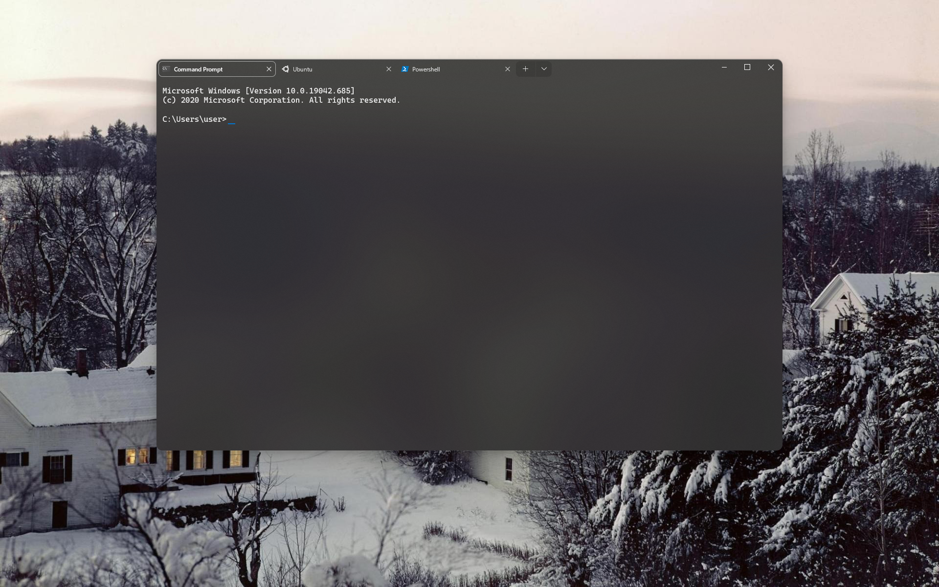
image
image

Edit:
image
Example with scrolled content

So the Titlebar uses the Console background - the Tabs blend in with an active tab standing out - and the Window Controls adapting their colour to contrast well.

@mdtauk commented on GitHub (Dec 12, 2020): Ignoring the Rounded Window Border (that will probably come to Windows with the new "Sun Valley" UI refresh) Here is how I would imagine a more immersive Terminal could look. ![image](https://user-images.githubusercontent.com/7389110/101990093-9a867580-3c9c-11eb-894b-1ec063c6d392.png) ![image](https://user-images.githubusercontent.com/7389110/101990097-a1ad8380-3c9c-11eb-9c46-2b7f7929fb6c.png) Edit: ![image](https://user-images.githubusercontent.com/7389110/101990467-05d14700-3c9f-11eb-9ea1-c1789c051c23.png) _Example with scrolled content_ So the Titlebar uses the Console background - the Tabs blend in with an active tab standing out - and the Window Controls adapting their colour to contrast well.
Author
Owner

@desmap commented on GitHub (Jan 4, 2021):

Acrylic/transparency is turned off on Alt-Tab, both in the preview thumbs and in the actual window.

Is this here the right place to report and should I open a new issue?

@desmap commented on GitHub (Jan 4, 2021): Acrylic/transparency is turned off on Alt-Tab, both in the preview thumbs and in the actual window. Is this here the right place to report and should I open a new issue?
Author
Owner

@DHowett commented on GitHub (Jan 4, 2021):

@desmap I believe that if you look in this thread and search in our historic issues, you will find an existing report for that behavior. 😄

@DHowett commented on GitHub (Jan 4, 2021): @desmap I believe that if you look in this thread and search in our historic issues, you will find an existing report for that behavior. 😄
Author
Owner

@just1a-person commented on GitHub (Feb 11, 2021):

Can we change the title? The UI isn't that bad now?

@just1a-person commented on GitHub (Feb 11, 2021): Can we change the title? The UI isn't that bad now?
Author
Owner

@ghost commented on GitHub (Mar 1, 2021):

Hi, I looked into some issues with the TabView and ways to fix them.

Currently, TabView is customized to remove all padding except for the left, which causes the top shadow and the rightmost tab corner to be cut.
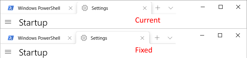
tabs_125x

However, if the custom padding is removed, it will persist when the window is maximized. This is because the space is created by changing the height of the caption buttons and not that of the TabView.
This could be fixed by adding/removing a negative margin instead when maximizing/windowing respectively.

TabView has a 8px top padding by default, instead of the 4px used by Terminal. I would suggest using the default, as it looks more balanced and other tabbed apps have it like that as well.
tabapps

As seen above, the TabStrip shadow is discontinued to the right because the TabView doesn't span the entire window.

This could be fixed by moving the DragBar and caption buttons to the TabViewFooter, or having them float above.
tabs_shadow

@ghost commented on GitHub (Mar 1, 2021): Hi, I looked into some issues with the TabView and ways to fix them. Currently, TabView is customized to remove all padding except for the left, which causes the top shadow and the rightmost tab corner to be cut. ![tabs_125x](https://user-images.githubusercontent.com/78622729/109519495-f4d0ee80-7ab3-11eb-9af9-8de77d6b8160.png) However, if the custom padding is removed, it will persist when the window is maximized. This is because the space is created by changing the height of the caption buttons and not that of the TabView. This could be fixed by adding/removing a negative margin instead when maximizing/windowing respectively. TabView has a 8px top padding by default, instead of the 4px used by Terminal. I would suggest using the default, as it looks more balanced and other tabbed apps have it like that as well. ![tabapps](https://user-images.githubusercontent.com/78622729/109519628-129e5380-7ab4-11eb-9393-a0fafe603fa4.png) As seen above, the TabStrip shadow is discontinued to the right because the TabView doesn't span the entire window. This could be fixed by moving the DragBar and caption buttons to the TabViewFooter, or having them float above. ![tabs_shadow](https://user-images.githubusercontent.com/78622729/109519693-23e76000-7ab4-11eb-93ca-3e583ee2f4c5.png)
Author
Owner

@shaheedmalik commented on GitHub (Mar 1, 2021):

Hi, I looked into some issues with the TabView and ways to fix them.

Currently, TabView is customized to remove all padding except for the right, which causes the top shadow and the rightmost tab corner to be cut.
tabs_125x

However, if the custom padding is removed, it will persist when the window is maximized. This is because the space is created by changing the height of the caption buttons and not that of the TabView.
This could be fixed by adding/removing a negative margin instead when maximizing/windowing respectively.

TabView has a 8px top padding by default, instead of the 4px used by Terminal. I would suggest using the default, as it looks more balanced and other tabbed apps have it like that as well.
tabapps

As seen above, the TabStrip shadow is discontinued to the right because the TabView doesn't span the entire window.
This could be fixed by moving the DragBar and caption buttons to the TabViewFooter, or having them float above.
tabs_shadow

This is due to the Desktop Window Manager not correctly scaling windows properly. It isn't a glitch with the TabView. Microsoft Edge has this same problem with the tab spacing at the top of the tab. Other windows have this problem but because there usually no noticable elements there, most people miss it. It is the reason why the Minimize Restore, Close buttons appear off.

@shaheedmalik commented on GitHub (Mar 1, 2021): > Hi, I looked into some issues with the TabView and ways to fix them. > > Currently, TabView is customized to remove all padding except for the right, which causes the top shadow and the rightmost tab corner to be cut. > ![tabs_125x](https://user-images.githubusercontent.com/78622729/109519495-f4d0ee80-7ab3-11eb-9af9-8de77d6b8160.png) > > However, if the custom padding is removed, it will persist when the window is maximized. This is because the space is created by changing the height of the caption buttons and not that of the TabView. > This could be fixed by adding/removing a negative margin instead when maximizing/windowing respectively. > > TabView has a 8px top padding by default, instead of the 4px used by Terminal. I would suggest using the default, as it looks more balanced and other tabbed apps have it like that as well. > ![tabapps](https://user-images.githubusercontent.com/78622729/109519628-129e5380-7ab4-11eb-9393-a0fafe603fa4.png) > > As seen above, the TabStrip shadow is discontinued to the right because the TabView doesn't span the entire window. > This could be fixed by moving the DragBar and caption buttons to the TabViewFooter, or having them float above. > ![tabs_shadow](https://user-images.githubusercontent.com/78622729/109519693-23e76000-7ab4-11eb-93ca-3e583ee2f4c5.png) This is due to the Desktop Window Manager not correctly scaling windows properly. It isn't a glitch with the TabView. Microsoft Edge has this same problem with the tab spacing at the top of the tab. Other windows have this problem but because there usually no noticable elements there, most people miss it. It is the reason why the Minimize Restore, Close buttons appear off.
Author
Owner

@ghost commented on GitHub (Mar 1, 2021):

Those issues are unrelated to the caption buttons looking off.
Currently, Terminal sets a custom padding in App.xaml, which if removed will solve the first problem.
<Thickness x:Key="TabViewHeaderPadding">8,0,0,0</Thickness>

The tab spacing is intentional, but Terminal should do it in a different way so that the shadow isn't cut.

Edit: The default TabView padding is 8,8,8,0, for reference.

@ghost commented on GitHub (Mar 1, 2021): Those issues are unrelated to the caption buttons looking off. Currently, Terminal sets a custom padding in App.xaml, which if removed will solve the first problem. `<Thickness x:Key="TabViewHeaderPadding">8,0,0,0</Thickness>` The tab spacing is intentional, but Terminal should do it in a different way so that the shadow isn't cut. Edit: The default TabView padding is `8,8,8,0`, for reference.
Author
Owner

@brendomaciel commented on GitHub (Apr 9, 2021):

I don't know if this is the right place to put this proposal, but here we goes:

image

What do you guys think about a more like Notepads app tab style?

I don't know why, but their acrylic works even with the unfocused window. Another detail is the fact that they put a little bit of extra personalization with the OS accent color in some places of the application (like tab border and menu icon color).

@brendomaciel commented on GitHub (Apr 9, 2021): I don't know if this is the right place to put this proposal, but here we goes: ![image](https://user-images.githubusercontent.com/4764874/114183982-a6b4d380-991a-11eb-91c1-b20afc38023d.png) What do you guys think about a more like Notepads app tab style? I don't know why, but their acrylic works even with the unfocused window. Another detail is the fact that they put a little bit of extra personalization with the OS accent color in some places of the application (like tab border and menu icon color).
Author
Owner

@DarthJahus commented on GitHub (Apr 10, 2021):

Can we have a visual indicator when Pause / Wait keyboard button is pressed? Maybe add it to the tab title : (paused) ; or add an optional status bar.

@DarthJahus commented on GitHub (Apr 10, 2021): Can we have a visual indicator when Pause / Wait keyboard button is pressed? Maybe add it to the tab title : (paused) ; or add an optional status bar.
Author
Owner

@r4dian commented on GitHub (Apr 11, 2021):

If Powerline/ohmyzsh/zpresto, (for example) adds a background on the right of the line, then once you hit the bottom of the window that background appears also in places it shouldn't (to repro, run a command with long output twice, with a similar prompt setup.)

Screenshot 2021-04-11 235044

@r4dian commented on GitHub (Apr 11, 2021): If Powerline/ohmyzsh/zpresto, (for example) adds a background on the right of the line, then once you hit the bottom of the window that background appears also in places it shouldn't (to repro, run a command with long output twice, with a similar prompt setup.) ![Screenshot 2021-04-11 235044](https://user-images.githubusercontent.com/1264174/114324190-c1589980-9b20-11eb-83ea-e13dc39bd861.png)
Author
Owner

@ghost commented on GitHub (May 27, 2021):

image

The acrylic NavigationView doesn't look that good with tabs.
I think it should either have the same background as the rest of the page, or there should be a header above it.

@ghost commented on GitHub (May 27, 2021): ![image](https://user-images.githubusercontent.com/84711285/119813115-90c29880-bef1-11eb-9b05-ba71a32817e2.png) The acrylic NavigationView doesn't look that good with tabs. I think it should either have the same background as the rest of the page, or there should be a header above it.
Author
Owner

@ghost commented on GitHub (Jun 8, 2021):

image

I suggest having the search menu (Ctrl+Shift+F) be detached from the titlebar for a couple of reasons:

  • the new WinUI TabView style has a border at the bottom and the menu won't be seamlessly connected anymore
  • WinUI now tries to avoid having sharp corners at all
  • other apps with a similar menu have it being detached

Would something like this be good? It has an 8px margin at the top, like the Command Palette.
searchmenu

@ghost commented on GitHub (Jun 8, 2021): ![image](https://user-images.githubusercontent.com/84711285/121154456-aae46b00-c84f-11eb-8302-e6d26b483b99.png) I suggest having the search menu (Ctrl+Shift+F) be detached from the titlebar for a couple of reasons: * the new WinUI TabView style has a border at the bottom and the menu won't be seamlessly connected anymore * WinUI now tries to avoid having sharp corners at all * other apps with a similar menu have it being detached Would something like this be good? It has an 8px margin at the top, like the Command Palette. ![searchmenu](https://user-images.githubusercontent.com/84711285/121172665-9ceb1600-c860-11eb-80d8-28bdb35ea139.png)
Author
Owner

@tropicaaal commented on GitHub (Sep 8, 2021):

I've thrown together this quick concept of what Terminal might look like with WinUI 2.6 controls and mica.
image

@tropicaaal commented on GitHub (Sep 8, 2021): I've thrown together this quick concept of what Terminal might look like with WinUI 2.6 controls and mica. ![image](https://user-images.githubusercontent.com/42101043/132423893-cd151c4d-19e2-4201-b15c-e848fefb59ea.png)
Author
Owner

@tropicaaal commented on GitHub (Sep 8, 2021):

image
Dark mode

@tropicaaal commented on GitHub (Sep 8, 2021): ![image](https://user-images.githubusercontent.com/42101043/132427407-6dd38fb2-b81c-4500-b978-b389de5dbab6.png) Dark mode
Author
Owner

@tropicaaal commented on GitHub (Sep 8, 2021):

imageSettings

image About dialog + Command palette

@tropicaaal commented on GitHub (Sep 8, 2021): ![image](https://user-images.githubusercontent.com/42101043/132434814-0110c890-c4c7-4820-a599-701ab41dcf05.png)Settings ![image](https://user-images.githubusercontent.com/42101043/132446778-a08678a5-3959-4a7f-8294-4f279808e384.png) About dialog + Command palette
Author
Owner

@tropicaaal commented on GitHub (Sep 8, 2021):

image
Finally, here's a concept for the find and replace flyout based on @gabrielconl 's idea

@tropicaaal commented on GitHub (Sep 8, 2021): ![image](https://user-images.githubusercontent.com/42101043/132447666-8fca966a-5ede-490f-87fc-ad350da7bd21.png) Finally, here's a concept for the find and replace flyout based on @gabrielconl 's idea
Author
Owner

@quietrobot commented on GitHub (Sep 8, 2021):

I've thrown together this quick concept of what Terminal might look like with WinUI 2.6 controls and mica.
image

Yes!!!!!!

@quietrobot commented on GitHub (Sep 8, 2021): > I've thrown together this quick concept of what Terminal might look like with WinUI 2.6 controls and mica. > ![image](https://user-images.githubusercontent.com/42101043/132423893-cd151c4d-19e2-4201-b15c-e848fefb59ea.png) Yes!!!!!!
Author
Owner

@miniksa commented on GitHub (Sep 8, 2021):

Thanks @Tropix126. We are trying to move to WinUI 2.6 so we can get their styling work, but we're currently blocked by https://github.com/microsoft/microsoft-ui-xaml/issues/5435. I've engaged with the WinUI team internally to hopefully get us past this.

@miniksa commented on GitHub (Sep 8, 2021): Thanks @Tropix126. We are trying to move to WinUI 2.6 so we can get their styling work, but we're currently blocked by https://github.com/microsoft/microsoft-ui-xaml/issues/5435. I've engaged with the WinUI team internally to hopefully get us past this.
Author
Owner

@tropicaaal commented on GitHub (Nov 12, 2021):

Looks like efforts have started on MUX 2.7 adoption in #11720.

@tropicaaal commented on GitHub (Nov 12, 2021): Looks like efforts have started on MUX 2.7 adoption in #11720.
Author
Owner

@Shomnipotence commented on GitHub (Jun 13, 2022):

WindowsTerminal3 拷贝2

WindowsTerminal3 拷贝

WindowsTerminal4

@Shomnipotence commented on GitHub (Jun 13, 2022): ![WindowsTerminal3 拷贝2](https://user-images.githubusercontent.com/6630660/173330485-56cdd398-9943-47a8-a432-8658a4dcc0e1.png) ![WindowsTerminal3 拷贝](https://user-images.githubusercontent.com/6630660/173330509-cf8a287c-8648-42ac-8976-25889aadb75a.png) ![WindowsTerminal4](https://user-images.githubusercontent.com/6630660/173330541-2127a902-65b6-444f-918e-0b54098545f3.png)
Author
Owner

@mdtauk commented on GitHub (Jun 13, 2022):

Edge moving to rounded (and disconnected) tabs, would allow the terminal background to become full bleed and not be too different a UI.

@mdtauk commented on GitHub (Jun 13, 2022): Edge moving to rounded (and disconnected) tabs, would allow the terminal background to become full bleed and not be too different a UI.
Author
Owner

@quietrobot commented on GitHub (Jun 13, 2022):

WindowsTerminal3 拷贝2

WindowsTerminal3 拷贝

WindowsTerminal4

It definitely looks 1000 times better!!!

@quietrobot commented on GitHub (Jun 13, 2022): > ![WindowsTerminal3 拷贝2](https://user-images.githubusercontent.com/6630660/173330485-56cdd398-9943-47a8-a432-8658a4dcc0e1.png) > > ![WindowsTerminal3 拷贝](https://user-images.githubusercontent.com/6630660/173330509-cf8a287c-8648-42ac-8976-25889aadb75a.png) > > ![WindowsTerminal4](https://user-images.githubusercontent.com/6630660/173330541-2127a902-65b6-444f-918e-0b54098545f3.png) It definitely looks 1000 times better!!!
Author
Owner

@zadjii-msft commented on GitHub (Jun 13, 2022):

The above work is something we're tracking in #3327. There's more discussion there, so I'll redirect the above couple comments to that thread instead. Thanks!

@zadjii-msft commented on GitHub (Jun 13, 2022): The above work is something we're tracking in #3327. There's more discussion there, so I'll redirect the above couple comments to that thread instead. Thanks!
Author
Owner

@mhtvsSFrpHdE commented on GitHub (Jul 31, 2022):

I don't care about the design language battle or something,
but could we just have a "Disable border radius" optional checkbox?

Here is my Firefox customization, I only applied border-radius: 0 CSS to every UI and get this beauty
Every other design was inherited from stock, just removed all the rounded corners

I believe Windows Terminal can get similar looking too if we simply allow user choice to disable corners
image

@mhtvsSFrpHdE commented on GitHub (Jul 31, 2022): I don't care about the design language battle or something, but could we just have a "Disable border radius" optional checkbox? Here is my Firefox customization, I only applied `border-radius: 0` CSS to every UI and get this beauty Every other design was inherited from stock, just removed all the rounded corners I believe Windows Terminal can get similar looking too if we simply allow user choice to disable corners ![image](https://user-images.githubusercontent.com/10773245/182011032-6dc691ee-b164-439d-ac61-009916393d6c.png)
Author
Owner

@KiruyaMomochi commented on GitHub (Aug 29, 2022):

Colored tabs feels a little separated.
To make it looks more like a hole, maybe add a colored line below the tab?

image

@KiruyaMomochi commented on GitHub (Aug 29, 2022): Colored tabs feels a little separated. To make it looks more like a hole, maybe add a colored line below the tab? ![image](https://user-images.githubusercontent.com/65301509/187289393-9e8b48a7-0dad-4a69-922e-b966dff1fc08.png)
Author
Owner

@tunaflsh commented on GitHub (Sep 25, 2022):

Dragging the window above the taps is still not supported yet? I just somehow accidentally moved my window too far to the right and I couldn't reach the draggable zone anymore.

@tunaflsh commented on GitHub (Sep 25, 2022): Dragging the window above the taps is still not supported yet? I just somehow accidentally moved my window too far to the right and I couldn't reach the draggable zone anymore.
Author
Owner

@zadjii-msft commented on GitHub (Jan 24, 2023):

Hey all,

I'm gonna finally close this thread out with the release of Windows Terminal 1.17. This release finally adds support for Mica, and with that, I'm gonna call this "done". I think we've settled enough on what the design of the Terminal is going to be going forward, and we've established a mechanism (through Themes) for users to add additional UI customizations as they see fit.

There's been a large number of minor suggestions for changes to the UI that have accumulated in this thread over the years. I'm under the impression that these should all be tracked as sub-points in our "Themes megrathread", #3327, at this point (my apologies if I missed anyone). Obviously, these aren't all done, but the fundamental framework is now in place for storing these Theme settings, so when these features are ever added, exposing them as optional settings should be "easy". There's also other minor functional nits (like #5493) which don't really need this megathread tracking them anymore.

Thanks to the 145 of you who have commented on this thread, and countless more of you following for updates. It's hard to believe how far the Terminal has come over the years, from v0.1 to what's possible today:

I'm really happy with the way this has all come together over the years, and that wouldn't have been possible without the absolute breadth of feedback we've gotten here (and in other threads) ❤️

@zadjii-msft commented on GitHub (Jan 24, 2023): Hey all, I'm gonna finally close this thread out with the release of [Windows Terminal 1.17](https://github.com/microsoft/terminal/releases/tag/v1.17.1023). This release finally adds support for Mica, and with that, I'm gonna call this "done". I think we've settled enough on what the design of the Terminal is going to be going forward, and we've established a mechanism (through [Themes](https://learn.microsoft.com/en-us/windows/terminal/customize-settings/themes)) for users to add additional UI customizations as they see fit. There's been a large number of minor suggestions for changes to the UI that have accumulated in this thread over the years. I'm under the impression that these should all be tracked as sub-points in our "Themes megrathread", #3327, at this point (my apologies if I missed anyone). Obviously, these aren't all done, but the fundamental framework is now in place for storing these Theme settings, so when these features are ever added, exposing them as optional settings should be "easy". There's also other minor functional nits (like #5493) which don't really need this megathread tracking them anymore. Thanks to the 145 of you who have commented on this thread, and countless more of you following for updates. It's hard to believe how far the Terminal has come over the years, from v0.1 to what's possible today: <img src="https://user-images.githubusercontent.com/18356694/214394164-2a8dff44-096d-48e6-8efb-820f099c07c3.png" width=480/> <img src="https://user-images.githubusercontent.com/18356694/214393963-2edc0dc9-a1b4-4943-9704-0393b71b26a0.png" width=480/> I'm really happy with the way this has all come together over the years, and that wouldn't have been possible without the absolute breadth of feedback we've gotten here (and in other threads) ❤️
Sign in to join this conversation.
1 Participants
Notifications
Due Date
No due date set.
Dependencies

No dependencies set.

Reference: starred/terminal#1827